\n
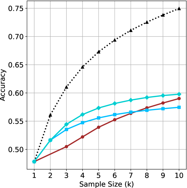
## Line Chart: Accuracy vs. Sample Size (k)
### Overview
The image is a line chart comparing the performance (Accuracy) of four different models or methods as the training sample size increases. The chart demonstrates how accuracy improves with more data for each method, with one method (black dotted line) showing significantly superior performance and a steeper learning curve compared to the other three, which cluster together at a lower performance tier.
### Components/Axes
* **X-Axis (Horizontal):** Labeled "Sample Size (k)". It represents the number of training samples in thousands. The axis has discrete markers at integer values from 1 to 10.
* **Y-Axis (Vertical):** Labeled "Accuracy". It represents a performance metric, likely classification accuracy, ranging from approximately 0.48 to 0.75. Major gridlines are drawn at intervals of 0.05 (0.50, 0.55, 0.60, 0.65, 0.70, 0.75).
* **Legend:** Located in the top-left quadrant of the plot area. It identifies four data series:
1. **Black dotted line with upward-pointing triangle markers (▲):** Label not visible in the provided crop, but this is the highest-performing series.
2. **Cyan solid line with diamond markers (◆):** The second-highest performing series.
3. **Blue solid line with square markers (■):** The third-highest performing series.
4. **Red solid line with circle markers (●):** The lowest-performing series initially, but it shows steady improvement.
### Detailed Analysis
**Trend Verification & Data Point Extraction (Approximate Values):**
1. **Black Dotted Line (▲):**
* **Trend:** Shows a strong, steep, and slightly concave-down upward trend. It starts at the lowest point (tied with others) but quickly diverges and maintains the highest accuracy throughout.
* **Data Points:**
* k=1: ~0.48
* k=2: ~0.56
* k=3: ~0.61
* k=4: ~0.645
* k=5: ~0.675
* k=6: ~0.695
* k=7: ~0.71
* k=8: ~0.725
* k=9: ~0.74
* k=10: ~0.75
2. **Cyan Solid Line (◆):**
* **Trend:** Shows a steady, slightly concave-down upward trend. It is consistently the second-best performer after k=2.
* **Data Points:**
* k=1: ~0.48
* k=2: ~0.515
* k=3: ~0.545
* k=4: ~0.56
* k=5: ~0.575
* k=6: ~0.58
* k=7: ~0.59
* k=8: ~0.595
* k=9: ~0.598
* k=10: ~0.60
3. **Blue Solid Line (■):**
* **Trend:** Shows a steady, nearly linear upward trend. It is generally the third-best performer, closely following the cyan line but with a slightly lower slope.
* **Data Points:**
* k=1: ~0.48
* k=2: ~0.515 (overlaps with cyan)
* k=3: ~0.535
* k=4: ~0.548
* k=5: ~0.555
* k=6: ~0.56
* k=7: ~0.565
* k=8: ~0.57
* k=9: ~0.575
* k=10: ~0.578
4. **Red Solid Line (●):**
* **Trend:** Shows a steady, nearly linear upward trend. It starts as the lowest performer but its slope is slightly steeper than the blue line, causing it to converge with and eventually surpass the blue line at higher k values.
* **Data Points:**
* k=1: ~0.48
* k=2: ~0.495
* k=3: ~0.505
* k=4: ~0.52
* k=5: ~0.54
* k=6: ~0.552
* k=7: ~0.565 (intersects blue line)
* k=8: ~0.575
* k=9: ~0.582
* k=10: ~0.59
### Key Observations
1. **Performance Hierarchy:** A clear performance gap exists. The method represented by the black dotted line (▲) is in a class of its own, achieving ~15-16 percentage points higher accuracy than the next best method at k=10.
2. **Convergence at Low k:** All four methods start at approximately the same accuracy (~0.48) when the sample size is smallest (k=1).
3. **Diminishing Returns:** All curves show signs of diminishing returns (concave-down shape), meaning the marginal gain in accuracy decreases as more data is added. This effect is most pronounced for the top-performing black line.
4. **Crossover Point:** The red line (●) and blue line (■) intersect between k=6 and k=7. Before this point, blue is more accurate; after it, red becomes more accurate.
5. **Clustering:** The cyan, blue, and red lines form a relatively tight cluster, with a maximum spread of about 0.02-0.03 accuracy points between the best and worst of them at any given k after k=2.
### Interpretation
This chart illustrates a classic machine learning learning curve. The key takeaway is the dramatic difference in **data efficiency** between the methods.
* The black-dotted method is highly data-efficient. It extracts significantly more predictive power from the same amount of data, as evidenced by its steep initial slope. This suggests it may be a more complex model, use a better feature representation, or employ a more effective learning algorithm.
* The other three methods (cyan, blue, red) have similar, lower data efficiency. Their close grouping suggests they may be variants of a similar algorithmic family or share a common limitation. The crossover between red and blue indicates that their relative performance is sensitive to the amount of available data.
* The universal convergence at k=1 implies that with extremely scarce data, the choice of method may matter less, as all are equally constrained. The value of choosing a superior method (black line) becomes overwhelmingly apparent as more data becomes available.
* The chart does not show a plateau for any line within the range k=1 to k=10, suggesting that further accuracy gains might be possible with even larger sample sizes, though at a diminishing rate.
**Note on Missing Information:** The specific names or identities of the four methods compared are not visible in the provided image crop. The legend labels are cut off. A complete technical document would require these labels to make the comparison meaningful.