## Chart: Log Probability vs. Number of Layers at Different Temperatures
### Overview
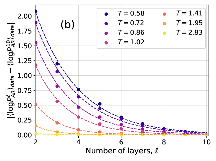
The image is a scatter plot showing the relationship between the absolute value of the difference between the log base 10 of probability *P* of *AR* with *l* layers and the average log base 10 of probability *P* of *AR*, and the number of layers (*l*) for different temperatures (*T*). The plot includes data points and dashed lines representing the trend for each temperature.
### Components/Axes
* **X-axis:** Number of layers, *l*. Scale ranges from 2 to 10, with integer markings.
* **Y-axis:** |<log *P*<sub>*AR*</sub><sup>*l*</sup>><sub>data</sub> - <log *P*<sub>*AR*</sub><sup>10</sup>><sub>data</sub>|. Scale ranges from 0.00 to 2.00, with markings at intervals of 0.25.
* **Legend:** Located in the top-right corner, the legend maps colors to temperatures:
* Blue: *T* = 0.58
* Dark Purple: *T* = 0.72
* Purple: *T* = 0.86
* Pink: *T* = 1.02
* Red-Pink: *T* = 1.41
* Orange: *T* = 1.95
* Yellow: *T* = 2.83
* **Title:** There is no explicit title, but the axes labels and legend provide context.
* **Annotation:** The label "(b)" is present in the top-left corner of the plot.
### Detailed Analysis
The plot shows how the absolute value of the difference between the log base 10 of probability *P* of *AR* with *l* layers and the average log base 10 of probability *P* of *AR* changes with the number of layers at different temperatures. Each temperature has a corresponding data series represented by colored dots and a dashed line.
* **T = 0.58 (Blue):** Starts at approximately 2.1 at *l* = 2 and decreases rapidly, reaching approximately 0.5 at *l* = 10.
* **T = 0.72 (Dark Purple):** Starts at approximately 1.9 at *l* = 2 and decreases rapidly, reaching approximately 0.3 at *l* = 10.
* **T = 0.86 (Purple):** Starts at approximately 1.5 at *l* = 2 and decreases rapidly, reaching approximately 0.2 at *l* = 10.
* **T = 1.02 (Pink):** Starts at approximately 1.1 at *l* = 2 and decreases rapidly, reaching approximately 0.15 at *l* = 10.
* **T = 1.41 (Red-Pink):** Starts at approximately 0.5 at *l* = 2 and decreases rapidly, reaching approximately 0.05 at *l* = 10.
* **T = 1.95 (Orange):** Starts at approximately 0.2 at *l* = 2 and decreases rapidly, reaching approximately 0.02 at *l* = 10.
* **T = 2.83 (Yellow):** Starts at approximately 0.05 at *l* = 2 and decreases rapidly, reaching approximately 0.01 at *l* = 10.
All data series show a decreasing trend as the number of layers increases. The rate of decrease appears to be higher for lower temperatures.
### Key Observations
* The absolute value of the difference between the log base 10 of probability *P* of *AR* with *l* layers and the average log base 10 of probability *P* of *AR* decreases as the number of layers increases for all temperatures.
* The rate of decrease is more pronounced at lower temperatures.
* The curves appear to converge towards zero as the number of layers increases.
* The initial values (at *l* = 2) are higher for lower temperatures.
### Interpretation
The plot suggests that as the number of layers increases, the log probability of *AR* converges towards a stable value, regardless of the temperature. The convergence is faster at lower temperatures, indicating that the system reaches a more stable state with fewer layers when the temperature is lower. The higher initial values at lower temperatures suggest that the initial deviation from the average log probability is greater at lower temperatures, but this deviation is quickly reduced as the number of layers increases. The data demonstrates that the number of layers has a significant impact on the log probability of *AR*, and this impact is modulated by temperature.