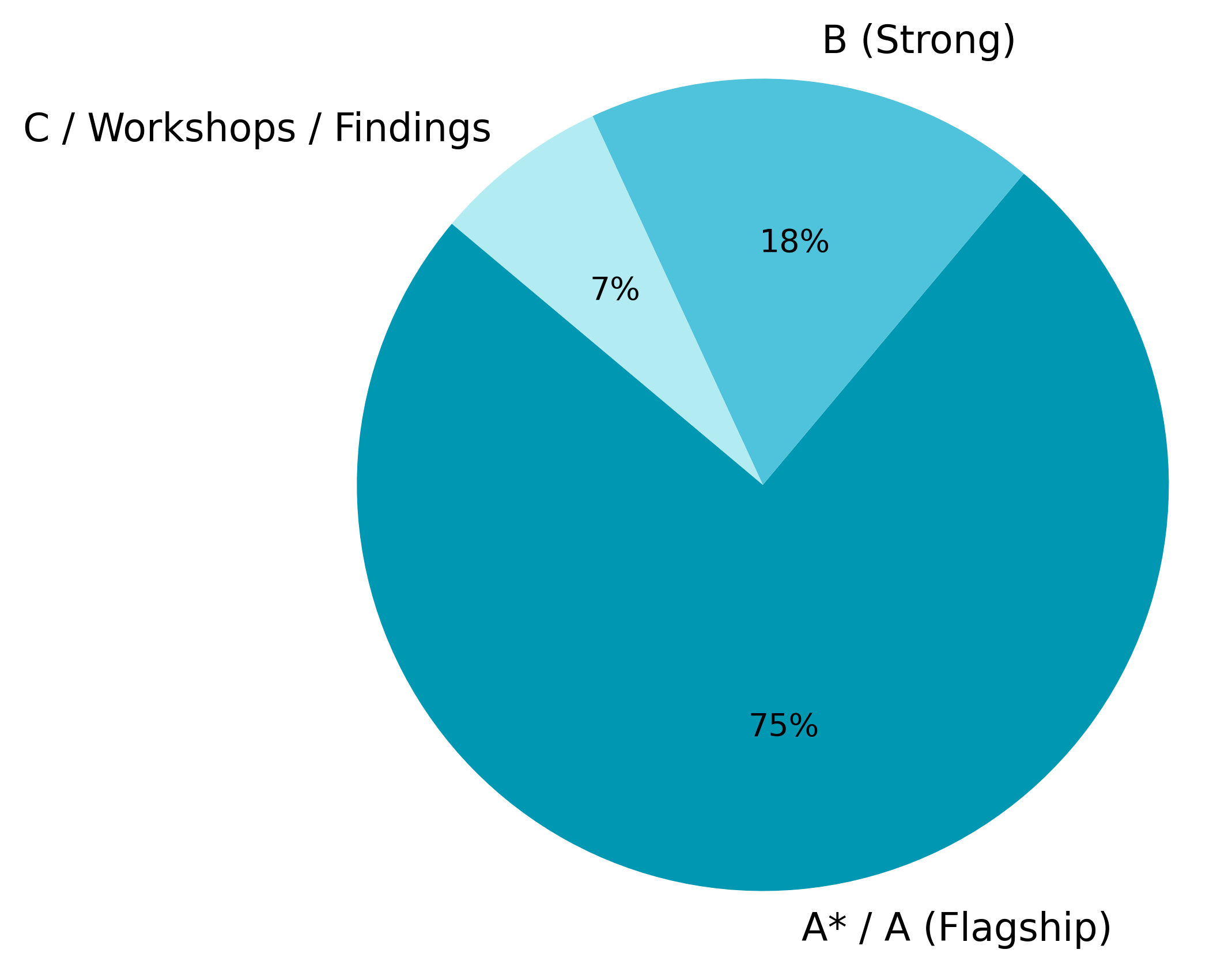
## Pie Chart: Project Category Distribution
### Overview
The image displays a pie chart divided into three segments, each representing a different category with an associated percentage. The chart is presented on a plain, light gray background. The labels are in English.
### Components/Axes
The chart consists of three colored segments, each with a text label and a percentage value placed directly on or near the segment. There are no traditional axes, as this is a pie chart.
**Segments (from largest to smallest):**
1. **Label:** `A* / A (Flagship)`
* **Color:** Dark teal/cyan.
* **Percentage:** `75%`
* **Position:** Occupies the bottom and right majority of the pie chart.
2. **Label:** `B (Strong)`
* **Color:** Medium blue.
* **Percentage:** `18%`
* **Position:** Located in the upper-right quadrant of the chart.
3. **Label:** `C / Workshops / Findings`
* **Color:** Light blue.
* **Percentage:** `7%`
* **Position:** Located in the upper-left quadrant of the chart.
### Detailed Analysis
* **Segment "A* / A (Flagship)":** This is the dominant segment, colored dark teal. It represents three-quarters (75%) of the whole, indicating it is the primary or most significant category. The label includes an asterisk (*) and the descriptor "Flagship," suggesting it may be a top-tier or priority category.
* **Segment "B (Strong)":** This medium-blue segment represents 18% of the whole. It is the second-largest category, described as "Strong."
* **Segment "C / Workshops / Findings":** This is the smallest segment, colored light blue, representing only 7% of the total. Its label suggests it may encompass workshop activities or research findings.
### Key Observations
1. **Dominant Category:** The "A* / A (Flagship)" category is overwhelmingly dominant, comprising 75% of the distribution.
2. **Clear Hierarchy:** The chart shows a clear three-tier hierarchy: Flagship (75%), Strong (18%), and Workshops/Findings (7%).
3. **Color Gradient:** The segments use a gradient of blue/teal shades, with the largest segment being the darkest and the smallest being the lightest.
4. **Label Specificity:** The labels vary in specificity. "A* / A" and "B" are coded, while "C / Workshops / Findings" is more descriptive.
### Interpretation
This pie chart likely illustrates the allocation of resources, focus, or outcomes across different project types or priority levels within an organization or initiative.
* **Resource Allocation:** The data suggests a heavy concentration of effort or investment (75%) in flagship ("A* / A") projects. This indicates a strategy focused on a few high-priority, potentially high-impact initiatives.
* **Supporting Tiers:** The "B (Strong)" category (18%) represents a significant but secondary tier of projects, possibly those with solid potential but not top priority. The small "C / Workshops / Findings" slice (7%) suggests that exploratory work, training, or research outputs constitute a minor portion of the overall portfolio.
* **Notable Anomaly:** The asterisk in "A* / A" is a specific notation whose meaning is not defined in the chart. It could denote a special status, a sub-category, or a footnote reference not visible in this image.
* **Strategic Implication:** The distribution implies a "top-heavy" or focused strategy. The success of the overall endeavor appears heavily dependent on the performance of the flagship projects. The minimal allocation to workshops/findings might indicate a mature phase where discovery is less emphasized, or it could point to a potential gap in exploratory or foundational activities.