## Pie Chart: Category Distribution
### Overview
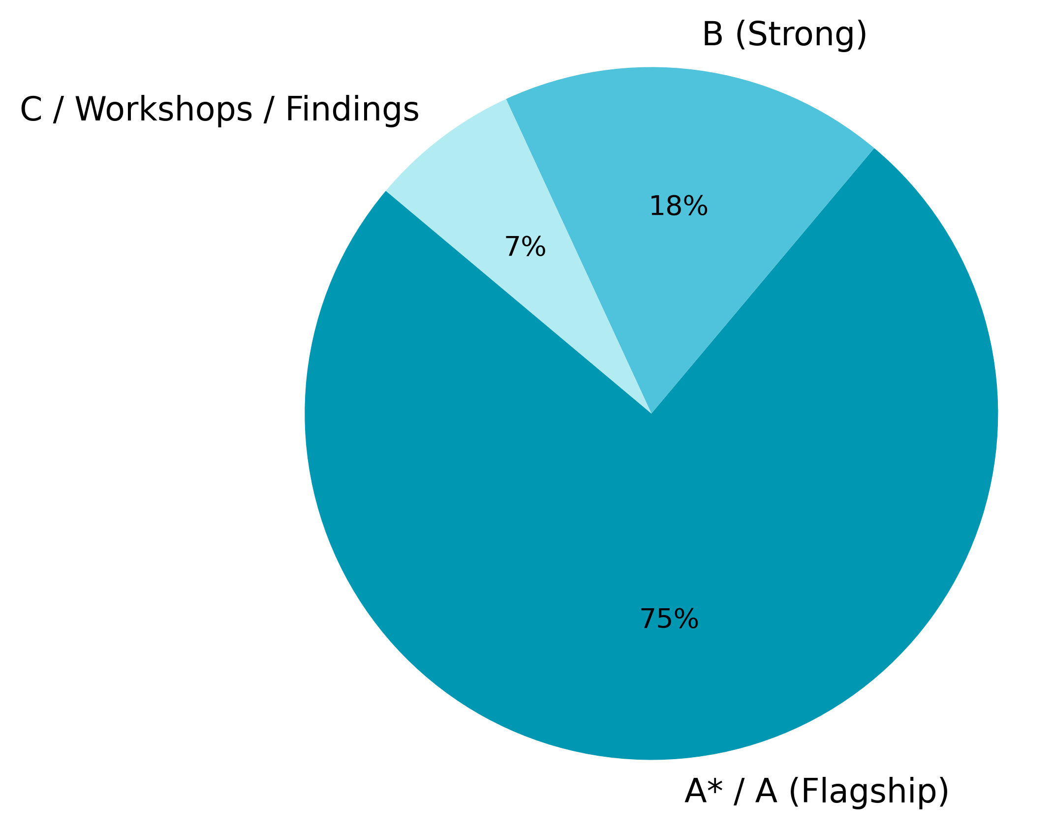
The image is a pie chart illustrating the distribution of three categories: A*/A (Flagship), B (Strong), and C/Workshops/Findings. The chart shows the percentage each category represents of the whole.
### Components/Axes
* **Categories:**
* A*/A (Flagship) - Represented by a dark teal color.
* B (Strong) - Represented by a medium turquoise color.
* C/Workshops/Findings - Represented by a light cyan color.
* **Percentages:** The percentages are displayed within each slice of the pie chart.
### Detailed Analysis
* **A*/A (Flagship):** This category occupies the largest portion of the pie chart, accounting for 75% of the total. The slice is located at the bottom of the pie chart.
* **B (Strong):** This category represents 18% of the total. The slice is located at the top-right of the pie chart.
* **C/Workshops/Findings:** This category represents the smallest portion, accounting for 7% of the total. The slice is located at the top-left of the pie chart.
### Key Observations
* The A*/A (Flagship) category is significantly larger than the other two categories, indicating it is the dominant category.
* The C/Workshops/Findings category is the smallest, suggesting it has the least representation.
### Interpretation
The pie chart provides a clear visual representation of the relative proportions of the three categories. The A*/A (Flagship) category's dominance suggests it is the most significant or prevalent among the three. The other two categories, B (Strong) and C/Workshops/Findings, have considerably smaller representations, indicating their lesser importance or frequency compared to the A*/A (Flagship) category.