\n
## Pie Chart: Distribution of Categories A*, A, B, and C
### Overview
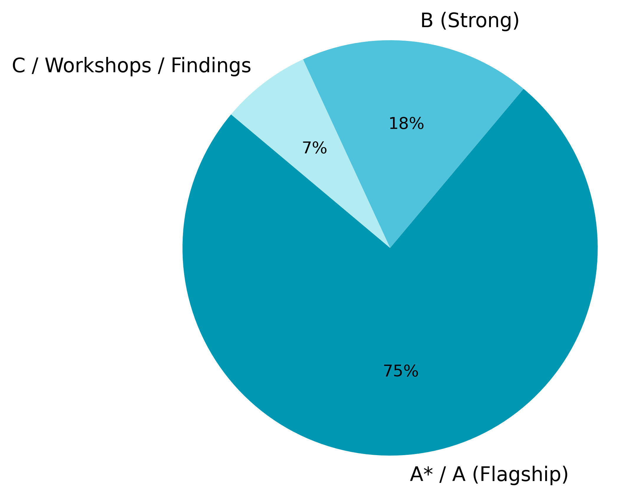
The image is a pie chart illustrating the proportional distribution of four categories: A* / A (Flagship), B (Strong), and C / Workshops / Findings. The chart visually represents the relative contribution of each category to a whole.
### Components/Axes
* **Categories:** A* / A (Flagship), B (Strong), C / Workshops / Findings
* **Values:** 75%, 18%, 7%
* **Legend:** Located in the top-right corner, associating colors with categories.
* Teal: A* / A (Flagship)
* Light Blue: B (Strong)
* Light Green: C / Workshops / Findings
### Detailed Analysis
The pie chart is divided into three distinct segments, with one segment dominating the chart.
* **A* / A (Flagship):** This segment occupies the largest portion of the pie chart, representing approximately 75% of the total. The segment is colored teal.
* **B (Strong):** This segment represents approximately 18% of the total. The segment is colored light blue.
* **C / Workshops / Findings:** This segment represents the smallest portion of the pie chart, accounting for approximately 7% of the total. The segment is colored light green.
The percentages are directly labeled on the chart segments.
### Key Observations
* The category A* / A (Flagship) significantly outweighs the other two categories, representing the vast majority (75%) of the total.
* The category C / Workshops / Findings is the least represented, with only 7%.
* The sum of the percentages (75% + 18% + 7%) equals 100%, confirming that the chart represents a complete distribution.
### Interpretation
The data suggests a strong dominance of the "A* / A (Flagship)" category. This could indicate that this category is the primary focus, driver, or contributor within the context of the data being represented. The relatively small proportions of "B (Strong)" and "C / Workshops / Findings" suggest they play secondary roles. The labeling of "C" as "Workshops / Findings" implies that this category represents the results or outputs of workshops, which are comparatively less significant than the flagship category. The chart effectively communicates a clear hierarchy of importance among the four categories. It is likely that the data represents a breakdown of resources, contributions, or outcomes, where the flagship category receives the most attention or investment.