## Line Charts: Test Loss vs. Gradient Updates for Different Model Dimensions (d)
### Overview
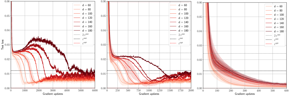
The image displays three horizontally arranged line charts. Each chart plots "Test loss" on the y-axis against "Gradient updates" on the x-axis for a series of models with different dimensions, denoted by `d`. The charts appear to show the training dynamics of machine learning models, likely neural networks, under different configurations or training regimes. The primary variable changing between the three plots is the scale of the x-axis (Gradient updates).
### Components/Axes
* **Y-Axis (All Charts):** Labeled "Test loss". The scale ranges from 0.00 to 0.06, with major tick marks at 0.01 intervals.
* **X-Axis (Left Chart):** Labeled "Gradient updates". Scale ranges from 0 to 6000, with major ticks every 1000 updates.
* **X-Axis (Middle Chart):** Labeled "Gradient updates". Scale ranges from 0 to 2000, with major ticks every 250 updates.
* **X-Axis (Right Chart):** Labeled "Gradient updates". Scale ranges from 0 to 600, with major ticks every 100 updates.
* **Legend (Present in all charts, top-right corner):**
* **Solid Lines (Color Gradient):** Represent different model dimensions `d`. The color transitions from light red/pink for lower `d` to dark red/maroon for higher `d`.
* `d = 60` (Lightest)
* `d = 80`
* `d = 100`
* `d = 120`
* `d = 140`
* `d = 160`
* `d = 180` (Darkest)
* **Dashed Lines (Reference Thresholds):**
* `2ε^min` (Black dashed line, highest of the three)
* `ε^min` (Black dashed line, middle)
* `ε^opt` (Red dashed line, lowest)
### Detailed Analysis
**Left Chart (0-6000 Gradient Updates):**
* **Trend Verification:** All curves start at a high test loss (>0.06). They initially decrease rapidly. For lower `d` values (60, 80, 100), the loss decreases smoothly and converges near or below the `ε^opt` line. For higher `d` values (140, 160, 180), the curves exhibit a pronounced "hump": after the initial decrease, the loss rises significantly (peaking between ~0.03 and 0.04) before eventually decreasing again. The peak of the hump occurs later (around 2000-3000 updates) and is higher for larger `d`. The `d=120` curve shows a smaller, delayed hump.
* **Data Points (Approximate):**
* `d=60`: Converges to ~0.005 by 2000 updates.
* `d=180`: Initial drop to ~0.025 at 500 updates, rises to peak ~0.035 at 2500 updates, then falls to ~0.01 by 6000 updates.
* All curves for `d >= 120` cross above the `2ε^min` line (~0.024) during their hump phase.
**Middle Chart (0-2000 Gradient Updates):**
* **Trend Verification:** This appears to be a zoomed-in view of the early training phase. The initial rapid decrease is clearer. The hump for high `d` models is still visible but less pronounced within this timeframe. The curves for lower `d` continue their smooth descent.
* **Data Points (Approximate):**
* By 250 updates, all models have loss <0.03.
* The `d=180` curve begins its ascent around 500 updates, reaching ~0.022 by 1000 updates.
* Lower `d` models (`d=60, 80`) approach the `ε^opt` line (~0.012) by 1500-2000 updates.
**Right Chart (0-600 Gradient Updates):**
* **Trend Verification:** This is a further zoom on the very early training dynamics. All curves show a steep, smooth, and monotonic decrease in test loss. No humps are visible in this early phase. The ordering is clear: higher `d` models (darker lines) have a slightly slower initial rate of decrease compared to lower `d` models (lighter lines).
* **Data Points (Approximate):**
* At 100 updates: Loss ranges from ~0.015 (`d=60`) to ~0.025 (`d=180`).
* At 600 updates: Loss ranges from ~0.005 (`d=60`) to ~0.010 (`d=180`). All curves are still above the `ε^opt` line.
### Key Observations
1. **Double Descent Phenomenon:** The left chart clearly illustrates a "double descent" or "hump" in test loss for higher-dimensional models (`d >= 120`). Performance initially improves, then worsens (the hump), and finally improves again to a good final value.
2. **Dimension Dependence:** The severity and timing of the hump are directly correlated with model dimension `d`. Larger `d` leads to a higher and later peak.
3. **Convergence:** Despite the intermediate hump, all models, regardless of `d`, appear to converge to a test loss near or below the `ε^opt` threshold given enough gradient updates (as seen in the left chart).
4. **Early Training:** In the very early phase (right chart), larger models have slightly higher test loss and learn slightly slower, but all models improve monotonically.
### Interpretation
These charts provide a visual empirical demonstration of the **double descent** phenomenon in machine learning, where test error can non-monotonically change with training time or model complexity.
* **What the data suggests:** The "hump" corresponds to a period where the model is fitting noise or idiosyncrasies of the training data (overfitting in a classical sense), leading to worse generalization (higher test loss). As training continues, the model eventually finds a smoother, more generalizable solution. The parameter `d` likely represents model width or capacity. Higher capacity models are more prone to this intermediate overfitting phase but can still achieve good final generalization.
* **Relationship between elements:** The three charts are different temporal zooms of the same underlying training processes. The dashed lines (`ε^min`, `ε^opt`) likely represent theoretical or empirical lower bounds on the achievable test error for this problem. The fact that models converge near `ε^opt` suggests they are reaching an optimal or near-optimal solution.
* **Notable Anomalies/Trends:** The most striking trend is the systematic relationship between `d` and the hump's shape. This challenges the classical bias-variance trade-off view, where more complex models are simply expected to overfit. Here, sufficient training time allows complex models to recover. The charts argue that the *training trajectory* is as important as the final model capacity.