\n
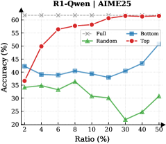
## Line Chart: Accuracy vs. Ratio for Different Data Distributions
### Overview
This image presents a line chart comparing the accuracy of a model across different ratios of data distribution. Four data series are plotted: "Full", "Random", "Bottom", and "Top". The chart aims to demonstrate how the distribution of data impacts model performance, measured by accuracy. The title of the chart is "R1-Qwen | AIME25".
### Components/Axes
* **X-axis:** "Ratio (%)", ranging from 2 to 50, with markers at 2, 4, 6, 8, 10, 20, 30, 40, and 50.
* **Y-axis:** "Accuracy (%)", ranging from 20 to 65, with markers at 20, 30, 40, 50, and 60.
* **Legend:** Located in the top-right corner, identifying the four data series with corresponding colors:
* "Full" - Grey 'x' markers
* "Random" - Green triangle markers
* "Bottom" - Blue diamond markers
* "Top" - Red circle markers
### Detailed Analysis
* **Full (Grey):** The "Full" line is approximately horizontal, maintaining an accuracy of around 61-63% across all ratios. The data points are:
* Ratio 2: ~62%
* Ratio 4: ~62%
* Ratio 6: ~62%
* Ratio 8: ~62%
* Ratio 10: ~62%
* Ratio 20: ~62%
* Ratio 30: ~62%
* Ratio 40: ~62%
* Ratio 50: ~62%
* **Random (Green):** The "Random" line shows a fluctuating trend. It starts at approximately 34% at a ratio of 2, increases to a peak of around 37% at a ratio of 6, then declines to approximately 22% at a ratio of 30, and finally rises to around 31% at a ratio of 50. The data points are:
* Ratio 2: ~34%
* Ratio 4: ~35%
* Ratio 6: ~37%
* Ratio 8: ~34%
* Ratio 10: ~32%
* Ratio 20: ~30%
* Ratio 30: ~22%
* Ratio 40: ~27%
* Ratio 50: ~31%
* **Bottom (Blue):** The "Bottom" line exhibits an upward trend. It begins at approximately 41% at a ratio of 2, dips slightly to around 39% at a ratio of 6, and then steadily increases to approximately 51% at a ratio of 50. The data points are:
* Ratio 2: ~41%
* Ratio 4: ~40%
* Ratio 6: ~39%
* Ratio 8: ~40%
* Ratio 10: ~41%
* Ratio 20: ~43%
* Ratio 30: ~44%
* Ratio 40: ~47%
* Ratio 50: ~51%
* **Top (Red):** The "Top" line demonstrates a strong upward trend, followed by a plateau. It starts at approximately 42% at a ratio of 2, rapidly increases to around 57% at a ratio of 6, continues to rise to approximately 61% at a ratio of 10, and then plateaus around 61-63% for the remaining ratios. The data points are:
* Ratio 2: ~42%
* Ratio 4: ~53%
* Ratio 6: ~57%
* Ratio 8: ~59%
* Ratio 10: ~61%
* Ratio 20: ~61%
* Ratio 30: ~61%
* Ratio 40: ~62%
* Ratio 50: ~62%
### Key Observations
* The "Top" data distribution consistently achieves the highest accuracy, particularly as the ratio increases.
* The "Full" data distribution maintains a stable, but relatively lower, accuracy compared to "Top".
* The "Random" data distribution exhibits the lowest and most volatile accuracy.
* The "Bottom" data distribution shows a positive correlation between ratio and accuracy, but remains lower than "Top".
### Interpretation
The chart suggests that the distribution of data significantly impacts model accuracy. Specifically, focusing on the "Top" portion of the data (presumably the most informative or representative samples) leads to the best performance. The "Full" dataset provides a baseline, indicating that simply having all data isn't necessarily optimal. The "Random" distribution performs poorly, highlighting the importance of data organization and selection. The increasing accuracy of the "Bottom" distribution with increasing ratio suggests that even less informative data can contribute to improved performance when a sufficient amount is used. The plateau in "Top" accuracy indicates a point of diminishing returns – adding more data from the "Top" distribution beyond a certain ratio doesn't yield significant improvements. The title "R1-Qwen | AIME25" likely refers to a specific model (R1-Qwen) and dataset (AIME25) used in the experiment. This data could be used to inform data sampling strategies for training machine learning models, prioritizing the inclusion of high-quality or representative data samples.