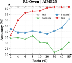
## Line Chart: R1-Qwen | AIME25 Performance by Ratio
### Overview
The chart illustrates the accuracy performance of four different strategies (Full, Bottom, Random, Top) across varying ratios (2% to 50%) on the AIME25 dataset. Accuracy is measured on a y-axis (20-60%), while the x-axis represents the ratio of data used. Four distinct lines represent each strategy's performance trend.
### Components/Axes
- **X-axis (Ratio %)**: Labeled "Ratio (%)", with tick marks at 2, 4, 6, 8, 10, 20, 30, 40, 50.
- **Y-axis (Accuracy %)**: Labeled "Accuracy (%)", with tick marks at 20, 25, 30, 35, 40, 45, 50, 55, 60.
- **Legend**: Located in the top-right corner, with four entries:
- Gray dashed line: "Full"
- Blue solid line: "Bottom"
- Green solid line: "Random"
- Red solid line: "Top"
- **Data Points**: Markers (circles) at each ratio interval for all strategies.
### Detailed Analysis
1. **Top (Red Line)**:
- Starts at ~35% accuracy at 2% ratio.
- Sharp increase to ~50% at 4%, ~55% at 6%, ~58% at 8%, and ~60% at 10%.
- Plateaus near 60% from 10% to 50% ratio.
- **Key Data Points**:
- 2%: 35%, 4%: 50%, 6%: 55%, 8%: 58%, 10%: 60%, 50%: 60%.
2. **Bottom (Blue Line)**:
- Begins at ~42% at 2%, dips to ~38% at 4%, then stabilizes at ~39-40% until 10%.
- Gradual rise to ~44% at 50%.
- **Key Data Points**:
- 2%: 42%, 4%: 38%, 6%: 39%, 8%: 40%, 10%: 38%, 50%: 44%.
3. **Random (Green Line)**:
- Fluctuates between ~34% (2%) and ~36% (8%), then drops to ~22% at 30%.
- Recovers to ~30% at 50%.
- **Key Data Points**:
- 2%: 34%, 4%: 35%, 6%: 33%, 8%: 36%, 10%: 31%, 20%: 30%, 30%: 22%, 40%: 25%, 50%: 30%.
4. **Full (Gray Dashed Line)**:
- Constant at 60% across all ratios.
- **Key Data Points**:
- All ratios: 60%.
### Key Observations
- **Top Strategy**: Dominates performance, achieving near-maximum accuracy (60%) after 10% ratio.
- **Bottom Strategy**: Shows a U-shaped trend, with a mid-range dip followed by recovery.
- **Random Strategy**: Highly volatile, with a significant drop at 30% ratio, suggesting instability.
- **Full Strategy**: Acts as a benchmark, maintaining perfect accuracy (60%) regardless of ratio.
### Interpretation
The data suggests that the **Top strategy** is the most effective, likely leveraging high-quality or prioritized data to achieve optimal results. The **Bottom strategy** performs moderately, with initial underperformance improving as more data is incorporated. The **Random strategy**'s erratic behavior indicates poor reliability, possibly due to overfitting or noise in the dataset. The **Full strategy**'s constant 60% accuracy may represent an upper bound or idealized performance, serving as a reference point. The sharp rise in Top strategy accuracy at lower ratios implies that prioritizing critical data points (e.g., top-ranked examples) is more impactful than using larger, unfiltered datasets. The Random strategy's dip at 30% ratio warrants further investigation, as it deviates significantly from other trends.