\n
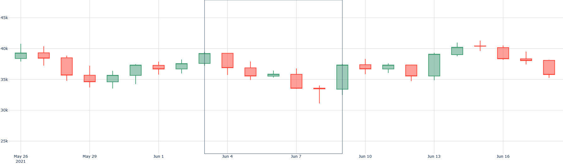
## Chart: Candlestick Chart - Price Fluctuations Over Time
### Overview
The image presents a candlestick chart displaying price fluctuations over a period from May 26, 2021, to June 16, 2021. Each candlestick represents the price movement for a single period (likely a day). The chart shows open, high, low, and closing prices. A vertical line is present around June 7th, visually separating the chart into two sections.
### Components/Axes
* **X-axis:** Represents time, with dates ranging from May 26, 2021, to June 16, 2021. The dates are spaced relatively evenly.
* **Y-axis:** Represents price, with a scale ranging from approximately 25,000 to 45,000. The scale is linear.
* **Candlesticks:** Each candlestick consists of a body and wicks.
* **Green Candlesticks:** Indicate that the closing price was higher than the opening price.
* **Red Candlesticks:** Indicate that the closing price was lower than the opening price.
* **Wicks:** Represent the high and low prices for the period. The upper wick extends to the highest price, and the lower wick extends to the lowest price.
* **Vertical Line:** A solid black vertical line is positioned around June 7th, potentially marking a significant event or period change.
### Detailed Analysis
The chart consists of a series of candlesticks. Here's a breakdown of the price movements, reading from left to right:
* **May 26 - May 29:** Initial period shows a red candlestick followed by a green candlestick, then another red candlestick.
* May 26: Red candlestick, opening around 39,000, closing around 37,500.
* May 29: Green candlestick, opening around 35,000, closing around 37,000.
* **May 29 - June 1:** A red candlestick followed by a green candlestick.
* June 1: Green candlestick, opening around 35,000, closing around 38,000.
* **June 1 - June 4:** A red candlestick followed by a green candlestick.
* June 4: Red candlestick, opening around 38,000, closing around 35,000.
* **June 4 - June 7:** A series of green and red candlesticks.
* June 7: A significant red candlestick, opening around 35,000, closing around 32,000.
* **June 7 - June 10:** A green candlestick followed by a red candlestick.
* June 10: Red candlestick, opening around 35,000, closing around 33,000.
* **June 10 - June 13:** A series of green and red candlesticks.
* June 13: Green candlestick, opening around 35,000, closing around 40,000.
* **June 13 - June 16:** A red candlestick followed by a green candlestick.
* June 16: Red candlestick, opening around 40,000, closing around 37,000.
The wicks vary in length, indicating the range of price fluctuations within each period. The longest wicks appear around June 7th, suggesting high volatility.
### Key Observations
* **Volatility:** The chart shows periods of high and low volatility, indicated by the length of the wicks.
* **Trend Change:** The vertical line around June 7th appears to coincide with a significant downward price movement, potentially indicating a trend change.
* **Price Range:** The price fluctuates between approximately 32,000 and 40,000 throughout the period.
* **Outlier:** The red candlestick around June 7th is notably larger than most other candlesticks, suggesting a significant price drop.
### Interpretation
The candlestick chart illustrates the price movements of an asset over a roughly three-week period in May/June 2021. The initial period shows some fluctuation, but the price generally remains within a relatively stable range. The vertical line around June 7th marks a potential turning point, with a sharp price decline followed by a period of recovery. The subsequent fluctuations suggest continued volatility, but the price remains within a narrower range than before the June 7th drop.
The chart suggests a bearish trend following the event around June 7th, although the price does show some recovery towards the end of the period. The large red candlestick on June 7th could represent a significant negative event or market correction. The overall pattern suggests a period of uncertainty and volatility, with the price struggling to establish a clear trend. The chart is a visual representation of price action, and further analysis would be needed to determine the underlying causes of these movements.