## Candlestick Chart: Price Movement Analysis (May 26 - June 17, 2021)
### Overview
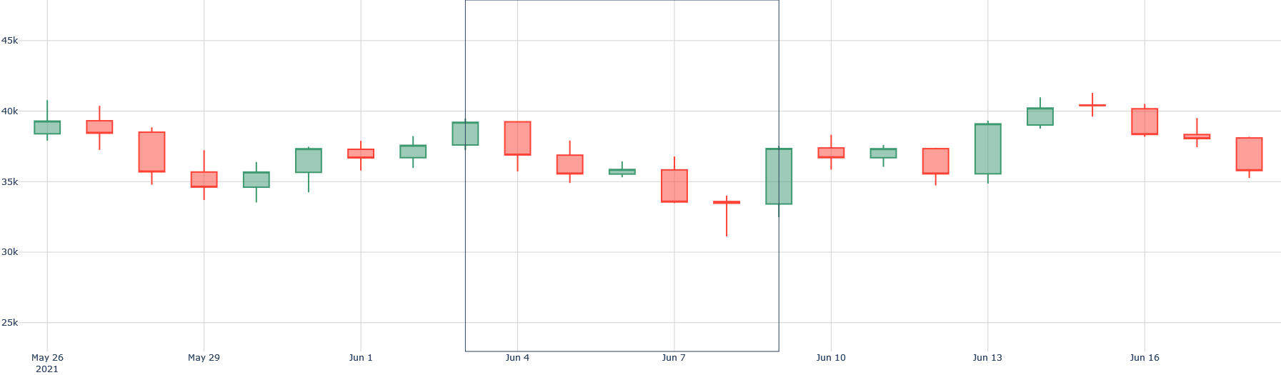
The image displays a candlestick chart tracking price movements over a 22-day period (May 26 to June 17, 2021). The chart uses green and red candlesticks to represent upward and downward price trends, respectively. The y-axis shows price values in thousands (25k–45k), while the x-axis marks specific dates. The chart exhibits significant volatility, with alternating periods of price increases and declines.
---
### Components/Axes
- **X-Axis (Horizontal)**:
- Labeled with dates: May 26, May 29, June 1, June 4, June 7, June 10, June 13, June 16, June 17.
- Dates are spaced approximately every 3–4 days.
- **Y-Axis (Vertical)**:
- Labeled "Price" with grid lines at 25k, 30k, 35k, 40k, and 45k.
- Values are approximate, with no explicit numerical labels on the axis.
- **Legend**:
- Located on the right side of the chart.
- Green: Upward price trend (closing price > opening price).
- Red: Downward price trend (closing price < opening price).
---
### Detailed Analysis
#### Candlestick Structure
- Each candlestick represents a trading day, with:
- **Body**: The range between the opening and closing prices.
- **Wicks**: The high (top) and low (bottom) prices of the day.
- **Key Observations**:
- **May 26–May 29**: Initial downward trend (red candlesticks), with prices dropping from ~40k to ~35k.
- **May 30–June 1**: Slight recovery (green candlesticks), stabilizing around 35k–37k.
- **June 4–June 7**: Sharp decline (red candlesticks), reaching a low of ~32k.
- **June 8–June 13**: Volatile recovery (mixed green/red), peaking at ~40k on June 14.
- **June 14–June 17**: Sustained upward trend (green candlesticks), closing near 38k–40k.
#### Notable Data Points
- **Highest Price**: ~42k (June 14, green candlestick).
- **Lowest Price**: ~32k (June 8, red candlestick).
- **Most Volatile Day**: June 7–8, with a ~10k drop.
- **Longest Green Candlestick**: June 14, indicating strong buying pressure.
- **Longest Red Candlestick**: June 7, reflecting significant selling pressure.
---
### Key Observations
1. **Volatility**: The chart shows frequent price swings, with no clear sustained trend until late June.
2. **Recovery Phase**: After mid-June, prices rebounded sharply, suggesting a shift in market sentiment.
3. **Uncertainty**: The alternating green/red candlesticks indicate indecision among traders during the middle period (June 4–13).
4. **Closing Trend**: The final days (June 14–17) show a consistent upward trend, closing near the 40k mark.
---
### Interpretation
The chart reflects a market characterized by **short-term volatility** and **long-term recovery**. The initial decline (May 26–29) may indicate negative sentiment or external shocks, while the subsequent rebound (June 8–17) suggests renewed investor confidence. The sharp drop on June 7–8 could signal a market correction or panic selling, followed by a recovery phase. The final upward trend (June 14–17) implies a potential breakout or consolidation phase, with prices stabilizing near the 40k mark.
**Critical Insight**: The chart highlights the importance of monitoring both short-term fluctuations and long-term trends. The recovery after mid-June may indicate underlying strength in the asset, but the volatility underscores the need for caution in decision-making.