\n
## Scatter Plots: Principal Component Analysis (PCA) Visualizations
### Overview
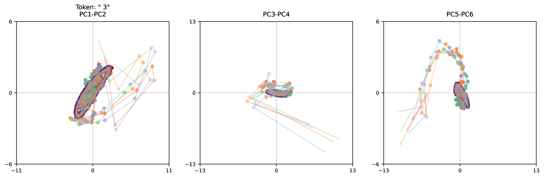
The image presents three scatter plots, each visualizing the relationship between two principal components (PCs) derived from a PCA. Each plot displays data points connected by lines, likely representing trajectories or sequences. The plots are arranged horizontally, with each plot representing a different pair of PCs. A "Token: '3'" label is present in the top-left corner of the first plot.
### Components/Axes
Each plot shares the following characteristics:
* **Axes:** Both x and y axes range from approximately -13 to +13 (though the exact range varies slightly between plots). The axes are labeled with the corresponding PC numbers (e.g., PC1-PC2, PC3-PC4, PC5-PC6).
* **Data Points:** Each plot contains numerous data points, connected by lines. The points are color-coded, with a variety of pastel shades used.
* **No Legend:** There is no explicit legend provided in the image, making it difficult to determine the meaning of the different colors.
### Detailed Analysis or Content Details
**Plot 1: PC1-PC2**
* **Trend:** The data points form a dense, elliptical cluster centered around the origin (0,0). Lines extend outwards from this cluster, indicating trajectories diverging from a common starting point.
* **Data Points:** The cluster is primarily concentrated between x = -11 and x = 2, and between y = -6 and y = 2. The lines extending from the cluster show a general upward and rightward trend, but with significant variation.
* **Approximate Data Points (from cluster):** (-10, -2), (-8, 0), (-6, 1), (-4, 2), (-2, 1), (0, 0), (2, -1). These are approximate values based on visual inspection.
**Plot 2: PC3-PC4**
* **Trend:** The data points form a more dispersed, loop-like structure. Lines connect points, suggesting a cyclical or iterative process.
* **Data Points:** The points are concentrated between x = -13 and x = 11, and between y = -3 and y = 3. The loop appears to start and end near the origin.
* **Approximate Data Points (from loop):** (-10, 1), (-8, 2), (-6, 1), (-4, -1), (-2, -2), (0, -1), (2, 0), (4, 1), (6, 2), (8, 1), (10, -1).
**Plot 3: PC5-PC6**
* **Trend:** This plot exhibits a distinct arc-shaped pattern. The data points form a curved trajectory, starting near the origin and sweeping upwards and to the right.
* **Data Points:** The arc is primarily located between x = -13 and x = 13, and between y = -6 and y = 6.
* **Approximate Data Points (from arc):** (-10, -1), (-8, 0), (-6, 2), (-4, 4), (-2, 5), (0, 5), (2, 4), (4, 2), (6, 0), (8, -2), (10, -4).
### Key Observations
* The plots demonstrate different patterns of variance in the data. Plot 1 shows a concentrated cluster with diverging trajectories, Plot 2 shows a cyclical pattern, and Plot 3 shows a distinct arc.
* The absence of a legend makes it impossible to interpret the meaning of the different colors.
* The "Token: '3'" label in the first plot suggests that these plots might be associated with a specific data subset or experimental condition.
### Interpretation
These plots are likely visualizations of data reduced in dimensionality using Principal Component Analysis (PCA). PCA is a technique used to identify the most important patterns of variation in a dataset. Each plot represents the projection of the data onto two principal components.
* **Plot 1 (PC1-PC2):** The dense cluster suggests that a significant portion of the data variance is explained by the first two principal components. The diverging lines indicate that there is variation in the data along these components, potentially representing different trajectories or states.
* **Plot 2 (PC3-PC4):** The loop-like structure suggests a cyclical or iterative process. The data may be evolving over time or undergoing a repeating pattern.
* **Plot 3 (PC5-PC6):** The arc-shaped pattern suggests a specific trend or direction in the data. The data may be transitioning from one state to another along these components.
The different patterns observed in each plot indicate that the data is complex and multi-dimensional. The choice of which principal components to visualize (PC1-PC2, PC3-PC4, PC5-PC6) likely depends on the specific research question or goal. Without a legend, it is difficult to determine the meaning of the different colors, but they likely represent different categories or groups within the data. The "Token: '3'" label suggests that these plots may be related to a specific subset of the data.