## Q-Q Plot: w(n) vs. Normal Distribution
### Overview
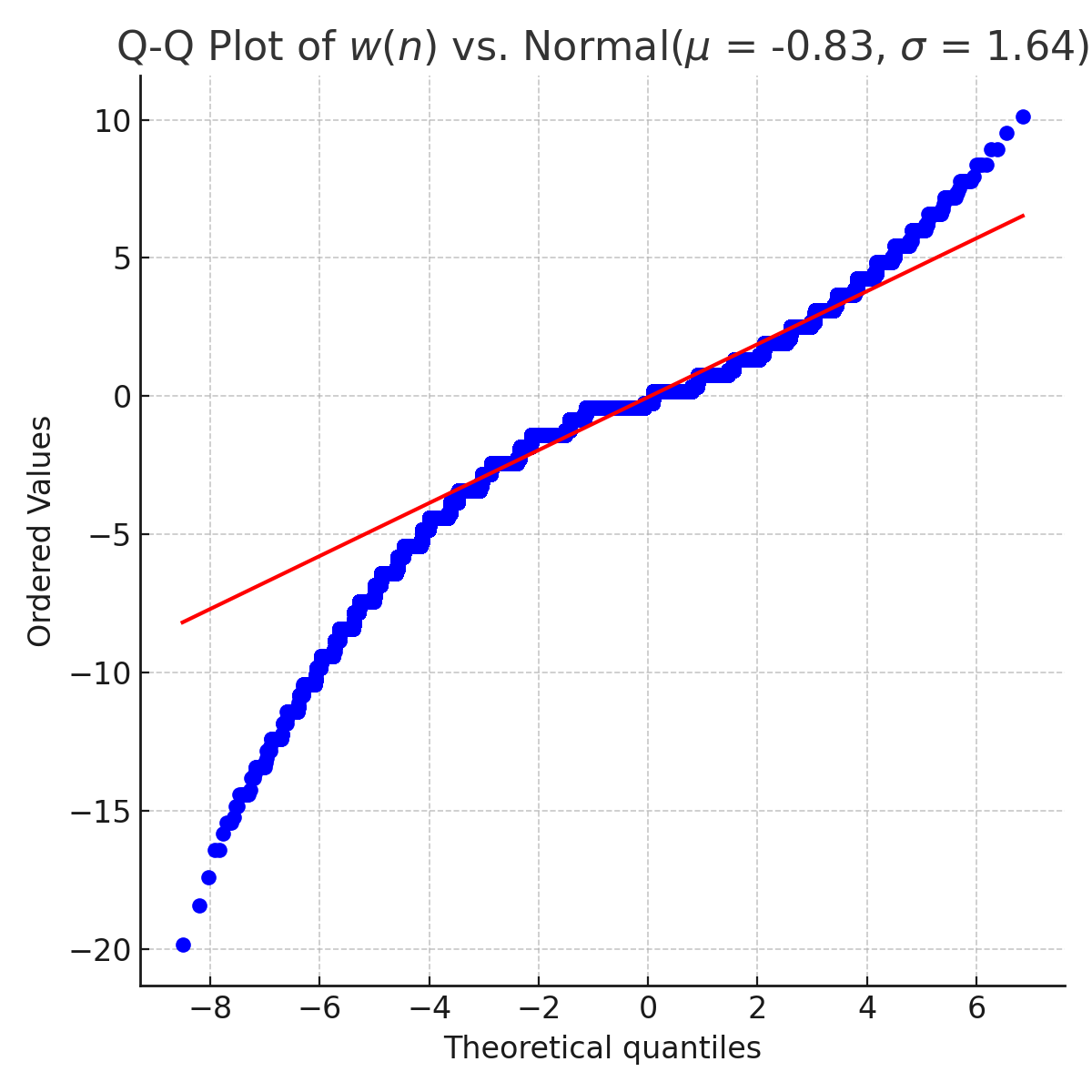
The image is a Q-Q (quantile-quantile) plot comparing the distribution of a variable w(n) against a normal distribution with a mean (μ) of -0.83 and a standard deviation (σ) of 1.64. The plot displays ordered values of w(n) against theoretical quantiles from the specified normal distribution. The blue dots represent the data points, and the red line represents the expected distribution if w(n) were perfectly normally distributed.
### Components/Axes
* **Title:** Q-Q Plot of w(n) vs. Normal(μ = -0.83, σ = 1.64)
* **X-axis:** Theoretical quantiles, ranging from approximately -8 to 6, with tick marks at every increment of 2.
* **Y-axis:** Ordered Values, ranging from -20 to 10, with tick marks at every increment of 5.
* **Data Points:** Blue dots representing the quantiles of w(n).
* **Reference Line:** A red line representing the theoretical normal distribution.
### Detailed Analysis
* **X-Axis (Theoretical Quantiles):**
* -8
* -6
* -4
* -2
* 0
* 2
* 4
* 6
* **Y-Axis (Ordered Values):**
* -20
* -15
* -10
* -5
* 0
* 5
* 10
* **Data Points (Blue):**
* The blue data points represent the ordered values of w(n).
* At the lower end (left side of the plot), the blue dots deviate significantly below the red line, indicating that the lower tail of w(n) has more extreme values than the normal distribution.
* In the middle section (around the theoretical quantiles of -2 to 2), the blue dots are closer to the red line, suggesting a better fit to the normal distribution in this range.
* At the upper end (right side of the plot), the blue dots are slightly above the red line, indicating that the upper tail of w(n) has slightly higher values than the normal distribution.
* **Reference Line (Red):**
* The red line represents the expected distribution if w(n) followed a normal distribution with μ = -0.83 and σ = 1.64.
* The red line starts at approximately (-8, -8) and ends at approximately (6, 6).
### Key Observations
* The distribution of w(n) deviates from the normal distribution, especially in the tails.
* The lower tail of w(n) is heavier than the normal distribution, as indicated by the blue dots falling below the red line on the left side of the plot.
* The upper tail of w(n) is slightly heavier than the normal distribution, as indicated by the blue dots falling slightly above the red line on the right side of the plot.
* The central part of the distribution of w(n) is closer to the normal distribution.
### Interpretation
The Q-Q plot suggests that the variable w(n) is not perfectly normally distributed. The deviations in the tails indicate that w(n) has a different distribution shape, with heavier tails than the normal distribution with μ = -0.83 and σ = 1.64. This means that extreme values are more frequent in w(n) than would be expected in a normal distribution with the specified parameters. The plot is useful for assessing the normality assumption in statistical analyses and for identifying potential outliers or deviations from normality.