## Line Chart: Performance Metrics vs. Parameter α
### Overview
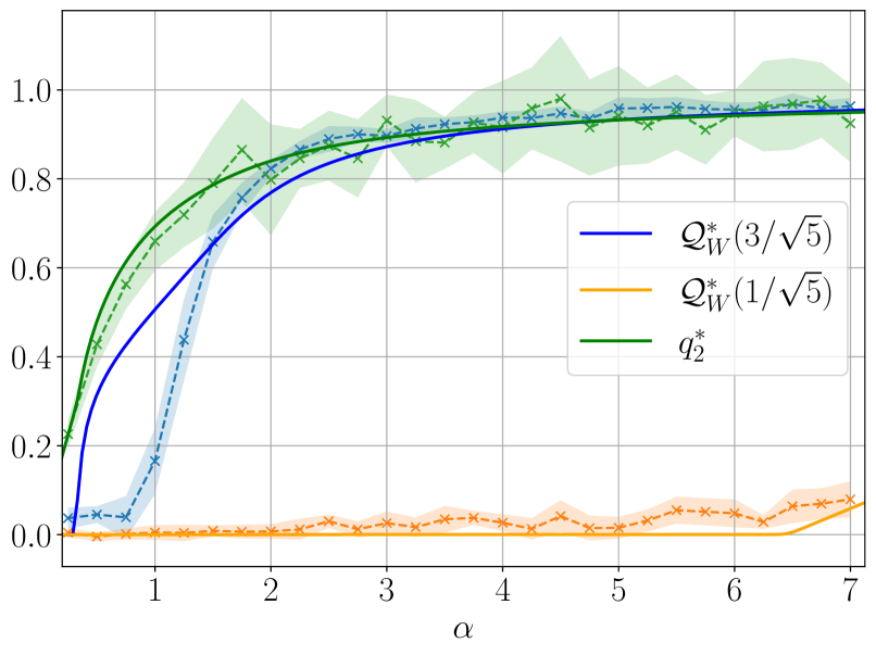
The image displays a line chart plotting three different performance metrics (Q) against a parameter α. The chart includes solid lines representing theoretical or fitted curves, dashed lines with 'x' markers representing empirical or sampled data, and shaded regions representing confidence intervals or variability around the empirical data. The overall trend shows two metrics improving with α and saturating near 1.0, while one metric remains near zero.
### Components/Axes
* **X-Axis:** Labeled "α" (alpha). The scale is linear, ranging from 0 to 7, with major tick marks at every integer (1, 2, 3, 4, 5, 6, 7).
* **Y-Axis:** Unlabeled, but represents a performance metric (likely probability, accuracy, or a similar bounded measure). The scale is linear, ranging from 0.0 to 1.0, with major tick marks at 0.0, 0.2, 0.4, 0.6, 0.8, and 1.0.
* **Legend:** Positioned in the center-right area of the plot. It contains three entries:
1. A blue solid line labeled `Q*_W(3/√5)`
2. An orange solid line labeled `Q*_W(1/√5)`
3. A green solid line labeled `q*_2`
* **Data Series:** Each legend entry corresponds to a pair of visual elements on the chart:
* A **solid line** of the specified color (theoretical curve).
* A **dashed line with 'x' markers** of the same color (empirical data).
* A **shaded region** of a lighter tint of the same color (confidence interval/variability band).
### Detailed Analysis
**1. Blue Series: `Q*_W(3/√5)`**
* **Trend:** The solid blue line shows a steep, concave-down increase from near 0 at α=0, crossing 0.5 around α≈0.8, and asymptotically approaching a value just below 1.0 (≈0.95) as α increases to 7.
* **Empirical Data (Dashed Blue):** Follows the solid line closely. Starts near 0, rises sharply between α=0.5 and α=2, and then fluctuates slightly around the solid line for α > 2.
* **Confidence Interval (Light Blue Shading):** Narrow at low α, widens significantly between α=1 and α=3 (spanning roughly 0.1 to 0.3 in height at its widest), and remains moderately wide for higher α values.
**2. Orange Series: `Q*_W(1/√5)`**
* **Trend:** The solid orange line remains very close to 0.0 across the entire range of α. It shows a very slight, gradual increase only at the highest α values (α > 6), reaching perhaps 0.05 at α=7.
* **Empirical Data (Dashed Orange):** Hovers near zero with minor fluctuations. The 'x' markers are consistently between 0.0 and 0.1.
* **Confidence Interval (Light Orange Shading):** Very narrow throughout, indicating low variability in the near-zero measurements.
**3. Green Series: `q*_2`**
* **Trend:** The solid green line starts higher than the blue line at α=0 (≈0.2), rises steeply, and follows a similar concave-down path, converging with the blue line's asymptote near 0.95 for α > 4.
* **Empirical Data (Dashed Green):** Closely tracks the solid green line. It starts around 0.2, increases rapidly, and shows more pronounced fluctuations around the solid line for α > 3 compared to the blue series.
* **Confidence Interval (Light Green Shading):** The widest of all three series. It is substantial across the entire range, indicating high variability in the empirical measurements for this metric. The band spans approximately ±0.1 to ±0.15 around the central trend for most α values.
### Key Observations
1. **Performance Dichotomy:** There is a stark contrast between the metrics. `Q*_W(3/√5)` and `q*_2` achieve high performance (>0.9) for α > 3, while `Q*_W(1/√5)` fails to improve significantly, remaining near baseline (≈0).
2. **Convergence:** The blue (`Q*_W(3/√5)`) and green (`q*_2`) series converge to nearly the same asymptotic value (≈0.95) for large α, despite starting from different points at α=0.
3. **Variability:** The green series (`q*_2`) exhibits the highest empirical variability (widest confidence band), while the orange series (`Q*_W(1/√5)`) has the lowest.
4. **Critical Region:** The most dramatic changes for the successful metrics occur in the low-α region (0 < α < 2.5).
### Interpretation
This chart likely compares the effectiveness of different strategies or parameter settings (denoted by the Q functions with different arguments) as a function of a resource or complexity parameter α.
* **Parameter Sensitivity:** The argument inside `Q*_W` is critical. The setting `(3/√5)` leads to successful learning/performance, while `(1/√5)` results in failure, suggesting a threshold or phase transition in the parameter space.
* **Metric Comparison:** The `q*_2` metric appears to be a different type of measure (perhaps a lower bound or an alternative estimator) that starts with an advantage at low α but ultimately matches the performance of the successful `Q*_W` variant. Its higher variance suggests it might be a noisier estimator.
* **Implication:** The data demonstrates that with sufficient α (resource/complexity), both the `Q*_W(3/√5)` strategy and the `q*_2` metric can achieve near-optimal performance (≈0.95), but they follow different trajectories and have different stability profiles. The failure of `Q*_W(1/√5)` highlights the importance of proper parameter tuning. The widening confidence intervals at higher α for the successful metrics could indicate increased sensitivity or harder-to-predict outcomes as the system scales.