\n
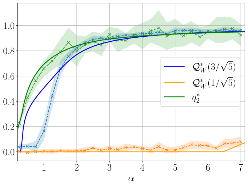
## Chart: Performance Comparison of Quantities
### Overview
The image presents a line chart comparing the performance of three quantities – Q<sub>w</sub><sup>\*</sup> (3/√5), Q<sub>w</sub><sup>\*</sup> (1/√5), and q<sub>2</sub> – as a function of the parameter α (alpha). The chart also includes shaded regions representing uncertainty or variance around the lines.
### Components/Axes
* **X-axis:** Labeled as "α" (alpha), ranging from approximately 0.5 to 7. The scale is linear.
* **Y-axis:** Ranges from approximately 0.0 to 1.1. The scale is linear.
* **Legend:** Located in the top-right corner of the chart. It identifies the three lines:
* Blue line: Q<sub>w</sub><sup>\*</sup> (3/√5)
* Orange line: Q<sub>w</sub><sup>\*</sup> (1/√5)
* Green line: q<sub>2</sub>
* **Shaded Regions:** Lightly colored regions surrounding each line, likely representing confidence intervals or standard deviations. The colors correspond to the respective lines (light blue, light orange, light green).
* **Data Markers:** Small 'x' markers are placed along each line, potentially representing individual data points.
### Detailed Analysis
* **Q<sub>w</sub><sup>\*</sup> (3/√5) (Blue Line):** This line starts at approximately 0.1 at α = 0.5, rapidly increases, and reaches approximately 0.85 at α = 1.5. It then plateaus, oscillating around 0.9 to 1.0 for α > 2.5. The shaded region around this line is relatively narrow, indicating lower uncertainty.
* **Q<sub>w</sub><sup>\*</sup> (1/√5) (Orange Line):** This line remains consistently low, fluctuating around 0.05 to 0.15 across the entire range of α. It shows a slight increase towards the end of the range, reaching approximately 0.2 at α = 7. The shaded region is wider than that of the blue line, suggesting higher uncertainty.
* **q<sub>2</sub> (Green Line):** This line starts at approximately 0.2 at α = 0.5 and increases rapidly, reaching approximately 0.8 at α = 1.5. It continues to increase, reaching a maximum of approximately 0.95 at α = 2.5, and then slowly decreases to approximately 0.9 at α = 7. The shaded region is moderately wide, indicating moderate uncertainty.
* **Data Points (x markers):** The data points generally follow the trend of the lines, with some scatter within the shaded regions.
### Key Observations
* Q<sub>w</sub><sup>\*</sup> (3/√5) consistently outperforms Q<sub>w</sub><sup>\*</sup> (1/√5) across all values of α.
* q<sub>2</sub> initially increases rapidly and surpasses Q<sub>w</sub><sup>\*</sup> (3/√5) before eventually leveling off and slightly decreasing.
* The uncertainty associated with Q<sub>w</sub><sup>\*</sup> (1/√5) is significantly higher than that of the other two quantities.
* All three quantities converge towards a value close to 1.0 as α increases.
### Interpretation
The chart demonstrates the performance of three different quantities as a function of the parameter α. The quantities likely represent some form of efficiency, accuracy, or convergence rate in a specific system or algorithm.
The fact that Q<sub>w</sub><sup>\*</sup> (3/√5) consistently outperforms Q<sub>w</sub><sup>\*</sup> (1/√5) suggests that the choice of the constant factor (3/√5 vs. 1/√5) significantly impacts performance. The initial rapid increase and subsequent plateau of all three lines indicate a diminishing return effect – increasing α beyond a certain point yields minimal improvement.
The convergence of all three quantities towards 1.0 as α increases suggests that the system approaches an optimal state or a limit as α becomes large. The shaded regions indicate the variability or uncertainty in the performance of each quantity, which could be due to noise, randomness, or limitations in the model. The wider shaded region for Q<sub>w</sub><sup>\*</sup> (1/√5) suggests that its performance is more sensitive to these factors.
The behavior of q<sub>2</sub>, initially exceeding Q<sub>w</sub><sup>\*</sup> (3/√5) and then declining, could indicate a trade-off between initial speed and long-term stability or accuracy.