\n
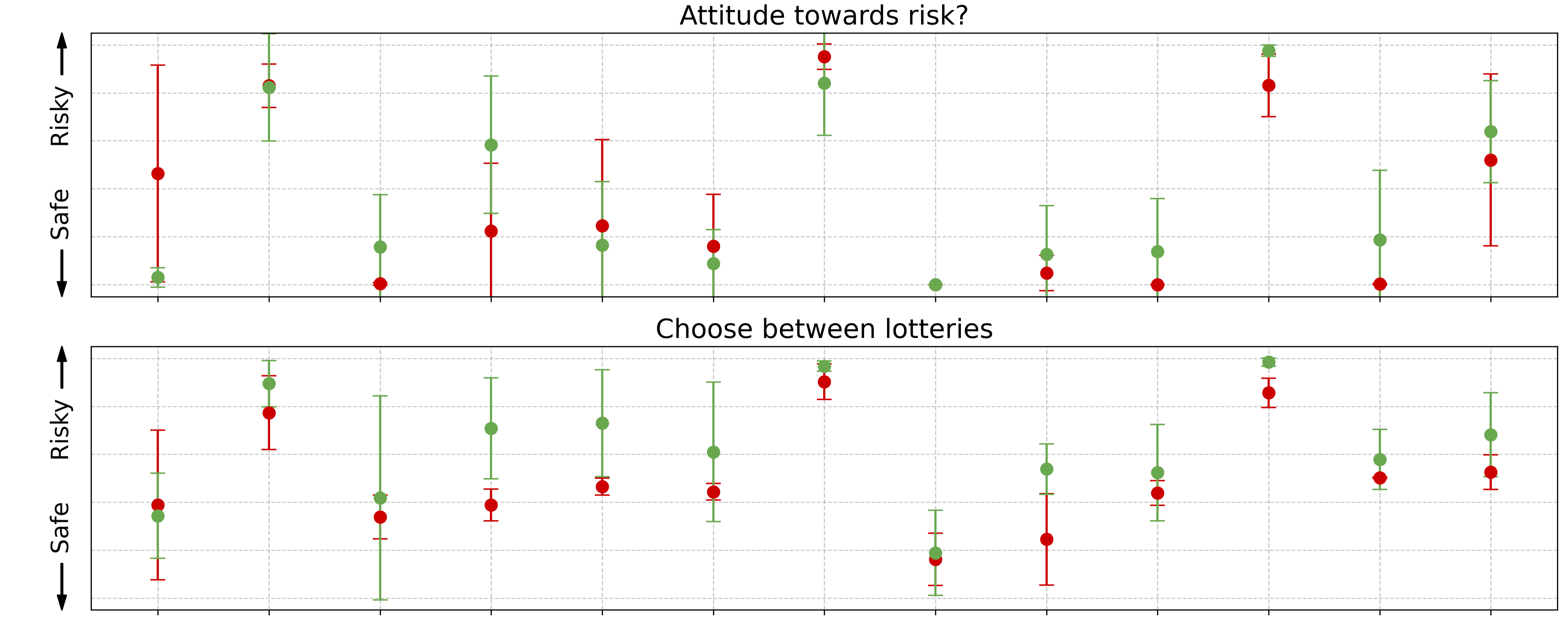
## Chart: Risk Preference and Lottery Choice
### Overview
The image presents two charts, stacked vertically, both displaying data related to risk preference. The top chart is titled "Attitude towards risk?" and the bottom chart is titled "Choose between lotteries". Both charts use a dot plot format with error bars to represent data points and their uncertainty. The y-axis of both charts is labeled with "Safe" at the bottom and "Risky" at the top, indicating a spectrum of risk preference. The x-axis appears to represent different conditions or trials, with no explicit labels.
### Components/Axes
* **Title (Top Chart):** "Attitude towards risk?"
* **Title (Bottom Chart):** "Choose between lotteries"
* **Y-axis Label (Both Charts):** "Safe" (bottom) to "Risky" (top). The axis is represented by an arrow pointing from left to right.
* **X-axis:** No explicit label, appears to represent different conditions or trials. The axis is represented by an arrow pointing from left to right.
* **Data Series:** Two data series are present in each chart, represented by red and green dots with error bars.
* **Error Bars:** Vertical lines extending above and below each data point, indicating the uncertainty or variability of the data.
* **Gridlines:** Faint vertical gridlines are present in the background of each chart, aiding in visual estimation of data point values.
### Detailed Analysis or Content Details
**Top Chart: "Attitude towards risk?"**
* **Green Data Series:** This series generally fluctuates around the middle of the "Safe" to "Risky" scale.
* Point 1: Approximately 0.2 on the x-axis, value around 0.4 on the y-axis (± 0.2).
* Point 2: Approximately 0.4 on the x-axis, value around 0.6 on the y-axis (± 0.2).
* Point 3: Approximately 0.6 on the x-axis, value around 0.8 on the y-axis (± 0.2).
* Point 4: Approximately 0.8 on the x-axis, value around 0.5 on the y-axis (± 0.2).
* Point 5: Approximately 1.0 on the x-axis, value around 0.7 on the y-axis (± 0.2).
* Point 6: Approximately 1.2 on the x-axis, value around 0.3 on the y-axis (± 0.2).
* Point 7: Approximately 1.4 on the x-axis, value around 0.6 on the y-axis (± 0.2).
* **Red Data Series:** This series also fluctuates, but tends to be slightly lower on the "Safe" to "Risky" scale than the green series.
* Point 1: Approximately 0.2 on the x-axis, value around 0.1 on the y-axis (± 0.2).
* Point 2: Approximately 0.4 on the x-axis, value around 0.3 on the y-axis (± 0.2).
* Point 3: Approximately 0.6 on the x-axis, value around 0.5 on the y-axis (± 0.2).
* Point 4: Approximately 0.8 on the x-axis, value around 0.2 on the y-axis (± 0.2).
* Point 5: Approximately 1.0 on the x-axis, value around 0.4 on the y-axis (± 0.2).
* Point 6: Approximately 1.2 on the x-axis, value around 0.0 on the y-axis (± 0.2).
* Point 7: Approximately 1.4 on the x-axis, value around 0.3 on the y-axis (± 0.2).
**Bottom Chart: "Choose between lotteries"**
* **Green Data Series:** This series shows a more pronounced trend, with values generally increasing towards the middle of the x-axis and then decreasing.
* Point 1: Approximately 0.2 on the x-axis, value around 0.2 on the y-axis (± 0.2).
* Point 2: Approximately 0.4 on the x-axis, value around 0.5 on the y-axis (± 0.2).
* Point 3: Approximately 0.6 on the x-axis, value around 0.9 on the y-axis (± 0.2).
* Point 4: Approximately 0.8 on the x-axis, value around 0.6 on the y-axis (± 0.2).
* Point 5: Approximately 1.0 on the x-axis, value around 0.5 on the y-axis (± 0.2).
* Point 6: Approximately 1.2 on the x-axis, value around 0.3 on the y-axis (± 0.2).
* Point 7: Approximately 1.4 on the x-axis, value around 0.4 on the y-axis (± 0.2).
* **Red Data Series:** This series also shows a trend, but is generally lower than the green series.
* Point 1: Approximately 0.2 on the x-axis, value around 0.0 on the y-axis (± 0.2).
* Point 2: Approximately 0.4 on the x-axis, value around 0.1 on the y-axis (± 0.2).
* Point 3: Approximately 0.6 on the x-axis, value around 0.3 on the y-axis (± 0.2).
* Point 4: Approximately 0.8 on the x-axis, value around 0.1 on the y-axis (± 0.2).
* Point 5: Approximately 1.0 on the x-axis, value around 0.2 on the y-axis (± 0.2).
* Point 6: Approximately 1.2 on the x-axis, value around 0.0 on the y-axis (± 0.2).
* Point 7: Approximately 1.4 on the x-axis, value around 0.1 on the y-axis (± 0.2).
### Key Observations
* In the "Attitude towards risk?" chart, both series show considerable variability, with error bars often overlapping.
* In the "Choose between lotteries" chart, the green series exhibits a clear peak around the middle of the x-axis, suggesting a preference for moderate risk in lottery choices.
* The red series consistently indicates a preference for safer options in both charts.
* The error bars indicate a significant degree of uncertainty in the data, making it difficult to draw definitive conclusions.
### Interpretation
The charts likely represent data from a study investigating risk preferences. The "Attitude towards risk?" chart assesses general risk aversion, while the "Choose between lotteries" chart examines risk preferences in a specific decision-making context. The consistent lower values of the red series suggest that participants generally prefer safer options. The peak in the green series in the "Choose between lotteries" chart indicates that participants are more willing to take risks when presented with lottery choices, but only up to a certain point. The large error bars suggest that individual risk preferences vary considerably. The lack of labels on the x-axis makes it difficult to determine the specific conditions or trials being compared, limiting a more in-depth interpretation. The charts demonstrate a nuanced relationship between general risk attitude and specific decision-making contexts, highlighting the importance of considering both factors when understanding risk preferences.