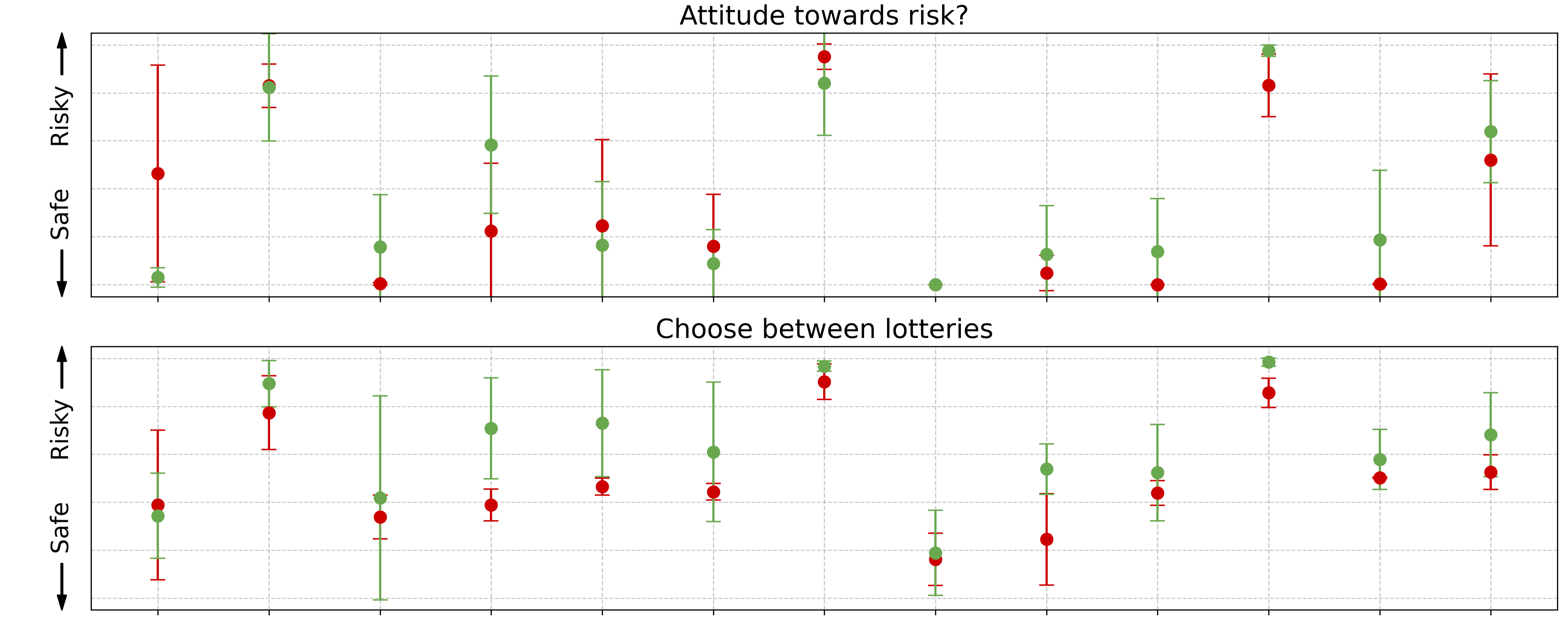
## Chart/Diagram Type: Dual-axis Scatter Plot with Error Bars
### Overview
The image contains two vertically stacked scatter plots with error bars, titled "Attitude towards risk?" (top) and "Choose between lotteries" (bottom). Each plot uses red and green dots to represent data points, with error bars indicating variability. The y-axis is labeled "Risky" (top) and "Safe" (bottom), with arrows pointing downward, suggesting a scale from "Risky" (high) to "Safe" (low). The x-axis categories are "Very risky," "Risky," "Safe," and "Very safe."
### Components/Axes
- **Y-Axis (Left)**:
- Top chart: "Attitude towards risk?" (labeled with "Risky" at the top and "Safe" at the bottom).
- Bottom chart: "Choose between lotteries" (same axis labels).
- **X-Axis (Bottom)**:
- Categories: "Very risky," "Risky," "Safe," "Very safe" (evenly spaced).
- **Legend**:
- Red dots: "Risky" (top chart) and "Risky" (bottom chart).
- Green dots: "Safe" (top chart) and "Safe" (bottom chart).
- **Error Bars**:
- Vertical lines extending from each dot, indicating variability (no numerical values provided).
### Detailed Analysis
- **Top Chart ("Attitude towards risk?")**:
- Red dots (Risky) are consistently positioned higher on the y-axis than green dots (Safe), indicating a stronger perception of risk.
- Error bars vary in length, with some red dots having longer error bars (e.g., "Very risky" category).
- No clear numerical values are provided, but the spatial distribution suggests a gradient from "Very risky" (highest risk perception) to "Very safe" (lowest).
- **Bottom Chart ("Choose between lotteries")**:
- Red dots (Risky) are slightly higher than green dots (Safe), suggesting a preference for riskier options.
- Error bars are shorter compared to the top chart, indicating less variability in responses.
- The "Very risky" and "Risky" categories show the highest red dot positions, while "Safe" and "Very safe" have lower green dots.
### Key Observations
1. **Risk Perception Gradient**: Both charts show a clear gradient from "Very risky" (high risk) to "Very safe" (low risk), with red dots (Risky) consistently above green dots (Safe).
2. **Error Bar Variability**: The top chart has longer error bars, suggesting greater uncertainty in risk perception, while the bottom chart has shorter error bars, indicating more consistent responses.
3. **No Numerical Data**: The image lacks explicit numerical values, making precise quantification impossible.
### Interpretation
The data suggests that participants perceive the options as riskier in the "Attitude towards risk?" chart compared to the "Choose between lotteries" chart. The red dots (Risky) dominate the upper portion of both charts, indicating a general tendency toward risk aversion or risk perception. However, the absence of numerical data limits the ability to quantify the magnitude of risk differences. The error bars imply variability in responses, but without additional context (e.g., sample size, statistical significance), the reliability of these trends remains uncertain. The spatial positioning of the dots and error bars highlights the relative risk profiles of the categories but does not provide causal explanations for the observed patterns.