\n
## Line Chart: Parallel Computing Performance Scaling
### Overview
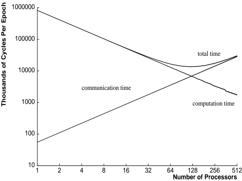
The image is a line chart illustrating the relationship between the number of processors in a parallel computing system and the time required to complete an epoch (a unit of work), measured in thousands of CPU cycles. The chart demonstrates the classic trade-off between computation and communication overhead in parallel systems, showing how total execution time changes with scale.
### Components/Axes
* **Chart Type:** Line chart with logarithmic scales on both axes.
* **Y-Axis (Vertical):**
* **Label:** "Thousands of Cycles Per Epoch"
* **Scale:** Logarithmic (base 10).
* **Range:** From 10 to 1,000,000.
* **Major Tick Marks:** 10, 100, 1000, 10000, 100000, 1000000.
* **X-Axis (Horizontal):**
* **Label:** "Number of Processors"
* **Scale:** Logarithmic (base 2).
* **Range:** From 1 to 512.
* **Major Tick Marks:** 1, 2, 4, 8, 16, 32, 64, 128, 256, 512.
* **Data Series (Lines):** Three distinct lines are plotted and labeled directly on the chart.
1. **"computation time"**: A line sloping downward from left to right.
2. **"communication time"**: A line sloping upward from left to right.
3. **"total time"**: A line that initially follows the computation time line, then curves upward after intersecting with the communication time line, forming a shallow U-shape.
### Detailed Analysis
**Trend Verification & Data Point Extraction (Approximate Values):**
1. **Computation Time Line:**
* **Trend:** Steadily decreases as the number of processors increases. This represents the ideal scaling of the computational workload being divided among more processors.
* **Key Points (Processors, Thousands of Cycles):**
* (1, ~1,000,000)
* (16, ~60,000)
* (64, ~15,000)
* (256, ~3,800)
* (512, ~1,900)
2. **Communication Time Line:**
* **Trend:** Steadily increases as the number of processors increases. This represents the growing overhead of coordinating and exchanging data between processors.
* **Key Points (Processors, Thousands of Cycles):**
* (1, ~50)
* (16, ~800)
* (64, ~3,200)
* (128, ~6,400)
* (512, ~25,600)
3. **Total Time Line:**
* **Trend:** Initially decreases, following the computation time line. It reaches a minimum point and then begins to increase, following the communication time line. This creates a U-shaped curve.
* **Key Points (Processors, Thousands of Cycles):**
* (1, ~1,000,000) - Dominated by computation.
* (32, ~20,000) - Still decreasing.
* **Minimum Point:** Approximately at **128 processors**, with a value of **~12,000** thousand cycles.
* (256, ~15,000) - Increasing.
* (512, ~27,500) - Increasing, now dominated by communication.
**Component Isolation & Spatial Grounding:**
* **Header Region:** Contains the Y-axis label ("Thousands of Cycles Per Epoch") rotated vertically on the left.
* **Main Chart Region:** Contains the three plotted lines and their embedded labels.
* The label **"total time"** is positioned in the **upper-right quadrant**, near the end of its corresponding line.
* The label **"communication time"** is positioned in the **center-left area**, above its upward-sloping line.
* The label **"computation time"** is positioned in the **lower-right quadrant**, below its downward-sloping line.
* **Footer Region:** Contains the X-axis label ("Number of Processors") and its tick marks.
* **Intersection Point:** The "computation time" and "communication time" lines cross at approximately **64 processors**, where both values are roughly **~7,000** thousand cycles.
### Key Observations
1. **Optimal Scaling Point:** The system achieves its best performance (lowest total time) at approximately **128 processors**. Beyond this point, adding more processors increases total execution time due to communication overhead.
2. **Crossover Point:** The cost of communication equals the cost of computation at around **64 processors**. This is a critical inflection point where the dominant performance bottleneck shifts.
3. **Diminishing Returns:** The computation time line shows near-linear speedup (on a log-log plot) initially, but the gains diminish as the processor count increases, which is typical due to fixed serial portions of the code (Amdahl's Law).
4. **Communication Overhead Growth:** Communication time grows approximately linearly with the number of processors on this log-log plot, suggesting a complexity of O(P) or slightly worse, where P is the processor count.
### Interpretation
This chart is a fundamental visualization of **strong scaling** in parallel computing, where a fixed-size problem is distributed across an increasing number of processors.
* **What the data suggests:** It demonstrates that simply adding more processors does not guarantee faster execution. There is a fundamental trade-off. The initial decrease in total time shows the benefit of parallelizing the computational workload. However, the eventual increase reveals the crippling effect of communication overhead, which includes network latency, synchronization waits, and data transfer times.
* **How elements relate:** The "total time" is the sum of "computation time" and "communication time." The chart visually decomposes the total runtime into its two primary constituent costs. The U-shape of the total time curve is the direct result of one component decreasing and the other increasing.
* **Notable implications:** For a system architect or programmer, this chart answers the critical question: "What is the optimal number of processors for this specific problem and hardware?" It also highlights that to achieve effective scaling beyond ~128 processors, one must focus on **reducing communication overhead** through algorithmic improvements (e.g., changing the communication pattern), faster interconnects, or overlapping communication with computation. The chart is a practical application of theoretical concepts like Amdahl's Law and the impact of the computation-to-communication ratio.