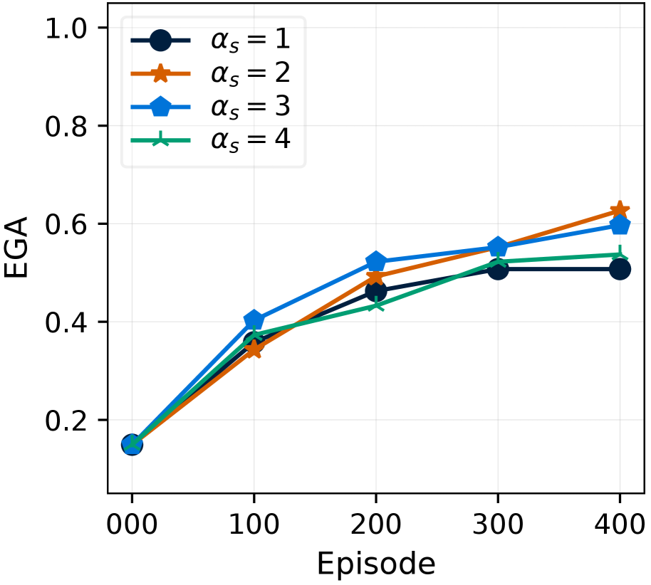
## Line Chart: EGA vs. Episode for Different Alpha Values
### Overview
This image presents a line chart illustrating the relationship between Episode number and EGA (presumably a performance metric) for four different values of αs (alpha_s). The chart displays how EGA changes over the course of 400 episodes for each αs value.
### Components/Axes
* **X-axis:** Episode (ranging from 0 to 400, with markers at 0, 100, 200, 300, and 400).
* **Y-axis:** EGA (ranging from 0 to 1.0, with markers at 0.2, 0.4, 0.6, 0.8, and 1.0).
* **Legend:** Located in the top-left corner, it identifies four lines representing different αs values:
* αs = 1 (Black line with circle markers)
* αs = 2 (Orange line with circle markers)
* αs = 3 (Light Blue line with diamond markers)
* αs = 4 (Teal line with triangle markers)
* **Grid:** A light gray grid is present in the background to aid in reading values.
### Detailed Analysis
Here's a breakdown of the data for each αs value, observing the trends first:
* **αs = 1 (Black):** The line starts at approximately 0.18 at Episode 0, increases steadily to around 0.52 at Episode 200, then plateaus, reaching approximately 0.55 at Episode 400.
* **αs = 2 (Orange):** The line begins at approximately 0.18 at Episode 0, rises more rapidly than αs = 1, reaching around 0.55 at Episode 200, and continues to increase slightly, ending at approximately 0.61 at Episode 400.
* **αs = 3 (Light Blue):** This line starts at approximately 0.18 at Episode 0, increases quickly, reaching around 0.45 at Episode 100, then slows down, reaching approximately 0.57 at Episode 200, and continues to increase slowly, ending at approximately 0.63 at Episode 400.
* **αs = 4 (Teal):** The line starts at approximately 0.18 at Episode 0, increases rapidly to around 0.42 at Episode 100, then slows down, reaching approximately 0.53 at Episode 200, and continues to increase slowly, ending at approximately 0.58 at Episode 400.
Here's a more precise data reconstruction (approximate values):
| Episode | αs = 1 | αs = 2 | αs = 3 | αs = 4 |
|---|---|---|---|---|
| 0 | 0.18 | 0.18 | 0.18 | 0.18 |
| 100 | 0.35 | 0.45 | 0.45 | 0.42 |
| 200 | 0.52 | 0.55 | 0.57 | 0.53 |
| 300 | 0.54 | 0.58 | 0.60 | 0.56 |
| 400 | 0.55 | 0.61 | 0.63 | 0.58 |
### Key Observations
* All lines start at the same EGA value (approximately 0.18).
* The lines generally converge as the episode number increases, suggesting diminishing returns from increasing αs.
* αs = 2 and αs = 3 achieve the highest EGA values at Episode 400.
* The rate of increase in EGA slows down for all αs values after Episode 100.
### Interpretation
The chart demonstrates the impact of the αs parameter on the EGA metric over the course of training episodes. Initially, increasing αs leads to a faster improvement in EGA. However, as training progresses (beyond Episode 200), the differences in EGA between different αs values become less pronounced. This suggests that there's an optimal range for αs, and beyond that, further increases don't significantly improve performance. The convergence of the lines indicates that the system is approaching a saturation point, where additional training doesn't yield substantial gains. The initial rapid increase could represent a period of rapid learning or adaptation, while the subsequent plateau suggests the system has converged to a stable state. The fact that αs = 2 and αs = 3 perform best suggests that these values strike a good balance between exploration and exploitation during the learning process.