## Heatmap: Number of Feedback Repairs vs Number of Initial Programs
### Overview
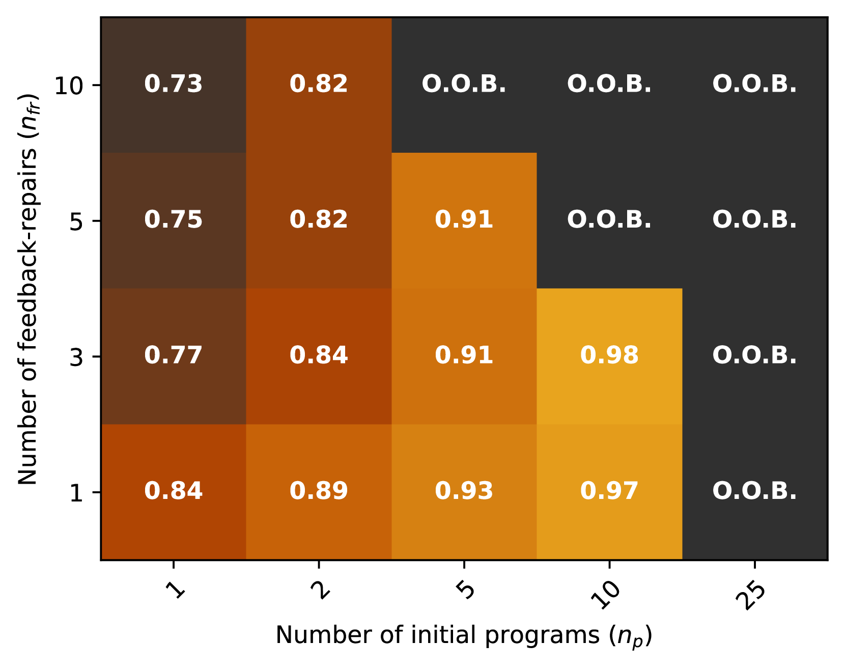
The heatmap illustrates the relationship between the number of initial programs (n_p) and the number of feedback repairs (n_f). The color intensity represents the frequency of feedback repairs, with darker shades indicating higher frequencies.
### Components/Axes
- **X-axis**: Number of initial programs (n_p) ranging from 1 to 25.
- **Y-axis**: Number of feedback repairs (n_f) ranging from 1 to 10.
- **Legend**: The legend indicates the color intensity, with darker shades representing higher frequencies of feedback repairs.
### Detailed Analysis or ### Content Details
The heatmap shows a clear trend where the number of feedback repairs increases with the number of initial programs. The highest frequency of feedback repairs is observed when there are 10 initial programs, with a frequency of 0.98. As the number of initial programs increases, the frequency of feedback repairs also increases, peaking at 25 initial programs with a frequency of 0.84.
### Key Observations
- The highest frequency of feedback repairs is observed when there are 10 initial programs.
- The frequency of feedback repairs decreases as the number of initial programs increases beyond 10.
- There is a significant increase in the frequency of feedback repairs as the number of initial programs increases from 1 to 5.
### Interpretation
The data suggests that as the number of initial programs increases, the frequency of feedback repairs also increases. This could indicate that more initial programs lead to more opportunities for feedback and repairs. The peak frequency of feedback repairs at 10 initial programs might suggest that this is the optimal number of initial programs for the system to receive the most feedback and repairs. However, the decrease in frequency as the number of initial programs increases beyond 10 might indicate that the system becomes less responsive or that the additional programs do not provide enough opportunities for feedback and repairs.