\n
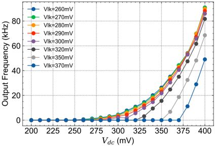
## Chart: Output Frequency vs. DC Voltage
### Overview
The image presents a line chart illustrating the relationship between Output Frequency (in kHz) and DC Voltage (Vdc, in mV) for various values of Vik (in mV). The chart displays seven different curves, each representing a constant Vik value, showing how the output frequency changes with varying DC voltage.
### Components/Axes
* **X-axis:** Vdc (mV), ranging from approximately 200 mV to 400 mV. The axis is labeled "Vdc (mV)".
* **Y-axis:** Output Frequency (kHz), ranging from 0 kHz to 80 kHz. The axis is labeled "Output Frequency (kHz)".
* **Legend:** Located at the top-left corner of the chart. It identifies each line with its corresponding Vik value:
* Blue: Vik = 260 mV
* Green: Vik = 270 mV
* Orange: Vik = 280 mV
* Red: Vik = 290 mV
* Purple: Vik = 300 mV
* Black: Vik = 320 mV
* Gray: Vik = 350 mV
* Dark Blue: Vik = 370 mV
### Detailed Analysis
The chart shows a non-linear relationship between Vdc and Output Frequency for each Vik value. The output frequency remains close to zero for Vdc values below approximately 300 mV, then increases rapidly as Vdc increases beyond this point.
Here's a breakdown of the data points, with approximate values based on visual inspection:
* **Vik = 260 mV (Blue):** The line starts at approximately (200 mV, 0 kHz) and remains near zero until around 360 mV. It then rises steeply, reaching approximately (400 mV, 12 kHz).
* **Vik = 270 mV (Green):** Starts at approximately (200 mV, 0 kHz). Rises more quickly than the 260mV line, reaching approximately (400 mV, 20 kHz).
* **Vik = 280 mV (Orange):** Starts at approximately (200 mV, 0 kHz). Rises more quickly than the 270mV line, reaching approximately (400 mV, 30 kHz).
* **Vik = 290 mV (Red):** Starts at approximately (200 mV, 0 kHz). Rises more quickly than the 280mV line, reaching approximately (400 mV, 45 kHz).
* **Vik = 300 mV (Purple):** Starts at approximately (200 mV, 0 kHz). Rises more quickly than the 290mV line, reaching approximately (400 mV, 55 kHz).
* **Vik = 320 mV (Black):** Starts at approximately (200 mV, 0 kHz). Rises more quickly than the 300mV line, reaching approximately (400 mV, 70 kHz).
* **Vik = 350 mV (Gray):** Starts at approximately (200 mV, 0 kHz). Rises more quickly than the 320mV line, reaching approximately (400 mV, 75 kHz).
* **Vik = 370 mV (Dark Blue):** Starts at approximately (200 mV, 0 kHz). Rises more quickly than the 350mV line, reaching approximately (400 mV, 80 kHz).
All lines exhibit a similar trend: a relatively flat response at low Vdc values, followed by a steep increase in output frequency as Vdc increases. The higher the Vik value, the higher the output frequency for a given Vdc value above the threshold.
### Key Observations
* The output frequency is highly sensitive to changes in Vdc above approximately 300 mV.
* Increasing Vik results in a higher output frequency for a given Vdc.
* The curves are not perfectly symmetrical; the rate of increase in frequency is steeper at higher Vdc values.
* There is a clear threshold effect, where the output frequency remains near zero until Vdc reaches a certain level.
### Interpretation
This chart likely represents the characteristics of an oscillator circuit or a similar electronic device where the output frequency is dependent on both the DC bias voltage (Vdc) and a control voltage (Vik). The data suggests that the device has a turn-on voltage (around 300 mV) below which it does not oscillate. The Vik parameter appears to control the gain or sensitivity of the oscillator, with higher Vik values leading to a more pronounced frequency response to changes in Vdc.
The steep increase in frequency at higher Vdc values indicates a non-linear relationship, potentially due to the characteristics of the active components within the circuit. The curves could be used to design or analyze circuits that require a voltage-controlled oscillator with specific frequency characteristics. The data could also be used to identify potential operating regions where the device is most stable or sensitive.