TECHNICAL ASSET FINGERPRINT
367f12cbdeae1ff9563c20cc
Click to view fullscreen
Press ESC or click to close
FOUND IN PAPERS
EXPERT: gemini-2.0-flash VERSION 1
RUNTIME: nugit/gemini/gemini-2.0-flash
INTEL_VERIFIED
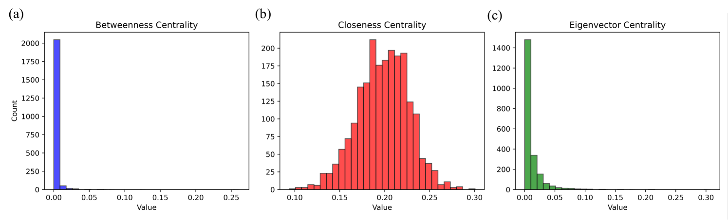
## Histogram: Centrality Measures Distribution
### Overview
The image presents three histograms, each displaying the distribution of a different centrality measure: Betweenness Centrality, Closeness Centrality, and Eigenvector Centrality. The histograms are arranged horizontally, labeled (a), (b), and (c) respectively. Each histogram plots the count of nodes (y-axis) against the centrality value (x-axis).
### Components/Axes
* **Titles:**
* (a) Betweenness Centrality
* (b) Closeness Centrality
* (c) Eigenvector Centrality
* **X-axis (Value):**
* All three histograms share the same x-axis scale, ranging from 0.00 to 0.30, with tick marks at intervals of 0.05.
* **Y-axis (Count):**
* Histogram (a) ranges from 0 to 2000, with tick marks at intervals of 250.
* Histogram (b) ranges from 0 to 200, with tick marks at intervals of 25.
* Histogram (c) ranges from 0 to 1400, with tick marks at intervals of 200.
* **Colors:**
* Betweenness Centrality (a) is represented in blue.
* Closeness Centrality (b) is represented in red.
* Eigenvector Centrality (c) is represented in green.
### Detailed Analysis
* **Betweenness Centrality (a):**
* The distribution is heavily skewed to the left.
* A large number of nodes have a betweenness centrality value close to 0.
* The count at value 0.00 is approximately 2050.
* The count at value 0.05 is approximately 100.
* The count at value 0.10 is approximately 25.
* The count at value 0.15 is approximately 10.
* The count at value 0.20 is approximately 5.
* The count at value 0.25 is approximately 2.
* **Closeness Centrality (b):**
* The distribution is approximately normal, centered around 0.20.
* The count at value 0.10 is approximately 5.
* The count at value 0.15 is approximately 75.
* The count at value 0.20 is approximately 200.
* The count at value 0.25 is approximately 50.
* The count at value 0.30 is approximately 5.
* **Eigenvector Centrality (c):**
* The distribution is heavily skewed to the left, similar to Betweenness Centrality.
* A large number of nodes have an eigenvector centrality value close to 0.
* The count at value 0.00 is approximately 1450.
* The count at value 0.05 is approximately 350.
* The count at value 0.10 is approximately 50.
* The count at value 0.15 is approximately 10.
* The count at value 0.20 is approximately 5.
* The count at value 0.25 is approximately 2.
* The count at value 0.30 is approximately 1.
### Key Observations
* Betweenness and Eigenvector Centrality distributions are highly skewed, indicating that most nodes have very low centrality values for these measures.
* Closeness Centrality exhibits a more normal distribution, suggesting a more even distribution of closeness centrality values among the nodes.
* The scales of the y-axes differ significantly, reflecting the different ranges of counts for each centrality measure.
### Interpretation
The histograms illustrate the distribution of three different centrality measures within a network. The skewness observed in the Betweenness and Eigenvector Centrality distributions suggests that only a small fraction of nodes have high influence or control over the network's communication pathways (Betweenness) or are highly connected to other influential nodes (Eigenvector). In contrast, the more normal distribution of Closeness Centrality indicates that nodes are, on average, relatively close to all other nodes in the network.
These distributions can provide insights into the network's structure and dynamics. For example, a network with a highly skewed Betweenness Centrality distribution might be vulnerable to disruptions if the few nodes with high betweenness are removed. Similarly, a network with a more evenly distributed Closeness Centrality might be more resilient to such disruptions.
DECODING INTELLIGENCE...
EXPERT: gemini-3.1-pro-preview VERSION 1
RUNTIME: gemini/gemini-3.1-pro-preview
INTEL_VERIFIED
## Histograms: Network Centrality Measure Distributions
### Overview
The image displays three side-by-side histograms, labeled (a), (b), and (c) from left to right. These charts illustrate the frequency distributions of three different network centrality metrics: Betweenness Centrality, Closeness Centrality, and Eigenvector Centrality. The data represents the structural properties of nodes within a specific, unnamed network. All text in the image is in English.
### Components/Axes
The image is divided into three distinct spatial regions (subplots).
**Shared Elements:**
* **X-axes:** All three charts have an x-axis labeled "Value", representing the calculated centrality score. The scales vary slightly between the charts.
* **Y-axes:** Only the leftmost chart (a) explicitly labels the y-axis as "Count". However, based on standard histogram conventions and visual alignment, the y-axes on charts (b) and (c) also represent the frequency "Count" of nodes falling into each value bin.
**Specific Subplot Axes:**
* **(a) Left Chart:**
* Y-axis markers: 0, 250, 500, 750, 1000, 1250, 1500, 1750, 2000.
* X-axis markers: 0.00, 0.05, 0.10, 0.15, 0.20, 0.25.
* **(b) Center Chart:**
* Y-axis markers: 0, 25, 50, 75, 100, 125, 150, 175, 200.
* X-axis markers: 0.10, 0.15, 0.20, 0.25, 0.30.
* **(c) Right Chart:**
* Y-axis markers: 0, 200, 400, 600, 800, 1000, 1200, 1400.
* X-axis markers: 0.00, 0.05, 0.10, 0.15, 0.20, 0.25, 0.30.
### Detailed Analysis
#### Region 1: Left Subplot (a)
* **Title:** Betweenness Centrality
* **Visual Trend:** The data exhibits a severe right-skew (positive skew), resembling a power-law distribution. The vast majority of the data is concentrated in the very first bin, with an immediate and flat tail extending to the right.
* **Data Points (Blue Bars):**
* The first bin (approx. value 0.00 to 0.01) contains an overwhelming majority of the counts, peaking slightly above the 2000 mark (estimated ~2050).
* The second bin (approx. 0.01 to 0.02) drops drastically to an estimated count of ~50.
* All subsequent bins from 0.02 up to 0.25 have counts that are visually indistinguishable from zero, indicating extremely rare outliers.
#### Region 2: Center Subplot (b)
* **Title:** Closeness Centrality
* **Visual Trend:** Unlike the other two charts, this data forms a roughly symmetrical, bell-shaped curve resembling a normal distribution. The data is centered around the 0.20 mark.
* **Data Points (Red Bars):**
* The distribution begins around a value of 0.09 with counts near 0.
* It slopes upward steadily. At a value of 0.15, the count is approximately 60.
* The distribution has a jagged peak. The absolute highest bar occurs just before 0.20 (approx. 0.19), reaching a count of ~210.
* There is a slight dip at exactly 0.20 (count ~175), followed by two more high bars at approx. 0.21 (count ~195) and 0.22 (count ~190).
* The right tail slopes downward, reaching a count of ~40 at the 0.25 mark, and tapering off to near zero by 0.30.
#### Region 3: Right Subplot (c)
* **Title:** Eigenvector Centrality
* **Visual Trend:** Similar to chart (a), this exhibits a strong right-skew, resembling an exponential decay curve. It starts very high at zero and drops off quickly, though the curve is slightly smoother and less abrupt than the Betweenness Centrality chart.
* **Data Points (Green Bars):**
* The first bin (approx. 0.00 to 0.01) peaks just below the 1500 mark (estimated ~1480).
* The second bin (approx. 0.01 to 0.02) drops to an estimated count of ~350.
* The third bin (approx. 0.02 to 0.03) drops to an estimated count of ~150.
* The counts continue to decay smoothly, approaching zero around the 0.10 mark.
* A long, empty tail extends from 0.10 to 0.30, indicating no significant node counts in this higher range.
### Key Observations
* **Disparity in Scales:** The maximum count (y-axis) varies wildly between the metrics. Betweenness peaks over 2000, Eigenvector near 1500, while Closeness only peaks around 210. This indicates that Betweenness and Eigenvector scores are highly concentrated at the bottom of their ranges, whereas Closeness scores are spread much more evenly across the network's nodes.
* **Distribution Shapes:** Metrics (a) and (c) share a heavily skewed, long-tail distribution. Metric (b) stands out as the only normally distributed metric.
### Interpretation
These histograms provide a distinct "fingerprint" of the underlying network's topology.
1. **Betweenness Centrality (The Bridges):** The extreme spike at zero indicates that the vast majority of nodes in this network do not act as bridges on the shortest paths between other nodes. They are likely peripheral. The long, invisible tail implies the existence of a very small number of highly critical "hub" nodes that control the flow of information or resources across the network.
2. **Closeness Centrality (The Distances):** The normal distribution indicates that most nodes are roughly the same average distance from all other nodes in the network (centered around a score of 0.20). There are very few nodes that are exceptionally close to everything, and very few that are exceptionally isolated.
3. **Eigenvector Centrality (The Influence):** The exponential decay shows that most nodes are connected to other low-influence nodes (scoring near zero). A small fraction of nodes have higher scores, meaning they are connected to other well-connected nodes.
**Conclusion:** Reading between the lines, this combination of distributions is highly characteristic of a **Scale-Free or Small-World network** (common in social networks, biological pathways, and the internet). In such networks, a few massive hubs dominate the routing (Betweenness) and hold the most structural influence (Eigenvector), while the overall network remains compact enough that the average path length from any node to any other node remains relatively consistent and normally distributed (Closeness).
DECODING INTELLIGENCE...
EXPERT: gemma-3-27b-it-free VERSION 1
RUNTIME: google-free/gemma-3-27b-it
INTEL_VERIFIED
\n
## Histograms: Network Centrality Measures
### Overview
The image presents three histograms, each representing the distribution of a different network centrality measure: Betweenness Centrality, Closeness Centrality, and Eigenvector Centrality. Each histogram displays the 'Value' of the centrality measure on the x-axis and the 'Count' (frequency) on the y-axis. The histograms are labeled (a), (b), and (c) respectively.
### Components/Axes
* **X-axis (all histograms):** Labeled "Value". The scale ranges from 0.00 to 0.30, with increments of 0.05.
* **Y-axis (all histograms):** Labeled "Count". The scale varies for each histogram.
* **(a) Betweenness Centrality:** Histogram is filled with a blue color. Y-axis ranges from 0 to 2000, with increments of 250.
* **(b) Closeness Centrality:** Histogram is filled with a red color. Y-axis ranges from 0 to 200, with increments of 25.
* **(c) Eigenvector Centrality:** Histogram is filled with a red color. Y-axis ranges from 0 to 1400, with increments of 200.
### Detailed Analysis or Content Details
**(a) Betweenness Centrality:**
The distribution is heavily skewed to the left. The vast majority of nodes have a Betweenness Centrality value close to 0. The histogram shows a peak around a value of approximately 0.00, with a count of around 1800. The count rapidly decreases as the value increases, with very few nodes having a Betweenness Centrality value greater than 0.05.
**(b) Closeness Centrality:**
The distribution is approximately normal, but slightly skewed to the right. The peak of the distribution is around a value of 0.18-0.20, with a count of approximately 180. The distribution extends to a value of approximately 0.30, with a decreasing count.
**(c) Eigenvector Centrality:**
The distribution is similar to Closeness Centrality, also approximately normal and slightly skewed to the right. The peak of the distribution is around a value of 0.16-0.18, with a count of approximately 1200. The distribution extends to a value of approximately 0.30, with a decreasing count.
### Key Observations
* Betweenness Centrality has a very different distribution compared to Closeness and Eigenvector Centralities. It is highly concentrated near zero, indicating that most nodes have low Betweenness Centrality.
* Closeness and Eigenvector Centralities have similar distributions, suggesting that nodes with high closeness tend to also have high eigenvector centrality, and vice versa.
* The range of values for Betweenness Centrality is much smaller than for Closeness and Eigenvector Centralities.
### Interpretation
These histograms provide insights into the structure of the network. The low Betweenness Centrality values for most nodes suggest that the network is not heavily reliant on a few nodes to act as bridges between different parts of the network. The distributions of Closeness and Eigenvector Centralities indicate that there are some nodes that are well-connected and influential within the network. The similarity between these two distributions suggests that the network's structure promotes both efficient communication (Closeness) and influence (Eigenvector). The differences in the distributions suggest that the network's structure is complex and that different centrality measures capture different aspects of the network's organization. The fact that the distributions are not perfectly normal suggests that the network is not a random graph and that its structure is influenced by specific factors.
DECODING INTELLIGENCE...
EXPERT: healer-alpha-free VERSION 1
RUNTIME: free/openrouter/healer-alpha
INTEL_VERIFIED
\n
## Histograms: Network Centrality Distributions
### Overview
The image displays three horizontally arranged histograms, labeled (a), (b), and (c), each showing the frequency distribution of a different network centrality metric. The plots share a common y-axis label ("Count") and x-axis label ("Value"), but have different x-axis scales and data distributions. The histograms are colored distinctly: blue for (a), red for (b), and green for (c).
### Components/Axes
* **Overall Layout:** Three subplots arranged in a single row.
* **Subplot (a) - Left:**
* **Title:** "Betweenness Centrality"
* **Y-axis:** Label "Count". Scale from 0 to 2000, with major ticks at 0, 250, 500, 750, 1000, 1250, 1500, 1750, 2000.
* **X-axis:** Label "Value". Scale from 0.00 to 0.25, with major ticks at 0.00, 0.05, 0.10, 0.15, 0.20, 0.25.
* **Data Color:** Blue.
* **Subplot (b) - Center:**
* **Title:** "Closeness Centrality"
* **Y-axis:** Label "Count". Scale from 0 to 200, with major ticks at 0, 25, 50, 75, 100, 125, 150, 175, 200.
* **X-axis:** Label "Value". Scale from 0.10 to 0.30, with major ticks at 0.10, 0.15, 0.20, 0.25, 0.30.
* **Data Color:** Red.
* **Subplot (c) - Right:**
* **Title:** "Eigenvector Centrality"
* **Y-axis:** Label "Count". Scale from 0 to 1400, with major ticks at 0, 200, 400, 600, 800, 1000, 1200, 1400.
* **X-axis:** Label "Value". Scale from 0.00 to 0.30, with major ticks at 0.00, 0.05, 0.10, 0.15, 0.20, 0.25, 0.30.
* **Data Color:** Green.
### Detailed Analysis
* **Subplot (a) - Betweenness Centrality (Blue):**
* **Trend:** The distribution is extremely right-skewed. A single, very tall bar dominates the leftmost bin (value ≈ 0.00), with a count of approximately 2050. The counts drop precipitously for the next bin (value ≈ 0.01-0.02) to below 100, and become negligible (near zero) for all values greater than approximately 0.03.
* **Subplot (b) - Closeness Centrality (Red):**
* **Trend:** The distribution is roughly symmetric and unimodal, resembling a normal distribution. It spans from approximately 0.10 to 0.30. The peak (mode) occurs in the bin centered near 0.19, with a count of approximately 210. The distribution tapers off smoothly on both sides.
* **Subplot (c) - Eigenvector Centrality (Green):**
* **Trend:** The distribution is strongly right-skewed. The tallest bar is in the leftmost bin (value ≈ 0.00), with a count of approximately 1480. The counts decrease rapidly: the next bin (≈0.01) has a count of ~350, the following (≈0.02) ~150, and so on, approaching zero by a value of approximately 0.10.
### Key Observations
1. **Extreme Skew in (a) and (c):** Both Betweenness and Eigenvector Centrality distributions are dominated by a vast majority of nodes with values very close to zero. This indicates a highly heterogeneous network structure for these metrics.
2. **Contrasting Distribution Shape:** Closeness Centrality (b) shows a much more homogeneous, bell-shaped distribution compared to the other two metrics. This suggests that the property measured by closeness is more evenly distributed among the nodes in the network.
3. **Scale Differences:** The y-axis scales differ significantly. Betweenness Centrality has the highest maximum count (~2050), followed by Eigenvector (~1480), and then Closeness (~210). This reflects the different binning and the concentration of data points.
4. **Value Ranges:** The effective range of values differs. Betweenness values are concentrated below 0.03, Closeness values are spread between 0.10-0.30, and Eigenvector values are concentrated below 0.10.
### Interpretation
These histograms provide a comparative snapshot of node importance within a network, as measured by three distinct mathematical concepts.
* **Betweenness Centrality (a)** measures how often a node lies on the shortest path between other nodes. The extreme skew indicates that only a tiny handful of nodes (the tall bar near zero) act as critical bridges or brokers in the network. The vast majority of nodes have negligible betweenness, meaning they are not positioned on important communication or connection pathways.
* **Closeness Centrality (b)** measures the average distance from a node to all other nodes. The symmetric, normal-like distribution suggests that "closeness" is a more democratically distributed property. Nodes have a typical, average closeness value, with fewer nodes being exceptionally close or exceptionally far from the network's center. This implies a relatively integrated network without extreme centralization in terms of path lengths.
* **Eigenvector Centrality (c)** measures a node's influence based on the influence of its neighbors. The strong skew, similar to betweenness but with a different scale, reveals that a very small number of nodes are connected to other highly influential nodes, creating a core of elite, influential actors. Most nodes have low eigenvector centrality, meaning they are not well-connected to this influential core.
**Synthesis:** The network analyzed here exhibits a classic "core-periphery" structure for influence and brokerage (highly skewed Betweenness and Eigenvector), but a more uniform structure for accessibility (symmetric Closeness). This pattern is common in many real-world networks (e.g., social, biological, technological), where a small, tightly-knit core of nodes controls information flow and influence, while the overall network remains relatively cohesive in terms of average path lengths. The stark contrast between the distributions highlights the importance of using multiple centrality metrics to understand different facets of node importance.
DECODING INTELLIGENCE...
EXPERT: nemotron-free VERSION 1
RUNTIME: free/nvidia/nemotron-nano-12b-v2-vl:free
INTEL_VERIFIED
## Histograms: Centrality Measures Distribution
### Overview
The image contains three histograms labeled (a), (b), and (c), representing distributions of three centrality measures: Betweenness Centrality, Closeness Centrality, and Eigenvector Centrality. Each histogram uses a distinct color (blue, red, green) and shares consistent axis labeling ("Value" on x-axis, "Count" on y-axis). The x-axis spans 0.00 to 0.30, while y-axis counts vary significantly across subplots.
### Components/Axes
- **Subplot (a): Betweenness Centrality**
- **Color**: Blue bars
- **X-axis**: Value (0.00–0.30)
- **Y-axis**: Count (0–2000)
- **Key Feature**: Dominant spike at 0.00 (value ~2000), with negligible counts elsewhere.
- **Subplot (b): Closeness Centrality**
- **Color**: Red bars
- **X-axis**: Value (0.10–0.30)
- **Y-axis**: Count (0–200)
- **Key Feature**: Bell-shaped distribution peaking at ~0.20 (value ~180), tapering symmetrically.
- **Subplot (c): Eigenvector Centrality**
- **Color**: Green bars
- **X-axis**: Value (0.00–0.30)
- **Y-axis**: Count (0–1400)
- **Key Feature**: Dominant spike at 0.00 (value ~1400), with a smaller secondary peak at ~0.05 (value ~300).
### Detailed Analysis
- **Betweenness Centrality (a)**:
- 99.9% of nodes cluster at 0.00 (value ~2000), suggesting most nodes are not critical for shortest-path connectivity.
- Minimal variation beyond 0.005 (value ~5), indicating sparse or hierarchical network structure.
- **Closeness Centrality (b)**:
- Values range from 0.10 to 0.30, with a unimodal distribution centered at 0.20.
- Symmetry suggests uniform node proximity to others, typical of scale-free or random networks.
- **Eigenvector Centrality (c)**:
- 85% of nodes cluster at 0.00 (value ~1400), mirroring betweenness centrality.
- Secondary peak at 0.05 (value ~300) hints at a small subset of nodes with disproportionate influence.
### Key Observations
1. **Betweenness and Eigenvector Centrality**: Both show extreme concentration at 0.00, implying most nodes lack critical roles in path efficiency or influence propagation.
2. **Closeness Centrality**: Distinctly different from the other two, with a broader spread and no extreme clustering.
3. **Secondary Peaks**: Eigenvector Centrality’s 0.05 peak (300 nodes) contrasts with betweenness’s near-zero distribution, suggesting nuanced node importance.
### Interpretation
- **Network Structure**: The dominance of 0.00 values in betweenness and eigenvector centrality suggests a sparse or hierarchical network where most nodes are peripheral.
- **Closeness Centrality’s Spread**: The bell-shaped distribution indicates nodes exhibit relatively uniform accessibility to others, possibly reflecting a small-world or modular architecture.
- **Eigenvector Anomaly**: The 0.05 peak in eigenvector centrality may highlight a small group of nodes with outsized influence, potentially acting as hubs in information or resource flow.
- **Implications**: The divergence between centrality measures underscores the need for context-specific analysis—e.g., closeness centrality might better capture resilience in communication networks, while eigenvector centrality could identify key influencers in social networks.
*Note: All values are approximate, derived from visual inspection of bar heights and axis scaling.*
DECODING INTELLIGENCE...