## Histograms: Network Centrality Measure Distributions
### Overview
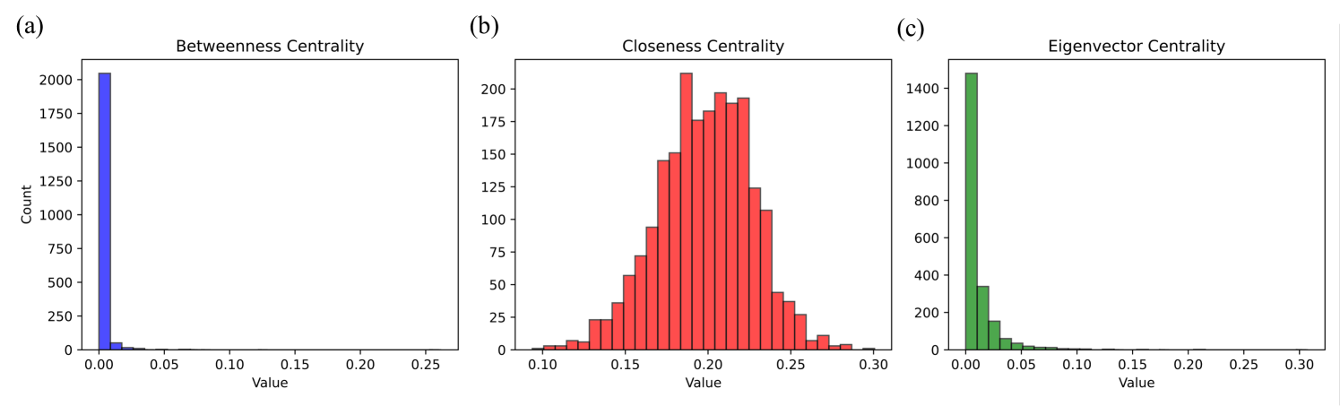
The image displays three side-by-side histograms, labeled (a), (b), and (c) from left to right. These charts illustrate the frequency distributions of three different network centrality metrics: Betweenness Centrality, Closeness Centrality, and Eigenvector Centrality. The data represents the structural properties of nodes within a specific, unnamed network. All text in the image is in English.
### Components/Axes
The image is divided into three distinct spatial regions (subplots).
**Shared Elements:**
* **X-axes:** All three charts have an x-axis labeled "Value", representing the calculated centrality score. The scales vary slightly between the charts.
* **Y-axes:** Only the leftmost chart (a) explicitly labels the y-axis as "Count". However, based on standard histogram conventions and visual alignment, the y-axes on charts (b) and (c) also represent the frequency "Count" of nodes falling into each value bin.
**Specific Subplot Axes:**
* **(a) Left Chart:**
* Y-axis markers: 0, 250, 500, 750, 1000, 1250, 1500, 1750, 2000.
* X-axis markers: 0.00, 0.05, 0.10, 0.15, 0.20, 0.25.
* **(b) Center Chart:**
* Y-axis markers: 0, 25, 50, 75, 100, 125, 150, 175, 200.
* X-axis markers: 0.10, 0.15, 0.20, 0.25, 0.30.
* **(c) Right Chart:**
* Y-axis markers: 0, 200, 400, 600, 800, 1000, 1200, 1400.
* X-axis markers: 0.00, 0.05, 0.10, 0.15, 0.20, 0.25, 0.30.
### Detailed Analysis
#### Region 1: Left Subplot (a)
* **Title:** Betweenness Centrality
* **Visual Trend:** The data exhibits a severe right-skew (positive skew), resembling a power-law distribution. The vast majority of the data is concentrated in the very first bin, with an immediate and flat tail extending to the right.
* **Data Points (Blue Bars):**
* The first bin (approx. value 0.00 to 0.01) contains an overwhelming majority of the counts, peaking slightly above the 2000 mark (estimated ~2050).
* The second bin (approx. 0.01 to 0.02) drops drastically to an estimated count of ~50.
* All subsequent bins from 0.02 up to 0.25 have counts that are visually indistinguishable from zero, indicating extremely rare outliers.
#### Region 2: Center Subplot (b)
* **Title:** Closeness Centrality
* **Visual Trend:** Unlike the other two charts, this data forms a roughly symmetrical, bell-shaped curve resembling a normal distribution. The data is centered around the 0.20 mark.
* **Data Points (Red Bars):**
* The distribution begins around a value of 0.09 with counts near 0.
* It slopes upward steadily. At a value of 0.15, the count is approximately 60.
* The distribution has a jagged peak. The absolute highest bar occurs just before 0.20 (approx. 0.19), reaching a count of ~210.
* There is a slight dip at exactly 0.20 (count ~175), followed by two more high bars at approx. 0.21 (count ~195) and 0.22 (count ~190).
* The right tail slopes downward, reaching a count of ~40 at the 0.25 mark, and tapering off to near zero by 0.30.
#### Region 3: Right Subplot (c)
* **Title:** Eigenvector Centrality
* **Visual Trend:** Similar to chart (a), this exhibits a strong right-skew, resembling an exponential decay curve. It starts very high at zero and drops off quickly, though the curve is slightly smoother and less abrupt than the Betweenness Centrality chart.
* **Data Points (Green Bars):**
* The first bin (approx. 0.00 to 0.01) peaks just below the 1500 mark (estimated ~1480).
* The second bin (approx. 0.01 to 0.02) drops to an estimated count of ~350.
* The third bin (approx. 0.02 to 0.03) drops to an estimated count of ~150.
* The counts continue to decay smoothly, approaching zero around the 0.10 mark.
* A long, empty tail extends from 0.10 to 0.30, indicating no significant node counts in this higher range.
### Key Observations
* **Disparity in Scales:** The maximum count (y-axis) varies wildly between the metrics. Betweenness peaks over 2000, Eigenvector near 1500, while Closeness only peaks around 210. This indicates that Betweenness and Eigenvector scores are highly concentrated at the bottom of their ranges, whereas Closeness scores are spread much more evenly across the network's nodes.
* **Distribution Shapes:** Metrics (a) and (c) share a heavily skewed, long-tail distribution. Metric (b) stands out as the only normally distributed metric.
### Interpretation
These histograms provide a distinct "fingerprint" of the underlying network's topology.
1. **Betweenness Centrality (The Bridges):** The extreme spike at zero indicates that the vast majority of nodes in this network do not act as bridges on the shortest paths between other nodes. They are likely peripheral. The long, invisible tail implies the existence of a very small number of highly critical "hub" nodes that control the flow of information or resources across the network.
2. **Closeness Centrality (The Distances):** The normal distribution indicates that most nodes are roughly the same average distance from all other nodes in the network (centered around a score of 0.20). There are very few nodes that are exceptionally close to everything, and very few that are exceptionally isolated.
3. **Eigenvector Centrality (The Influence):** The exponential decay shows that most nodes are connected to other low-influence nodes (scoring near zero). A small fraction of nodes have higher scores, meaning they are connected to other well-connected nodes.
**Conclusion:** Reading between the lines, this combination of distributions is highly characteristic of a **Scale-Free or Small-World network** (common in social networks, biological pathways, and the internet). In such networks, a few massive hubs dominate the routing (Betweenness) and hold the most structural influence (Eigenvector), while the overall network remains compact enough that the average path length from any node to any other node remains relatively consistent and normally distributed (Closeness).