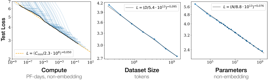
## Scatter Plots: Test Loss vs. Compute, Dataset Size, and Parameters
### Overview
The image presents three scatter plots illustrating the relationship between test loss and three different factors: compute (measured in PF-days, non-embedding), dataset size (measured in tokens), and parameters (non-embedding). Each plot shows a decreasing trend in test loss as the corresponding factor increases.
### Components/Axes
**Plot 1: Test Loss vs. Compute**
* **Y-axis:** Test Loss, linear scale from 2 to 7.
* **X-axis:** Compute, logarithmic scale from 10^-9 to 10^1, labeled "PF-days, non-embedding".
* **Data:** Multiple light blue lines, a black line representing an average, and a dashed orange line representing a fitted curve.
* **Fitted Curve Equation (orange dashed line):** L = (Cmin / (2.3 * 10^8))^-0.050
**Plot 2: Test Loss vs. Dataset Size**
* **Y-axis:** Test Loss, linear scale from 2.7 to 4.2.
* **X-axis:** Dataset Size, logarithmic scale from 10^7 to 10^9, labeled "tokens".
* **Data:** Blue data points connected by a blue line, and a gray fitted curve.
* **Fitted Curve Equation (gray line):** L = (D / (5.4 * 10^13))^-0.095
**Plot 3: Test Loss vs. Parameters**
* **Y-axis:** Test Loss, linear scale from 2.4 to 5.6.
* **X-axis:** Parameters, logarithmic scale from 10^5 to 10^9, labeled "non-embedding".
* **Data:** Blue data points connected by a blue line, and a gray fitted curve.
* **Fitted Curve Equation (gray line):** L = (N / (8.8 * 10^13))^-0.076
### Detailed Analysis
**Plot 1: Test Loss vs. Compute**
* The light blue lines show individual runs, while the black line represents an average trend.
* The test loss decreases as compute increases.
* The orange dashed line represents the fitted curve, which approximates the average trend.
* At Compute = 10^-9, Test Loss is approximately 6.7.
* At Compute = 10^1, Test Loss is approximately 2.7.
**Plot 2: Test Loss vs. Dataset Size**
* The blue line with data points shows a clear decreasing trend.
* The gray line represents the fitted curve.
* At Dataset Size = 10^7, Test Loss is approximately 4.0.
* At Dataset Size = 10^9, Test Loss is approximately 2.8.
**Plot 3: Test Loss vs. Parameters**
* The blue line with data points shows a decreasing trend.
* The gray line represents the fitted curve.
* At Parameters = 10^5, Test Loss is approximately 5.5.
* At Parameters = 10^9, Test Loss is approximately 3.8.
### Key Observations
* All three plots show a negative correlation between test loss and the respective factor (compute, dataset size, and parameters).
* The fitted curves provide a mathematical representation of these relationships.
* The logarithmic scale on the x-axes suggests that the impact of each factor diminishes as its value increases.
### Interpretation
The plots demonstrate that increasing compute, dataset size, and the number of parameters generally leads to a reduction in test loss. This suggests that larger models, trained on more data, and with more computational resources, tend to perform better. The specific equations provided for the fitted curves quantify the relationship between test loss and each factor, allowing for predictions and comparisons. The diminishing returns observed due to the logarithmic scale highlight the importance of optimizing resource allocation to achieve the greatest reduction in test loss.