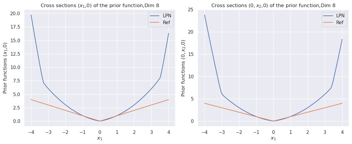
## Line Chart: Cross Sections of Prior Function
### Overview
The image presents two line charts, displayed side-by-side. Both charts visualize cross-sections of a prior function in 8 dimensions. The left chart shows the cross-section (x1, 0) and the right chart shows the cross-section (0, x2, 0). Each chart plots "Prior functions" against "x1" (left chart) or "x1" (right chart). Two lines are plotted on each chart, representing "LPN" and "Ref" data series.
### Components/Axes
* **Left Chart:**
* **Title:** "Cross sections (x1,0) of the prior function,Dim 8" (top-center)
* **X-axis Label:** "x1" (bottom-center)
* **Y-axis Label:** "Prior functions (x1,0)" (left-center)
* **Legend:** Located in the top-right corner.
* "LPN" - Blue line
* "Ref" - Orange line
* **Right Chart:**
* **Title:** "Cross sections (0,x2,0) of the prior function,Dim 8" (top-center)
* **X-axis Label:** "x1" (bottom-center)
* **Y-axis Label:** "Prior functions (0,x2,0)" (left-center)
* **Legend:** Located in the top-right corner.
* "LPN" - Blue line
* "Ref" - Orange line
### Detailed Analysis or Content Details
**Left Chart:**
* **LPN (Blue Line):** The line starts at approximately 18.5 at x1 = -4. It decreases to a minimum of approximately 2.5 at x1 = 0. Then, it increases to approximately 5.0 at x1 = 4. The trend is initially steeply decreasing, then increasing.
* **Ref (Orange Line):** The line starts at approximately 2.5 at x1 = -4. It increases to a maximum of approximately 3.0 at x1 = 0. Then, it decreases to approximately 2.5 at x1 = 4. The trend is initially increasing, then decreasing.
**Right Chart:**
* **LPN (Blue Line):** The line starts at approximately 21.0 at x1 = -4. It decreases to a minimum of approximately 4.5 at x1 = 0. Then, it increases to approximately 18.0 at x1 = 4. The trend is initially steeply decreasing, then increasing.
* **Ref (Orange Line):** The line starts at approximately 4.5 at x1 = -4. It increases to a maximum of approximately 5.0 at x1 = 0. Then, it decreases to approximately 4.5 at x1 = 4. The trend is initially increasing, then decreasing.
### Key Observations
* Both charts exhibit a U-shaped curve for both the "LPN" and "Ref" lines.
* The "LPN" line consistently has higher values than the "Ref" line in both charts, especially at the extreme ends of the x1 axis.
* The minimum values of the "LPN" line are significantly lower than the maximum values of the "Ref" line.
* The "Ref" line appears to be relatively flat compared to the "LPN" line.
### Interpretation
The charts demonstrate the cross-sectional behavior of a prior function in 8 dimensions, comparing two different methods ("LPN" and "Ref"). The U-shaped curves suggest that the function has a minimum value around x1 = 0 in both cross-sections. The significant difference in magnitude between the "LPN" and "Ref" lines indicates that the two methods produce substantially different prior distributions. The "LPN" method appears to assign higher probability density to values further away from x1 = 0, while the "Ref" method maintains a more consistent probability density across the range of x1. The fact that the "Ref" line is relatively flat suggests a less informative prior, while the "LPN" line's more pronounced curve indicates a stronger prior belief about the distribution of the variable. The two charts, taken together, provide insight into how these two methods shape the prior distribution in different dimensions.