\n
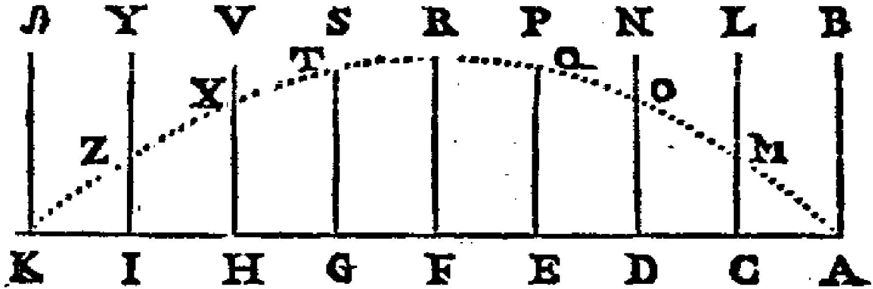
## Line Graph: Unlabeled Curve Analysis
### Overview
The image presents a hand-drawn line graph with two distinct curves and labeled axes. The graph appears to illustrate a relationship between two variables, represented by the horizontal and vertical axes. The curves are labeled with letters, and the axes are also labeled with letters. The graph is relatively simple, lacking a title or explicit units.
### Components/Axes
* **Horizontal Axis:** Labeled with letters from A to K, spaced somewhat unevenly.
* **Vertical Axis:** Labeled with letters from A to N, also spaced somewhat unevenly.
* **Curve 1:** Represented by a dotted line, labeled with points Z, X, T, Q, and M.
* **Curve 2:** Represented by a dashed line, labeled with points Y, V, S, R, P, N, L, and B.
### Detailed Analysis
**Curve 1 (Z-X-T-Q-M):**
This curve begins at point Z on the vertical axis, approximately aligned with point K on the horizontal axis. It rises with increasing slope to point X, aligned with point I. The curve continues to rise, but with a decreasing slope, reaching point T aligned with point H. From T, the curve descends with increasing slope to point Q aligned with point N. Finally, it continues to descend with increasing slope to point M aligned with point C.
* Approximate Coordinates:
* Z: (K, ~A)
* X: (I, ~V)
* T: (H, ~S)
* Q: (N, ~P)
* M: (C, ~A)
**Curve 2 (Y-V-S-R-P-N-L-B):**
This curve starts at point Y on the vertical axis, aligned with point I on the horizontal axis. It rises with decreasing slope to point V, aligned with point H. The curve continues to rise, reaching a peak at point S aligned with point G. From S, the curve descends with increasing slope to point R aligned with point F. It continues to descend to point P aligned with point E, then to point N aligned with point D, point L aligned with point C, and finally to point B aligned with point A.
* Approximate Coordinates:
* Y: (I, ~Y)
* V: (H, ~V)
* S: (G, ~R)
* R: (F, ~P)
* P: (E, ~N)
* N: (D, ~L)
* L: (C, ~B)
* B: (A, ~B)
### Key Observations
* Curve 1 exhibits an initial increase followed by a decrease, resembling a bell curve or a peak.
* Curve 2 exhibits a similar pattern, with an initial increase, a peak, and a subsequent decrease.
* The peaks of the two curves are offset. Curve 2 peaks earlier (at S) than Curve 1 (at T).
* Both curves start and end at approximately the same vertical level (A).
* The spacing of the labels on both axes is not uniform, suggesting the scales may not be linear.
### Interpretation
The graph likely represents the relationship between two variables over a range defined by the horizontal axis. The two curves could represent different processes or conditions affecting the same variable. The offset peaks suggest a phase shift or a difference in timing between the two processes. The fact that both curves return to approximately the same level at the ends suggests a cyclical or bounded behavior.
Without a title or axis labels, it's difficult to determine the specific meaning of the graph. However, the shape of the curves suggests a process that increases to a maximum and then decreases, potentially representing growth, decay, or a periodic phenomenon. The curves could represent the change in a quantity over time, or the relationship between two related quantities. The non-uniform spacing of the axis labels suggests that the data may not be evenly distributed or that the scales are not linear. Further context is needed to fully interpret the graph's meaning.