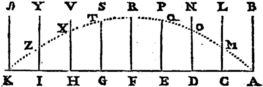
## Diagram: Labeled Trend Curve with Vertical Divisions
### Overview
The image is a black-and-white technical diagram, likely from a historical or scientific text. It depicts a dotted curve plotted across a series of vertical divisions. Each division is labeled with a letter at the top and a different letter at the bottom. Specific points along the curve are also labeled with letters. The diagram appears to illustrate a trend or relationship across a sequence of categories or intervals.
### Components/Axes
* **Vertical Divisions:** There are 9 vertical lines, creating 8 intervals.
* **Top Labels (Left to Right):** J, Y, V, S, R, P, N, L, B.
* **Bottom Labels (Left to Right):** K, I, H, G, F, E, D, C, A.
* **Curve:** A dotted line forming an inverted U-shape or bell curve.
* **Curve Point Labels (Left to Right along the curve):** Z, X, T, Q, O, M.
* **Spatial Layout:** The top and bottom labels are aligned vertically. The curve originates near the bottom-left corner (near point K/J), rises to a peak in the central region (between divisions S/R and R/P), and descends to the bottom-right corner (near point A/B).
### Detailed Analysis
* **Trend Verification:** The dotted line shows a clear single-peak trend. It slopes upward from the leftmost point (Z) to a maximum near the center, then slopes downward to the rightmost point (M).
* **Point Placement & Label Cross-Reference:**
* **Point Z:** Located on the curve between the first and second vertical lines (between J/K and Y/I). It is the lowest point on the left side.
* **Point X:** Located on the curve between the second and third vertical lines (between Y/I and V/H). It is higher than Z.
* **Point T:** Located on the curve between the third and fourth vertical lines (between V/H and S/G). It is near the ascending peak.
* **Peak Region:** The highest point of the curve appears to be in the interval between the fourth (S/G) and fifth (R/F) vertical lines, and possibly extending into the sixth (P/E). No single point label is at the absolute apex.
* **Point Q:** Located on the curve between the sixth and seventh vertical lines (between P/E and N/D). It is on the descending slope.
* **Point O:** Located on the curve between the seventh and eighth vertical lines (between N/D and L/C). It is lower than Q.
* **Point M:** Located on the curve between the eighth and ninth vertical lines (between L/C and B/A). It is the lowest point on the right side.
* **Data Table Reconstruction:** The diagram does not contain numerical data. It presents a qualitative relationship using labeled positions.
### Key Observations
1. **Asymmetry:** The curve is not perfectly symmetric. The ascent from Z to the peak appears slightly steeper than the descent from the peak to M.
2. **Labeling Scheme:** The top and bottom letters do not follow a simple alphabetical sequence. They may represent specific categories, states, or measurement points in a process.
3. **Peak Location:** The maximum value of the plotted trend occurs in the central third of the diagram, specifically in the region bounded by the vertical lines for S/G, R/F, and P/E.
4. **Discrete Points on a Continuous Trend:** The labeled points (Z, X, T, Q, O, M) highlight specific instances along the continuous dotted trend line.
### Interpretation
This diagram is a conceptual representation of a unimodal distribution or a process that rises to a climax and then falls. The vertical lines segment the domain into distinct phases or categories. The letters likely serve as identifiers for these phases (top row) and possibly their corresponding states or outcomes (bottom row).
The curve demonstrates that the measured attribute or phenomenon is minimal at the initial (J/K) and final (B/A) stages, reaches its maximum intensity in the middle stages (around S/G to P/E), and then diminishes. The labeled points (Z, X, T, Q, O, M) could represent critical thresholds, sample points, or named states within this process.
Without additional context, the specific meaning of the letters is unknown. However, the structure is classic for illustrating concepts like a product life cycle, a reaction progress, a population growth curve, or a signal strength profile across a sequence. The deliberate asymmetry might indicate that the process of building up to the peak is different in nature or rate from the process of decline.