## Chart Type: Performance Comparison Charts
### Overview
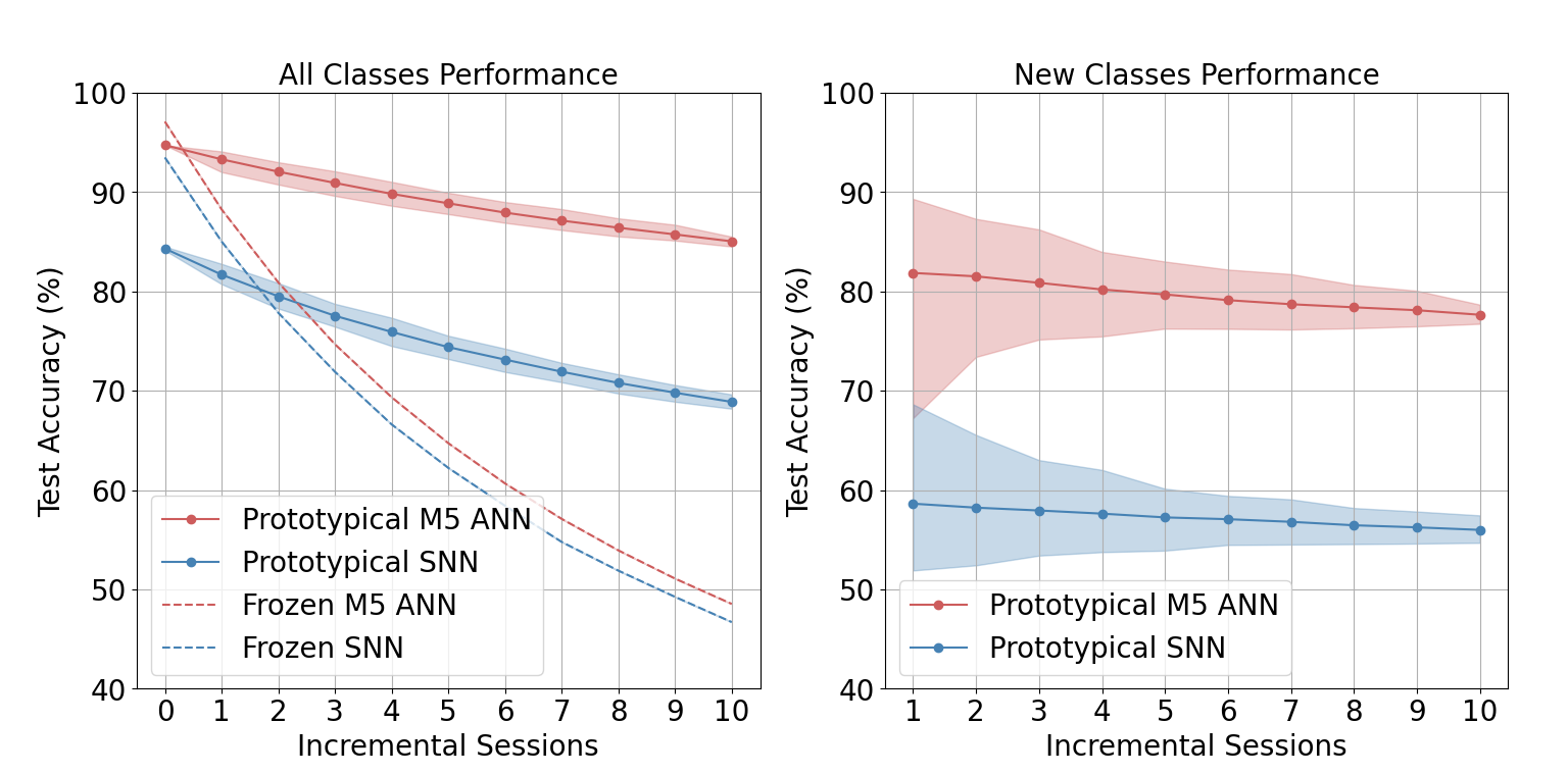
The image contains two line charts comparing the performance of different machine learning models (Prototypical M5 ANN, Prototypical SNN, Frozen M5 ANN, and Frozen SNN) across incremental sessions. The left chart shows the performance on "All Classes," while the right chart shows the performance on "New Classes." The y-axis represents "Test Accuracy (%)" and the x-axis represents "Incremental Sessions." Each chart includes shaded regions around the lines, likely representing confidence intervals or standard deviations.
### Components/Axes
**Left Chart (All Classes Performance):**
* **Title:** All Classes Performance
* **Y-axis:**
* Label: Test Accuracy (%)
* Scale: 40 to 100, with gridlines at intervals of 10.
* **X-axis:**
* Label: Incremental Sessions
* Scale: 0 to 10, with gridlines at intervals of 1.
* **Legend (bottom-left):**
* Prototypical M5 ANN (solid red line with circular markers)
* Prototypical SNN (solid blue line with circular markers)
* Frozen M5 ANN (dashed red line)
* Frozen SNN (dashed blue line)
**Right Chart (New Classes Performance):**
* **Title:** New Classes Performance
* **Y-axis:**
* Label: Test Accuracy (%)
* Scale: 40 to 100, with gridlines at intervals of 10.
* **X-axis:**
* Label: Incremental Sessions
* Scale: 1 to 10, with gridlines at intervals of 1.
* **Legend (bottom-left):**
* Prototypical M5 ANN (solid red line with circular markers)
* Prototypical SNN (solid blue line with circular markers)
### Detailed Analysis
**Left Chart (All Classes Performance):**
* **Prototypical M5 ANN (solid red line):**
* Trend: Decreasing, but relatively stable.
* Data Points:
* Session 0: ~95%
* Session 1: ~93%
* Session 5: ~90%
* Session 10: ~86%
* **Prototypical SNN (solid blue line):**
* Trend: Decreasing.
* Data Points:
* Session 0: ~84%
* Session 1: ~82%
* Session 5: ~74%
* Session 10: ~69%
* **Frozen M5 ANN (dashed red line):**
* Trend: Decreasing.
* Data Points:
* Session 0: ~97%
* Session 1: ~85%
* Session 5: ~65%
* Session 10: ~47%
* **Frozen SNN (dashed blue line):**
* Trend: Decreasing.
* Data Points:
* Session 0: ~93%
* Session 1: ~80%
* Session 5: ~60%
* Session 10: ~45%
**Right Chart (New Classes Performance):**
* **Prototypical M5 ANN (solid red line):**
* Trend: Relatively stable, slight decrease.
* Data Points:
* Session 1: ~82%
* Session 2: ~81%
* Session 5: ~80%
* Session 10: ~78%
* **Prototypical SNN (solid blue line):**
* Trend: Decreasing.
* Data Points:
* Session 1: ~59%
* Session 2: ~63%
* Session 5: ~58%
* Session 10: ~56%
### Key Observations
* In the "All Classes Performance" chart, the "Frozen" models (both M5 ANN and SNN) show a more significant performance drop compared to the "Prototypical" models as the number of incremental sessions increases.
* In the "New Classes Performance" chart, the Prototypical M5 ANN consistently outperforms the Prototypical SNN.
* The shaded regions around the lines indicate the variability or uncertainty in the performance of each model. The wider the shaded region, the greater the variability.
### Interpretation
The charts compare the performance of different machine learning models under incremental learning scenarios. The "All Classes Performance" chart suggests that freezing the model parameters (Frozen M5 ANN and Frozen SNN) leads to a more rapid decline in performance as new sessions are added, compared to the Prototypical models that likely adapt or learn with each new session. The "New Classes Performance" chart highlights the difference in generalization ability between the Prototypical M5 ANN and Prototypical SNN when dealing with unseen classes. The M5 ANN appears to be more robust and maintains a higher accuracy level. The shaded regions provide insight into the consistency of the models' performance; wider regions suggest less consistent results.