## Line Chart: MER Average vs. N
### Overview
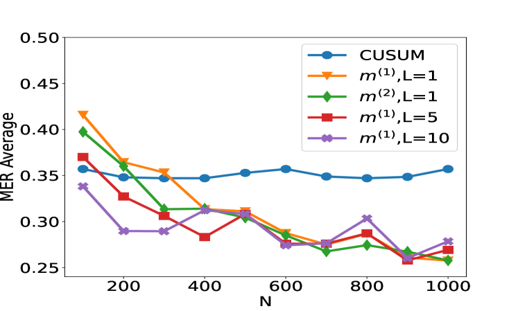
The image is a line chart comparing the MER (Message Error Rate) Average for different methods as a function of N. The chart displays five different data series, each representing a different method or configuration. The x-axis represents N, and the y-axis represents the MER Average.
### Components/Axes
* **X-axis:** Labeled "N", with tick marks at 200, 400, 600, 800, and 1000.
* **Y-axis:** Labeled "MER Average", with tick marks at 0.25, 0.30, 0.35, 0.40, 0.45, and 0.50.
* **Legend:** Located in the top-right corner, it identifies the five data series:
* Blue: CUSUM
* Orange: m^(1), L=1
* Green: m^(2), L=1
* Red: m^(1), L=5
* Purple: m^(1), L=10
### Detailed Analysis
* **CUSUM (Blue):** The line starts at approximately 0.37 at N=100, decreases slightly to around 0.35 at N=400, and then remains relatively stable around 0.35, ending at approximately 0.36 at N=1000.
* **m^(1), L=1 (Orange):** The line starts at approximately 0.42 at N=100, decreases to approximately 0.35 at N=400, and then decreases further to approximately 0.28 at N=600, remaining relatively stable around 0.28-0.31 until N=1000.
* **m^(2), L=1 (Green):** The line starts at approximately 0.40 at N=100, decreases to approximately 0.31 at N=400, and then decreases further to approximately 0.27 at N=600, remaining relatively stable around 0.26-0.28 until N=1000.
* **m^(1), L=5 (Red):** The line starts at approximately 0.37 at N=100, decreases to approximately 0.29 at N=200, decreases further to approximately 0.28 at N=400, increases to approximately 0.31 at N=600, decreases to approximately 0.26 at N=800, and then increases to approximately 0.27 at N=1000.
* **m^(1), L=10 (Purple):** The line starts at approximately 0.34 at N=100, decreases to approximately 0.29 at N=200, increases to approximately 0.32 at N=400, decreases to approximately 0.28 at N=600, increases to approximately 0.30 at N=800, and then decreases to approximately 0.27 at N=1000.
### Key Observations
* The CUSUM method has the most stable MER Average across different values of N.
* The m^(1), L=1, m^(2), L=1, m^(1), L=5, and m^(1), L=10 methods all show a decreasing trend in MER Average as N increases from 100 to 600, after which they fluctuate.
* For N greater than 600, the m^(1), L=5 and m^(1), L=10 methods have similar MER Averages.
* For N greater than 600, the m^(2), L=1 method has the lowest MER Average.
### Interpretation
The chart compares the performance of different methods for reducing message error rate (MER) as the parameter N changes. The CUSUM method appears to be the most stable, maintaining a relatively consistent MER Average across different values of N. The other methods, particularly m^(1) and m^(2) with L=1, 5, and 10, show a decrease in MER Average as N increases initially, but then fluctuate. This suggests that increasing N may initially improve performance for these methods, but beyond a certain point, the improvement plateaus or becomes inconsistent. The choice of method and parameter L may depend on the specific application and the desired trade-off between stability and MER Average.