## Line Chart: MER Average vs. N for Different Methods
### Overview
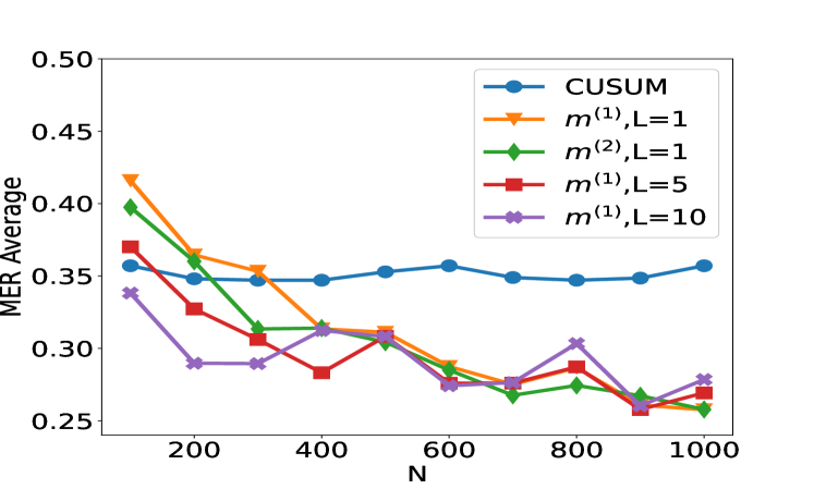
This image displays a line chart comparing the "MER Average" (Mean Error Rate Average) against "N" (likely representing sample size or number of observations) for five different methods: CUSUM, m⁽¹⁾,L=1, m⁽²⁾,L=1, m⁽¹⁾,L=5, and m⁽¹⁾,L=10. The chart visualizes how the average MER changes as N increases for each of these methods.
### Components/Axes
* **Chart Type**: Line Chart
* **Title**: Implicitly, the chart title relates to the comparison of MER Average across different methods as N varies.
* **X-axis**:
* **Label**: N
* **Scale**: Numerical, ranging from approximately 100 to 1000.
* **Markers**: 100, 200, 400, 600, 800, 1000.
* **Y-axis**:
* **Label**: MER Average
* **Scale**: Numerical, ranging from 0.25 to 0.50.
* **Markers**: 0.25, 0.30, 0.35, 0.40, 0.45, 0.50.
* **Legend**: Located in the top-right quadrant of the chart. It maps colors and markers to specific methods:
* Blue circles: CUSUM
* Orange triangles: m⁽¹⁾,L=1
* Green diamonds: m⁽²⁾,L=1
* Red squares: m⁽¹⁾,L=5
* Purple crosses: m⁽¹⁾,L=10
### Detailed Analysis or Content Details
The chart displays data points for each method at various values of N. The approximate values for each data series are as follows:
**1. CUSUM (Blue circles):**
* **Trend**: This line generally shows a slight upward trend, with some minor fluctuations. It starts around 0.36 at N=100, dips slightly, and then rises to around 0.36 at N=1000.
* **Data Points (approximate N, MER Average):**
* (100, 0.36)
* (200, 0.35)
* (300, 0.35)
* (400, 0.35)
* (500, 0.355)
* (600, 0.35)
* (700, 0.348)
* (800, 0.35)
* (900, 0.348)
* (1000, 0.353)
**2. m⁽¹⁾,L=1 (Orange triangles):**
* **Trend**: This line shows a significant downward trend from N=100 to N=600, after which it fluctuates. It starts at a high value and decreases substantially.
* **Data Points (approximate N, MER Average):**
* (100, 0.425)
* (200, 0.365)
* (300, 0.355)
* (400, 0.35)
* (500, 0.315)
* (600, 0.29)
* (700, 0.285)
* (800, 0.265)
* (900, 0.27)
* (1000, 0.28)
**3. m⁽²⁾,L=1 (Green diamonds):**
* **Trend**: This line exhibits a generally decreasing trend, with some fluctuations. It starts high and ends lower than its initial value.
* **Data Points (approximate N, MER Average):**
* (100, 0.40)
* (200, 0.37)
* (300, 0.32)
* (400, 0.31)
* (500, 0.305)
* (600, 0.28)
* (700, 0.27)
* (800, 0.26)
* (900, 0.255)
* (1000, 0.255)
**4. m⁽¹⁾,L=5 (Red squares):**
* **Trend**: This line shows a clear downward trend, particularly from N=100 to N=500, and then it fluctuates.
* **Data Points (approximate N, MER Average):**
* (100, 0.365)
* (200, 0.32)
* (300, 0.29)
* (400, 0.285)
* (500, 0.31)
* (600, 0.275)
* (700, 0.26)
* (800, 0.26)
* (900, 0.27)
* (1000, 0.275)
**5. m⁽¹⁾,L=10 (Purple crosses):**
* **Trend**: This line shows significant fluctuations, with an initial decrease, a peak, and then a general downward trend with a slight increase at the end.
* **Data Points (approximate N, MER Average):**
* (100, 0.34)
* (200, 0.29)
* (300, 0.295)
* (400, 0.315)
* (500, 0.295)
* (600, 0.28)
* (700, 0.27)
* (800, 0.30)
* (900, 0.275)
* (1000, 0.275)
### Key Observations
* **Initial Performance**: At N=100, the m⁽¹⁾,L=1 method has the highest MER Average (approx. 0.425), while CUSUM and m⁽¹⁾,L=10 have the lowest (approx. 0.36 and 0.34 respectively).
* **General Trend**: Most methods, except for CUSUM, show a general decreasing trend in MER Average as N increases, especially in the initial range of N.
* **CUSUM Stability**: The CUSUM method exhibits a relatively stable MER Average across the range of N, hovering around 0.35. It does not show a significant decrease or increase.
* **Convergence**: As N approaches 1000, several methods (m⁽¹⁾,L=1, m⁽¹⁾,L=5, m⁽¹⁾,L=10, and m⁽²⁾,L=1) appear to converge to a MER Average in the range of 0.25 to 0.28.
* **Outlier/Peak**: The m⁽¹⁾,L=10 method shows a notable peak at N=400 (approx. 0.315), which is higher than its neighboring data points.
### Interpretation
This chart likely demonstrates the performance of different anomaly detection or change detection algorithms (indicated by CUSUM and the 'm' notations, possibly representing different variants or parameters of a method). The "MER Average" is a performance metric, where a lower value is generally better, indicating fewer errors on average.
The data suggests that for most of the tested methods (m⁽¹⁾,L=1, m⁽²⁾,L=1, m⁽¹⁾,L=5, and m⁽¹⁾,L=10), increasing the sample size (N) leads to a reduction in the average MER, implying that these methods become more effective or reliable with more data. This is a common characteristic of many statistical and machine learning algorithms.
The CUSUM method, however, appears to be less sensitive to the increase in N, maintaining a relatively consistent MER Average. This could indicate that CUSUM is either already performing optimally within this range of N, or it has a different operational characteristic that makes its performance less dependent on sample size compared to the other methods.
The parameters 'L' in the 'm' methods (e.g., L=1, L=5, L=10) likely represent a window size or a threshold parameter. The comparison between m⁽¹⁾,L=1, m⁽¹⁾,L=5, and m⁽¹⁾,L=10 suggests that the choice of 'L' can influence the performance, with some values of 'L' leading to better (lower) MER Averages than others, especially at larger N. For instance, m⁽²⁾,L=1 and m⁽¹⁾,L=5 seem to achieve lower MER Averages at higher N compared to m⁽¹⁾,L=10.
The peak observed in m⁽¹⁾,L=10 at N=400 might represent a point where the algorithm's performance temporarily degrades, possibly due to specific data characteristics at that sample size or an interaction between the algorithm's parameters and the data distribution.
In summary, the chart illustrates a trade-off between different methods and their sensitivity to sample size, with most methods showing improvement as N increases, while CUSUM remains relatively stable. The parameter 'L' also plays a role in the performance of the 'm' methods.