# Technical Document Analysis of Chart
## Chart Overview
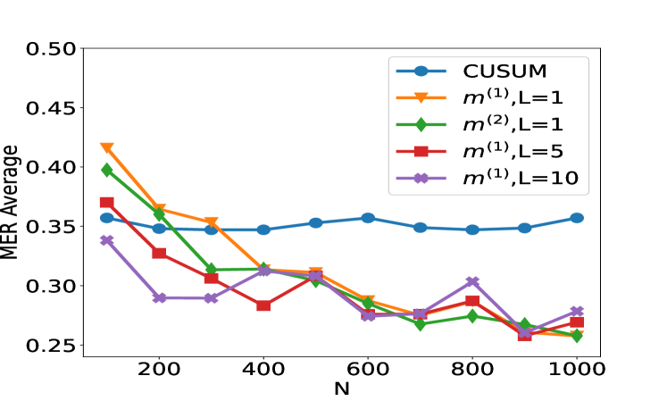
The image is a line chart comparing the **MER Average** (Mean Error Rate) across different statistical methods as a function of **N** (sample size). The chart includes five data series, each represented by distinct colors, markers, and labels in the legend.
---
### **Axis Labels and Scales**
- **X-axis (Horizontal):**
- Label: **N**
- Range: 200 to 1000 (increments of 200)
- Units: Not explicitly stated, but contextually represents sample size.
- **Y-axis (Vertical):**
- Label: **MER Average**
- Range: 0.25 to 0.50 (increments of 0.05)
- Units: Likely a normalized error rate (e.g., proportion of errors).
---
### **Legend and Data Series**
The legend is positioned in the **top-right corner** of the chart. Each data series is mapped to a unique color, marker, and label:
1. **CUSUM**
- Color: **Blue**
- Marker: **Circle (●)**
- Trend: Starts at ~0.35, remains relatively flat with minor fluctuations.
2. **m^(1),L=1**
- Color: **Orange**
- Marker: **Triangle (▼)**
- Trend: Starts at ~0.42, sharply declines to ~0.28 by N=600, then stabilizes.
3. **m^(2),L=1**
- Color: **Green**
- Marker: **Diamond (◇)**
- Trend: Starts at ~0.40, declines to ~0.28 by N=600, then fluctuates slightly.
4. **m^(1),L=5**
- Color: **Red**
- Marker: **Square (■)**
- Trend: Starts at ~0.38, declines to ~0.26 by N=600, then fluctuates.
5. **m^(1),L=10**
- Color: **Purple**
- Marker: **Cross (✗)**
- Trend: Starts at ~0.34, declines to ~0.27 by N=600, then fluctuates.
---
### **Key Observations**
1. **CUSUM (Blue Line):**
- Maintains the highest MER Average (~0.35–0.36) across all N values.
- Exhibits minimal variability compared to other methods.
2. **m^(1),L=1 (Orange Line):**
- Begins with the highest MER Average (~0.42 at N=200).
- Shows the steepest decline, stabilizing near ~0.28 by N=600.
3. **m^(2),L=1 (Green Line):**
- Starts slightly below m^(1),L=1 (~0.40 at N=200).
- Declines more gradually than m^(1),L=1 but remains above m^(1),L=5 and m^(1),L=10.
4. **m^(1),L=5 (Red Line) and m^(1),L=10 (Purple Line):**
- Both exhibit similar trends: sharp declines followed by oscillations.
- m^(1),L=10 starts lower (~0.34 at N=200) but converges with m^(1),L=5 at higher N values.
---
### **Spatial Grounding**
- **Legend Position:** Top-right corner of the chart.
- **Data Series Alignment:**
- Colors and markers in the legend match the corresponding lines in the plot.
- Example: The orange line with triangles corresponds to **m^(1),L=1**.
---
### **Trend Verification**
- **CUSUM:** Flat trend (no significant increase/decrease).
- **m^(1),L=1:** Sharp decline followed by stabilization.
- **m^(2),L=1:** Gradual decline with minor fluctuations.
- **m^(1),L=5 and m^(1),L=10:** Steeper declines with post-stabilization oscillations.
---
### **Conclusion**
The chart illustrates how MER Average varies with sample size (N) for different statistical methods. CUSUM performs consistently, while methods with smaller L values (e.g., m^(1),L=1) show sharper improvements in error rates as N increases.