## Diagram: Parameter Space Partitioning
### Overview
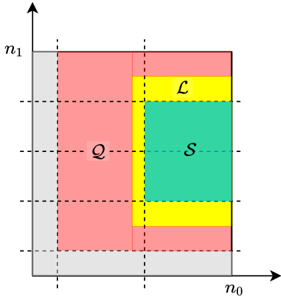
The image is a conceptual two-dimensional diagram illustrating the partitioning of a parameter space defined by axes \( n_0 \) and \( n_1 \). It uses color-coded regions and labels to denote distinct sets or categories within this space. The diagram is schematic, with no numerical values on the axes, indicating it represents a theoretical or abstract model rather than quantitative data.
### Components/Axes
* **Axes:**
* Horizontal axis: Labeled \( n_0 \), with an arrow pointing to the right.
* Vertical axis: Labeled \( n_1 \), with an arrow pointing upward.
* The origin is at the bottom-left corner.
* **Grid Lines:** Dashed lines create a grid, dividing the space into rectangular sections. These lines likely represent thresholds or boundaries.
* **Regions & Labels:** The space is partitioned into four distinct, color-coded regions:
1. **Gray Region:** A vertical rectangle on the far left, spanning the full height of the \( n_1 \) axis. It has no internal label.
2. **Pink Region:** A large rectangle to the right of the gray region. It is labeled with a script letter **Q**.
3. **Yellow Region:** An L-shaped region that borders the pink region on its right and top sides. It is labeled with a script letter **ℒ** (mathematical script L).
4. **Green Region:** A rectangle nested within the inner corner of the yellow L-shape. It is labeled with a script letter **S**.
### Detailed Analysis
* **Spatial Relationships:**
* The **Gray** region is the leftmost partition.
* The **Pink (Q)** region occupies the central-left area, adjacent to the gray region.
* The **Yellow (ℒ)** region forms a border around the top and right sides of the **Green (S)** region.
* The **Green (S)** region is completely enclosed by the yellow region on its top and right, and borders the pink region on its left and bottom.
* **Boundary Structure:** The dashed grid lines align with the edges of the colored regions, suggesting the partitions are defined by specific, discrete values along the \( n_0 \) and \( n_1 \) axes.
### Key Observations
1. **Nested Hierarchy:** The green region (S) is a subset of the area bounded by the yellow region (ℒ), which itself is adjacent to the pink region (Q). This suggests a potential hierarchical or conditional relationship between the sets.
2. **Axis Abstraction:** The lack of numerical markers on the \( n_0 \) and \( n_1 \) axes emphasizes that this is a conceptual map of relationships, not a plot of specific data points.
3. **Color as Primary Identifier:** The regions are primarily distinguished by color, with the script letters serving as secondary labels.
### Interpretation
This diagram likely represents the partitioning of a two-dimensional parameter space (defined by variables \( n_0 \) and \( n_1 \)) into distinct operational or theoretical regimes. The labels **Q**, **ℒ**, and **S** are common notations in fields like optimization, control theory, or machine learning, where they might stand for:
* **Q:** A "Query" set, a "Quality" region, or a quadratic cost domain.
* **ℒ:** A "Lyapunov" function region, a "Loss" boundary, or a "Linear" operating zone.
* **S:** A "Stable" set, a "Safe" region, or a "Solution" space.
The structure suggests that for parameters within the green **S** region, certain properties (like stability or optimality) hold. The surrounding yellow **ℒ** region might represent a boundary layer or a region of different dynamic behavior. The pink **Q** region could be a broader domain of interest, while the gray area may represent an infeasible or undefined zone. The diagram's purpose is to visually communicate how these critical regions are arranged and nested within the parameter space, which is essential for understanding system behavior, designing algorithms, or analyzing stability.