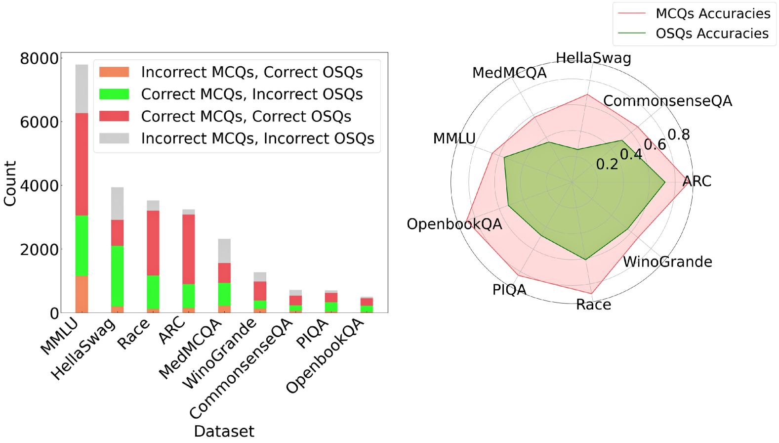
## Chart Type: Combined Bar and Radar Chart
### Overview
The image presents a combined visualization consisting of a stacked bar chart on the left and a radar chart on the right. The bar chart displays the counts of different combinations of correct/incorrect answers for MCQs (Multiple Choice Questions) and OSQs (Open-ended Short Questions) across various datasets. The radar chart compares the accuracies of MCQs and OSQs across the same datasets.
### Components/Axes
**Left: Stacked Bar Chart**
* **X-axis:** "Dataset" with categories: MMLU, HellaSwag, Race, ARC, MedMCQA, WinoGrande, CommonsenseQA, PIQA, OpenbookQA.
* **Y-axis:** "Count" ranging from 0 to 8000, with increments of 2000.
* **Legend (Top-Right of Bar Chart):**
* Orange: Incorrect MCQs, Correct OSQs
* Green: Correct MCQs, Incorrect OSQs
* Red: Correct MCQs, Correct OSQs
* Gray: Incorrect MCQs, Incorrect OSQs
**Right: Radar Chart**
* **Axes:** Radial axes represent the datasets: HellaSwag, CommonsenseQA, ARC, WinoGrande, Race, PIQA, OpenbookQA, MMLU, MedMCQA.
* **Scale:** Concentric circles indicate accuracy values from 0.2 to 0.8, with increments of 0.2.
* **Legend (Top-Right of Radar Chart):**
* Red Line/Area: MCQs Accuracies
* Green Line/Area: OSQs Accuracies
### Detailed Analysis
**Left: Stacked Bar Chart**
* **MMLU:**
* Incorrect MCQs, Correct OSQs (Orange): ~1200
* Correct MCQs, Incorrect OSQs (Green): ~1800
* Correct MCQs, Correct OSQs (Red): ~3300
* Incorrect MCQs, Incorrect OSQs (Gray): ~1500
* **HellaSwag:**
* Incorrect MCQs, Correct OSQs (Orange): ~200
* Correct MCQs, Incorrect OSQs (Green): ~2100
* Correct MCQs, Correct OSQs (Red): ~600
* Incorrect MCQs, Incorrect OSQs (Gray): ~1000
* **Race:**
* Incorrect MCQs, Correct OSQs (Orange): ~100
* Correct MCQs, Incorrect OSQs (Green): ~1100
* Correct MCQs, Correct OSQs (Red): ~1800
* Incorrect MCQs, Incorrect OSQs (Gray): ~500
* **ARC:**
* Incorrect MCQs, Correct OSQs (Orange): ~100
* Correct MCQs, Incorrect OSQs (Green): ~1200
* Correct MCQs, Correct OSQs (Red): ~1800
* Incorrect MCQs, Incorrect OSQs (Gray): ~300
* **MedMCQA:**
* Incorrect MCQs, Correct OSQs (Orange): ~50
* Correct MCQs, Incorrect OSQs (Green): ~400
* Correct MCQs, Correct OSQs (Red): ~1100
* Incorrect MCQs, Incorrect OSQs (Gray): ~800
* **WinoGrande:**
* Incorrect MCQs, Correct OSQs (Orange): ~50
* Correct MCQs, Incorrect OSQs (Green): ~500
* Correct MCQs, Correct OSQs (Red): ~400
* Incorrect MCQs, Incorrect OSQs (Gray): ~300
* **CommonsenseQA:**
* Incorrect MCQs, Correct OSQs (Orange): ~25
* Correct MCQs, Incorrect OSQs (Green): ~250
* Correct MCQs, Correct OSQs (Red): ~400
* Incorrect MCQs, Incorrect OSQs (Gray): ~100
* **PIQA:**
* Incorrect MCQs, Correct OSQs (Orange): ~25
* Correct MCQs, Incorrect OSQs (Green): ~150
* Correct MCQs, Correct OSQs (Red): ~200
* Incorrect MCQs, Incorrect OSQs (Gray): ~100
* **OpenbookQA:**
* Incorrect MCQs, Correct OSQs (Orange): ~25
* Correct MCQs, Incorrect OSQs (Green): ~100
* Correct MCQs, Correct OSQs (Red): ~150
* Incorrect MCQs, Incorrect OSQs (Gray): ~50
**Right: Radar Chart**
* **MCQs Accuracies (Red Area):** The red area represents the accuracy of MCQs across different datasets. The accuracy varies, with peaks at ARC and CommonsenseQA, and lower values at PIQA and OpenbookQA.
* HellaSwag: ~0.7
* CommonsenseQA: ~0.75
* ARC: ~0.75
* WinoGrande: ~0.6
* Race: ~0.6
* PIQA: ~0.5
* OpenbookQA: ~0.5
* MMLU: ~0.6
* MedMCQA: ~0.65
* **OSQs Accuracies (Green Area):** The green area represents the accuracy of OSQs across different datasets. The accuracy is generally lower than MCQs, with peaks at HellaSwag and CommonsenseQA.
* HellaSwag: ~0.5
* CommonsenseQA: ~0.5
* ARC: ~0.4
* WinoGrande: ~0.3
* Race: ~0.3
* PIQA: ~0.3
* OpenbookQA: ~0.3
* MMLU: ~0.4
* MedMCQA: ~0.45
### Key Observations
* The stacked bar chart shows the distribution of correct and incorrect answers for MCQs and OSQs across different datasets. MMLU has the highest overall count, while OpenbookQA has the lowest.
* The radar chart indicates that MCQs generally have higher accuracy than OSQs across all datasets.
* The difference in accuracy between MCQs and OSQs is most pronounced in datasets like ARC and WinoGrande.
### Interpretation
The combined chart provides insights into the performance of models on different question types (MCQs and OSQs) across various datasets. The stacked bar chart highlights the raw counts of correct and incorrect answers, while the radar chart normalizes these counts into accuracy scores, allowing for a direct comparison of MCQ and OSQ performance.
The data suggests that models generally perform better on MCQs than OSQs, possibly due to the constrained nature of multiple-choice questions. Datasets like MMLU, which have a high overall count but moderate accuracy in the radar chart, may be more challenging overall. The radar chart clearly shows the relative strengths and weaknesses of the models across different datasets and question types. The stacked bar chart shows the raw counts of each combination of correct/incorrect answers, which can be useful for understanding the types of errors the models are making.