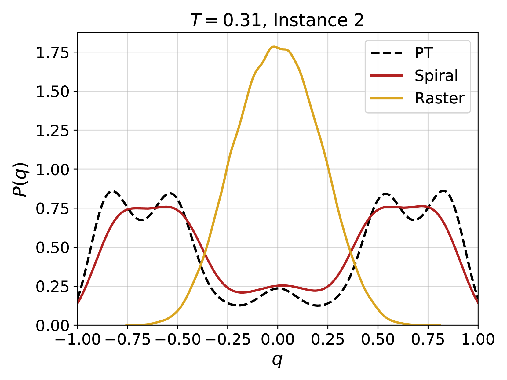
## Line Graph: Probability Distribution P(q) for Three Methods at T=0.31
### Overview
The image is a line graph comparing the probability distribution function \( P(q) \) across the variable \( q \) for three different methods or algorithms: PT, Spiral, and Raster. The chart is titled "T = 0.31, Instance 2," suggesting it is one instance from a series of experiments or simulations run at a parameter value T=0.31.
### Components/Axes
* **Title:** "T = 0.31, Instance 2" (centered at the top).
* **X-axis:** Labeled "q". The scale runs from -1.00 to 1.00, with major tick marks at intervals of 0.25 (-1.00, -0.75, -0.50, -0.25, 0.00, 0.25, 0.50, 0.75, 1.00).
* **Y-axis:** Labeled "P(q)". The scale runs from 0.00 to 1.75, with major tick marks at intervals of 0.25 (0.00, 0.25, 0.50, 0.75, 1.00, 1.25, 1.50, 1.75).
* **Legend:** Located in the top-right corner of the plot area. It contains three entries:
* `--- PT` (represented by a black dashed line)
* `— Spiral` (represented by a solid red line)
* `— Raster` (represented by a solid yellow/gold line)
* **Grid:** A light gray grid is present, aligned with the major tick marks on both axes.
### Detailed Analysis
The graph plots three distinct probability distributions. Below is an analysis of each data series, including its visual trend and approximate key data points.
**1. PT (Black Dashed Line)**
* **Trend:** This distribution is multi-modal and roughly symmetric around q=0. It exhibits four distinct peaks: two prominent outer peaks and two smaller inner peaks. The line oscillates, showing a complex structure.
* **Key Points (Approximate):**
* **Leftmost Peak:** Located at approximately q = -0.85, with P(q) ≈ 0.85.
* **Left Inner Peak:** Located at approximately q = -0.55, with P(q) ≈ 0.85.
* **Central Trough:** The lowest point between the inner peaks is at approximately q = -0.25, with P(q) ≈ 0.15.
* **Central Local Maximum:** A small peak at q = 0.00, with P(q) ≈ 0.25.
* **Right Inner Peak:** Located at approximately q = 0.55, with P(q) ≈ 0.85.
* **Rightmost Peak:** Located at approximately q = 0.85, with P(q) ≈ 0.85.
* The distribution approaches P(q) ≈ 0.15 at the boundaries q = -1.00 and q = 1.00.
**2. Spiral (Solid Red Line)**
* **Trend:** This distribution is also symmetric around q=0 but is smoother and less oscillatory than PT. It features two broad, dominant peaks on either side of the center and a shallow central trough.
* **Key Points (Approximate):**
* **Left Broad Peak:** The plateau spans roughly from q = -0.75 to q = -0.50, with a maximum P(q) ≈ 0.75.
* **Central Trough:** The minimum is at q = 0.00, with P(q) ≈ 0.25.
* **Right Broad Peak:** The plateau spans roughly from q = 0.50 to q = 0.75, with a maximum P(q) ≈ 0.75.
* The distribution approaches P(q) ≈ 0.15 at the boundaries q = -1.00 and q = 1.00.
**3. Raster (Solid Yellow/Gold Line)**
* **Trend:** This distribution is unimodal and sharply peaked, resembling a Gaussian or normal distribution centered at q=0. It is highly concentrated around the center and decays rapidly towards the boundaries.
* **Key Points (Approximate):**
* **Central Peak:** The maximum is at q = 0.00, with P(q) ≈ 1.78 (the highest value on the chart).
* **Width:** The distribution falls to half its maximum value (P(q) ≈ 0.89) at approximately q = ±0.20.
* **Boundaries:** The probability density is near zero (P(q) < 0.05) for |q| > 0.60.
### Key Observations
1. **Symmetry:** All three distributions appear symmetric about q=0.
2. **Concentration vs. Dispersion:** The Raster method produces a highly concentrated probability mass around q=0. In contrast, the PT and Spiral methods produce more dispersed distributions, with significant probability density across a wider range of q values, particularly in the regions |q| > 0.5.
3. **Structural Complexity:** The PT distribution shows the most complex structure with four clear peaks, suggesting it samples or represents the space in a more intricate, possibly discrete, manner compared to the smoother Spiral distribution.
4. **Shared Features:** The PT and Spiral distributions share similar boundary values and have peaks in similar regions (around |q| ≈ 0.5-0.85), though the PT peaks are sharper.
### Interpretation
This chart likely compares the performance or output of three different algorithms (PT, Spiral, Raster) for sampling from or approximating a target probability distribution over a variable \( q \), under a specific condition (T=0.31).
* The **Raster** method's sharp, central peak suggests it is highly efficient at concentrating samples or probability mass around the mode (q=0) of the underlying distribution. This could be desirable for optimization or finding the most likely state but may poorly represent the tails or alternative modes.
* The **Spiral** and **PT** methods produce broader, multi-modal distributions. This indicates they are exploring a wider region of the state space. The PT method's additional fine structure (the four peaks) might imply it is capturing more detailed features of a complex, possibly rugged, energy landscape or probability surface. The similarity between PT and Spiral suggests they may be related algorithms, with PT offering a higher-resolution or more discrete approximation.
* The parameter **T=0.31** is likely a temperature or similar control parameter. At this value, the Raster method is "cold" or focused, while the PT and Spiral methods maintain a "hotter," more exploratory behavior. The choice between methods would depend on the goal: exploitation (Raster) vs. exploration (PT/Spiral). The "Instance 2" label implies this is one of potentially many runs, and the distributions could vary with different random seeds or problem instances.