## Line Chart: Probability Distribution vs. q for T=0.31, Instance 2
### Overview
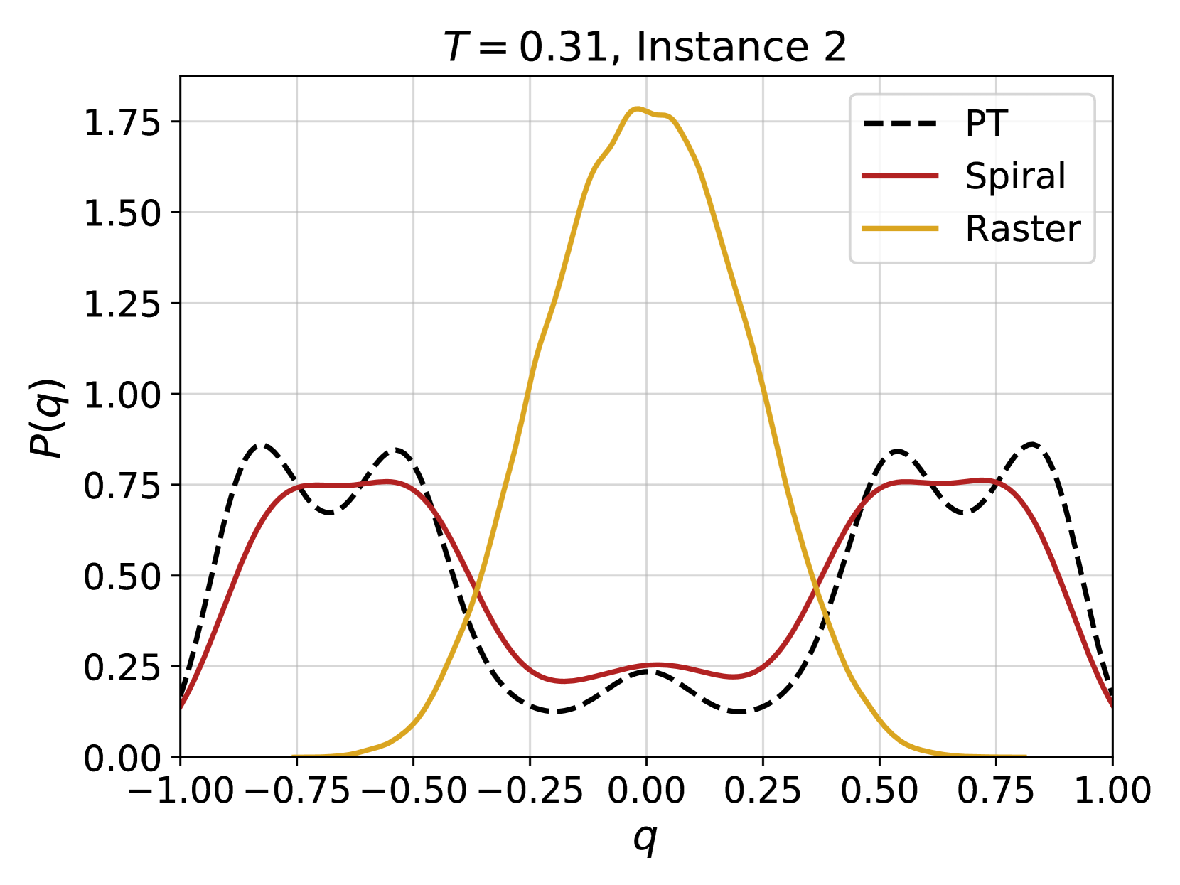
The image is a line chart comparing the probability distribution P(q) as a function of q for three different methods: PT (dashed black line), Spiral (solid red line), and Raster (solid gold line). The chart is titled "T = 0.31, Instance 2". The x-axis (q) ranges from -1.00 to 1.00, and the y-axis (P(q)) ranges from 0.00 to 1.75.
### Components/Axes
* **Title:** T = 0.31, Instance 2
* **X-axis:**
* Label: q
* Scale: -1.00, -0.75, -0.50, -0.25, 0.00, 0.25, 0.50, 0.75, 1.00
* **Y-axis:**
* Label: P(q)
* Scale: 0.00, 0.25, 0.50, 0.75, 1.00, 1.25, 1.50, 1.75
* **Legend:** Located in the top-right corner of the chart.
* PT: Dashed black line
* Spiral: Solid red line
* Raster: Solid gold line
### Detailed Analysis
* **PT (Dashed Black Line):** The PT line starts at approximately 0.2 at q = -1.00, rises to a peak of approximately 0.85 at q = -0.75, dips to approximately 0.7 at q = -0.5, dips again to approximately 0.2 at q = -0.25, rises to approximately 0.2 at q = 0.25, rises again to approximately 0.85 at q = 0.75, and falls back down to approximately 0.2 at q = 1.00. The trend is a double-peaked curve, symmetric around q = 0.
* **Spiral (Solid Red Line):** The Spiral line starts at approximately 0.2 at q = -1.00, rises to a peak of approximately 0.75 at q = -0.75, dips to approximately 0.25 at q = -0.25, remains at approximately 0.25 until q = 0.25, rises to approximately 0.75 at q = 0.75, and falls back down to approximately 0.2 at q = 1.00. The trend is a double-peaked curve, symmetric around q = 0.
* **Raster (Solid Gold Line):** The Raster line starts at approximately 0.0 at q = -1.00, remains at approximately 0.0 until q = -0.5, rises sharply to a peak of approximately 1.75 at q = 0.0, and falls sharply back down to approximately 0.0 at q = 0.5, and remains at approximately 0.0 until q = 1.00. The trend is a single peak centered around q = 0.
### Key Observations
* The Raster method exhibits a much higher peak probability around q = 0 compared to the PT and Spiral methods.
* The PT and Spiral methods show similar double-peaked distributions, with peaks around q = -0.75 and q = 0.75.
* All three methods converge to similar low probabilities at the extreme values of q (-1.00 and 1.00).
### Interpretation
The chart compares the probability distributions of q obtained using three different methods (PT, Spiral, and Raster) for a system at temperature T = 0.31 in Instance 2. The Raster method shows a strong preference for q values near 0, while the PT and Spiral methods indicate a higher probability for q values around -0.75 and 0.75. This suggests that the Raster method might be more sensitive to a specific state or configuration, while the PT and Spiral methods capture a broader range of possible states. The double peaks in the PT and Spiral distributions could indicate the presence of two distinct, equally probable states. The differences in the distributions highlight the impact of the chosen method on the observed probability distribution of q.