## Heatmap: KNorm Distribution by Context Length
### Overview
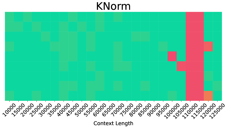
The image displays a heatmap titled "KNorm" visualizing the distribution of KNorm values across varying context lengths. The x-axis represents context lengths (10,000 to 125,000 in 5,000 increments), while the y-axis represents KNorm values (10,000 to 125,000). The heatmap uses a green-to-red gradient, with red indicating higher values and green lower values. A vertical red bar dominates the far-right region, and an orange cell appears at the bottom-right corner.
### Components/Axes
- **X-axis (Context Length)**: Labeled "Context Length," ranging from 10,000 to 125,000 in 5,000 increments.
- **Y-axis (KNorm)**: Labeled "KNorm," ranging from 10,000 to 125,000 in 5,000 increments.
- **Color Gradient**: Green (low values) to red (high values), with an orange cell at the lowest y-axis value (10,000) and highest x-axis value (125,000).
- **Legend**: Not explicitly visible; inferred from color gradient.
### Detailed Analysis
- **Vertical Red Bar**: A dense cluster of red cells spans the entire height of the heatmap at the far-right x-axis (125,000 context length), indicating consistently high KNorm values across all y-axis ranges.
- **Orange Cell**: A single orange cell is located at the intersection of the lowest y-axis value (10,000) and highest x-axis value (125,000), suggesting an extreme outlier or peak.
- **Red Squares**: Scattered red squares appear in the upper-right quadrant (x-axis: 100,000–125,000; y-axis: 100,000–125,000), indicating localized high KNorm values.
- **Green Dominance**: Most cells are green, particularly in the lower-left quadrant (x-axis: 10,000–50,000; y-axis: 10,000–50,000), showing low KNorm values.
### Key Observations
1. **High KNorm at Large Context Lengths**: The vertical red bar and red squares suggest KNorm values increase significantly at context lengths ≥100,000.
2. **Outlier at 125,000 Context Length**: The orange cell at (125,000, 10,000) deviates from the trend, potentially indicating an anomaly or measurement error.
3. **Low KNorm in Smaller Contexts**: The majority of green cells in the lower-left quadrant imply KNorm values remain low for context lengths ≤50,000.
### Interpretation
The heatmap demonstrates a strong correlation between context length and KNorm values, with KNorm increasing as context length grows. The vertical red bar at 125,000 context length suggests a threshold effect, where KNorm values become consistently high beyond this point. The orange cell at (125,000, 10,000) is puzzling, as it contradicts the trend of high KNorm at large context lengths—it may represent a data anomaly or a specific edge case. The red squares in the upper-right quadrant indicate that high KNorm values are not uniformly distributed but cluster in specific regions. This visualization highlights the need for further investigation into the factors driving KNorm spikes at extreme context lengths and the validity of the outlier at (125,000, 10,000).