## Scatter Plot: BLEU Score vs. Edit Distance with Distribution Shift
### Overview
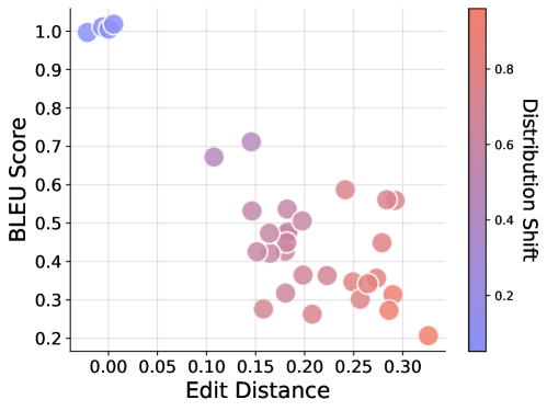
This image is a scatter plot visualizing the relationship between three variables: Edit Distance (x-axis), BLEU Score (y-axis), and Distribution Shift (color gradient). The plot contains approximately 30-35 data points, each represented by a semi-transparent circle. The overall trend suggests a negative correlation between Edit Distance and BLEU Score, with an additional relationship indicated by the color gradient.
### Components/Axes
* **X-Axis:**
* **Label:** "Edit Distance"
* **Scale:** Linear, ranging from 0.00 to 0.30.
* **Tick Marks:** 0.00, 0.05, 0.10, 0.15, 0.20, 0.25, 0.30.
* **Y-Axis:**
* **Label:** "BLEU Score"
* **Scale:** Linear, ranging from 0.2 to 1.0.
* **Tick Marks:** 0.2, 0.3, 0.4, 0.5, 0.6, 0.7, 0.8, 0.9, 1.0.
* **Color Bar (Legend):**
* **Position:** Right side of the chart, vertical.
* **Label:** "Distribution Shift"
* **Scale:** Linear, ranging from approximately 0.2 to 0.8.
* **Gradient:** Transitions from blue (low values, ~0.2) through purple to red (high values, ~0.8).
* **Tick Marks:** 0.2, 0.4, 0.6, 0.8.
* **Data Points:** Semi-transparent circles. Their position encodes Edit Distance (x) and BLEU Score (y). Their color encodes the Distribution Shift value according to the color bar.
### Detailed Analysis
**Spatial Grounding & Trend Verification:**
1. **Top-Left Cluster (Low Edit Distance, High BLEU):**
* **Position:** Concentrated near x=0.00, y=1.0.
* **Color:** Blue to light blue.
* **Estimated Values:** Edit Distance ≈ 0.00-0.02, BLEU Score ≈ 0.98-1.02, Distribution Shift ≈ 0.2-0.3.
* **Trend:** This cluster represents the best performance (highest BLEU, lowest Edit Distance) and the lowest Distribution Shift.
2. **Central & Right Scatter (Higher Edit Distance, Lower BLEU):**
* **Position:** Spread from x≈0.10 to x≈0.33, and y≈0.20 to y≈0.70.
* **Color:** Varies from purple to pink to red.
* **General Trend:** As we move from left to right (increasing Edit Distance), the points generally move downward (decreasing BLEU Score). Concurrently, the color shifts from purple towards red (increasing Distribution Shift).
* **Approximate Data Points (Grouped by visual clusters):**
* **Mid-Left (x≈0.10-0.15):** A few points with BLEU ≈ 0.65-0.70, colored purple (Distribution Shift ≈ 0.4-0.5).
* **Central Dense Cluster (x≈0.15-0.22):** Many points with BLEU scores between 0.25 and 0.55. Colors range from purple to pink (Distribution Shift ≈ 0.4-0.7).
* **Right Side (x≈0.22-0.33):** Points with BLEU scores mostly below 0.6, with several below 0.4. Colors are predominantly pink to red (Distribution Shift ≈ 0.6-0.8+). The point with the highest Edit Distance (~0.33) has a low BLEU score (~0.20) and is red (high Distribution Shift).
### Key Observations
1. **Strong Negative Correlation:** There is a clear inverse relationship between Edit Distance and BLEU Score. Points with low Edit Distance have high BLEU Scores, and vice-versa.
2. **Color Gradient Correlation:** The Distribution Shift (color) is strongly correlated with the other two metrics. Low Distribution Shift (blue) is associated with the optimal performance cluster (low Edit Distance, high BLEU). High Distribution Shift (red) is associated with poorer performance (higher Edit Distance, lower BLEU).
3. **Performance Degradation Path:** The data suggests a trajectory: as Distribution Shift increases, model performance degrades, manifesting as both higher Edit Distance and lower BLEU Score.
4. **Outliers:** There are a few points that slightly deviate from the main trend. For example, a purple point at approximately (x=0.15, y=0.70) has a relatively high BLEU score for its Edit Distance and Distribution Shift value.
### Interpretation
This chart likely evaluates the performance of a text generation or translation model under varying conditions. **BLEU Score** is a standard metric for evaluating machine-generated text against a reference, where higher is better. **Edit Distance** measures the amount of change needed to transform the generated text into the reference, where lower is better. **Distribution Shift** probably quantifies how much the input data distribution differs from the model's training distribution.
The data demonstrates that **distribution shift is a key factor in model performance degradation**. When the input data is very similar to the training data (low Distribution Shift, blue points), the model performs excellently (high BLEU, low Edit Distance). As the input data diverges from the training distribution (increasing Distribution Shift, moving to red), the model's outputs become less accurate (lower BLEU) and require more edits (higher Edit Distance). This visualization effectively argues that maintaining a low distribution shift is critical for reliable model performance, and it quantifies the cost of shift in terms of two complementary evaluation metrics. The tight clustering of the blue points suggests the model is highly consistent on in-distribution data, while the wider scatter of red points indicates more variable and generally worse performance on out-of-distribution data.