## Scatter Plot: BLEU Score vs. Edit Distance
### Overview
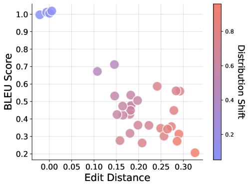
This image is a scatter plot visualizing the relationship between "Edit Distance" (x-axis) and "BLEU Score" (y-axis). The individual data points are colored according to a "Distribution Shift" scale, ranging from blue (low shift) to red (high shift). The plot illustrates an inverse correlation between the similarity of the generated text to the reference (Edit Distance) and the quality of the output (BLEU Score), while also highlighting how these metrics correlate with distribution shifts.
### Components/Axes
* **X-Axis:** Labeled "Edit Distance". The scale ranges from 0.00 to 0.30, with grid lines marked at 0.05 intervals.
* **Y-Axis:** Labeled "BLEU Score". The scale ranges from 0.2 to 1.0, with grid lines marked at 0.1 intervals.
* **Legend (Color Bar):** Located on the right side of the chart, labeled "Distribution Shift".
* **Blue:** Represents low distribution shift (approx. 0.1).
* **Red:** Represents high distribution shift (approx. 0.9).
* **Purple/Pink:** Represents intermediate values.
### Detailed Analysis
The data points are distributed into two distinct regions:
1. **The "High-Performance" Cluster (Top-Left):**
* **Position:** Located at the top-left corner of the chart.
* **Values:** Edit Distance is approximately 0.00 to 0.02; BLEU Score is approximately 1.0.
* **Color:** These points are blue, indicating a very low "Distribution Shift."
* **Trend:** This represents the ideal scenario where the generated text is nearly identical to the reference.
2. **The "Degraded-Performance" Cloud (Middle-Right):**
* **Position:** Spans the center to the bottom-right of the chart.
* **Values:** Edit Distance ranges from approximately 0.10 to 0.33; BLEU Score ranges from approximately 0.2 to 0.7.
* **Color:** These points transition from purple to red, indicating a moderate to high "Distribution Shift."
* **Trend:** As the Edit Distance increases (moving right), the BLEU Score generally decreases (moving down), and the Distribution Shift increases (shifting from purple to red).
3. **Notable Data Points:**
* **Highest Edit Distance:** A single point at approximately 0.33 Edit Distance and 0.2 BLEU Score. It is colored bright red, indicating the highest level of Distribution Shift in the dataset.
* **Highest BLEU in the dispersed cloud:** A point at approximately 0.15 Edit Distance and 0.7 BLEU Score, colored light purple.
### Key Observations
* **Inverse Correlation:** There is a clear negative correlation between Edit Distance and BLEU Score. As the Edit Distance increases, the BLEU Score drops.
* **Distribution Shift Correlation:** There is a strong positive correlation between "Distribution Shift" and "Edit Distance." Higher Edit Distance values are consistently associated with higher Distribution Shift values (redder colors).
* **Bifurcation:** The data is not a continuous gradient but rather bifurcated into a high-quality cluster (blue) and a lower-quality, higher-shift cloud (purple/red). This suggests a potential threshold where model performance degrades significantly.
### Interpretation
This chart likely represents the evaluation of a Natural Language Processing (NLP) model, such as a machine translation or text generation system.
* **What the data demonstrates:** The "Distribution Shift" acts as a proxy for how "out-of-distribution" the input data is compared to the model's training data. The plot demonstrates that when the model encounters data with a higher distribution shift, it produces outputs that are further from the reference (higher Edit Distance) and of lower quality (lower BLEU Score).
* **Why it matters:** This visualization is critical for diagnosing model robustness. It shows that the model is highly sensitive to distribution shifts. The distinct separation between the blue cluster and the red/purple cloud suggests that the model maintains high performance until a certain point, after which performance degrades rapidly as the distribution shift increases.
* **Reading between the lines:** The lack of data points in the "Top-Right" (High Edit Distance, High BLEU) and "Bottom-Left" (Low Edit Distance, Low BLEU) quadrants confirms that the metrics are logically consistent: you cannot have a high BLEU score (high similarity) with a high Edit Distance (high dissimilarity), nor a low BLEU score with a low Edit Distance. The "Distribution Shift" is the primary driver of the variance in performance.