## Scatter Plot: BLEU Score vs Edit Distance with Distribution Shift
### Overview
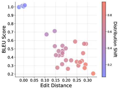
The image is a scatter plot visualizing the relationship between BLEU Score (y-axis) and Edit Distance (x-axis), with data points color-coded by Distribution Shift. The plot reveals clusters of data points in distinct regions, suggesting patterns in how these metrics interact.
### Components/Axes
- **X-axis (Edit Distance)**: Ranges from 0.00 to 0.30 in increments of 0.05. Represents the magnitude of textual edits.
- **Y-axis (BLEU Score)**: Ranges from 0.2 to 1.0 in increments of 0.1. Measures text similarity to a reference.
- **Legend (Distribution Shift)**: A vertical color gradient from blue (low shift, ~0.2) to red (high shift, ~0.8). Positioned on the right side of the plot.
- **Data Points**: Circular markers with varying opacity, sized uniformly. Colors correspond to the Distribution Shift legend.
### Detailed Analysis
1. **Top-Left Cluster (Blue Points)**:
- **Position**: X ≈ 0.00–0.05, Y ≈ 0.95–1.0.
- **Characteristics**: High BLEU Scores (~0.95–1.0) with minimal Edit Distance (~0.00–0.05). Colors are predominantly blue, indicating low Distribution Shift.
- **Interpretation**: These points represent near-identical text to the reference, with minimal edits and high similarity.
2. **Central Cluster (Purple Points)**:
- **Position**: X ≈ 0.15–0.25, Y ≈ 0.4–0.6.
- **Characteristics**: Moderate BLEU Scores (~0.4–0.6) and Edit Distances (~0.15–0.25). Colors transition from purple to red, indicating mid-to-high Distribution Shift.
- **Interpretation**: This cluster suggests a trade-off between edit magnitude and similarity, with moderate performance and noticeable distribution shifts.
3. **Bottom-Right Cluster (Red Points)**:
- **Position**: X ≈ 0.25–0.30, Y ≈ 0.2–0.4.
- **Characteristics**: Low BLEU Scores (~0.2–0.4) and high Edit Distances (~0.25–0.30). Colors are predominantly red, indicating high Distribution Shift.
- **Interpretation**: These points reflect significant textual alterations, leading to poor similarity and high distribution shifts.
4. **Diagonal Trend**:
- A faint diagonal band of purple-to-red points stretches from (X=0.15, Y=0.5) to (X=0.25, Y=0.4), suggesting a negative correlation between Edit Distance and BLEU Score as Distribution Shift increases.
### Key Observations
- **Outliers**: The blue cluster in the top-left is an outlier group with exceptionally high BLEU Scores and near-zero Edit Distance.
- **Trend**: As Edit Distance increases, BLEU Scores generally decrease, with a steeper decline observed in regions of higher Distribution Shift (redder points).
- **Color Consistency**: All data points align with the legend’s color gradient, confirming accurate spatial grounding.
### Interpretation
The plot demonstrates that **lower Edit Distance** (closer to the original text) correlates with **higher BLEU Scores**, indicating better performance. Conversely, **higher Edit Distance** (more extensive edits) leads to **lower BLEU Scores**, likely due to greater divergence from the reference. The **Distribution Shift** gradient (blue to red) reinforces this trend, showing that increased shift (redder points) exacerbates performance degradation. The central purple cluster highlights a transitional zone where moderate edits and shifts result in mid-range performance, suggesting a threshold effect. This analysis implies that models or systems generating text with minimal edits (blue cluster) perform best, while those introducing significant changes (red cluster) struggle, particularly under high distribution shifts.