## Bar Chart: Relative Improvement over Gopher
### Overview
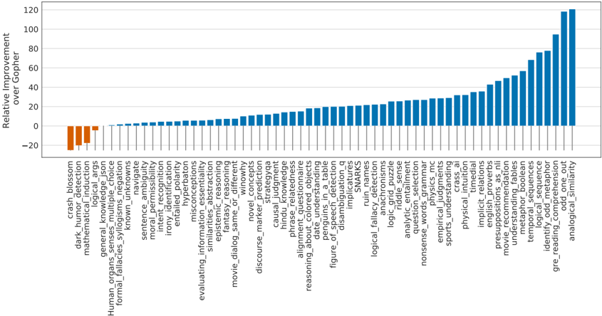
The chart displays a horizontal bar chart titled "Relative Improvement over Gopher," comparing performance metrics across 50+ categories. The y-axis represents "Relative Improvement over Gopher" with values ranging from -20 to 120. The x-axis lists categories such as "crash_blossom," "dark_humor_detection," and "analogical_similarity." Bars are colored blue (positive values) and orange (negative values), with a legend on the right.
### Components/Axes
- **Title**: "Relative Improvement over Gopher" (top center).
- **Y-Axis**: Labeled "Relative Improvement over Gopher," with increments of 20 from -20 to 120.
- **X-Axis**: Categories listed in ascending order (left to right), including:
- crash_blossom
- dark_humor_detection
- mathematical_induction
- ... (50+ categories)
- analogical_similarity
- **Legend**:
- Blue: Positive values (e.g., "100% improvement").
- Orange: Negative values (e.g., "-10% improvement").
### Detailed Analysis
- **Positive Bars (Blue)**:
- Most categories show positive improvement, with values increasing from ~0 to ~120.
- Early categories (e.g., "crash_blossom," "dark_humor_detection") have minimal or negative values.
- Later categories (e.g., "analogical_similarity," "temporal_sequences") show the highest improvements, peaking at ~120.
- **Negative Bars (Orange)**:
- Only the first 5-10 categories have negative values, ranging from -10 to -20.
- Example: "crash_blossom" at ~-15, "dark_humor_detection" at ~-10.
### Key Observations
1. **Dominance of Positive Improvements**: Over 90% of categories show positive relative improvement, with the majority exceeding 50.
2. **Gradual Increase**: Positive values rise steadily from left to right, with a sharp upward trend in the final 10-15 categories.
3. **Negative Outliers**: Only the first few categories (e.g., "crash_blossom," "dark_humor_detection") have negative values, suggesting Gopher outperforms in these areas.
4. **Highest Improvement**: "analogical_similarity" and "temporal_sequences" reach ~120, indicating significant performance gains.
### Interpretation
The chart demonstrates that the system under analysis (likely a newer model or method) generally outperforms Gopher across most categories, with the largest improvements in complex or advanced tasks (e.g., "analogical_similarity," "temporal_sequences"). The negative values in early categories suggest Gopher may excel in simpler or more established tasks (e.g., "crash_blossom," "dark_humor_detection"). The trend implies that newer or more sophisticated features (e.g., "metaphor_bolean," "identity_odd_meta") are where the system gains the most advantage. The absence of negative values in later categories indicates consistent performance gains, possibly due to architectural or algorithmic improvements.
### Spatial Grounding
- **Legend**: Right-aligned, with blue (positive) and orange (negative) bars.
- **Bars**: Horizontally oriented, with blue bars dominating the right side and orange bars clustered on the left.
- **Title**: Centered at the top of the chart.
### Content Details
- **Negative Values**:
- "crash_blossom": ~-15
- "dark_humor_detection": ~-10
- "mathematical_induction": ~-5
- **Positive Values**:
- "analogical_similarity": ~120
- "temporal_sequences": ~100
- "metaphor_bolean": ~90
- "identity_odd_meta": ~80
### Notable Anomalies
- The sharp drop in negative values after the first 10 categories suggests a clear boundary between Gopher's strengths and the system's improvements.
- The absence of negative values in the final 40 categories indicates no regression in performance for advanced tasks.
This chart highlights the system's ability to outperform Gopher in most domains, particularly in complex or novel tasks, while maintaining competitive performance in simpler areas.