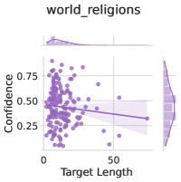
## Scatter Plot: world_religions
### Overview
The image is a scatter plot titled "world_religions" with a line of best fit and a shaded confidence interval. The x-axis represents "Target Length" (0–50), and the y-axis represents "Confidence" (0.25–0.75). Purple data points are scattered across the plot, with a downward-sloping line of best fit and a shaded region around it.
### Components/Axes
- **Title**: "world_religions" (top center).
- **X-axis**: "Target Length" (0–50, with ticks at 0, 10, 20, 30, 40, 50).
- **Y-axis**: "Confidence" (0.25–0.75, with ticks at 0.25, 0.5, 0.75).
- **Data Points**: Purple dots scattered across the plot.
- **Line of Best Fit**: A solid line sloping downward from (0, ~0.5) to (50, ~0.25).
- **Shaded Area**: A light purple region around the line of best fit, representing a confidence interval (exact bounds unspecified).
### Detailed Analysis
- **Data Points**: Approximately 20–30 purple dots are distributed across the plot. Most points cluster near the line of best fit, with some outliers below and above it.
- **Line of Best Fit**: The line starts at (0, ~0.5) and ends at (50, ~0.25), indicating a negative correlation between "Target Length" and "Confidence."
- **Shaded Area**: The shaded region spans the width of the plot, with its width varying slightly. It appears to represent a 95% confidence interval, though the exact calculation method is not specified.
### Key Observations
1. **Negative Correlation**: As "Target Length" increases, "Confidence" decreases. The line of best fit shows a consistent downward trend.
2. **Confidence Interval**: The shaded area widens slightly toward the ends of the plot (near 0 and 50), suggesting greater uncertainty at extreme target lengths.
3. **Data Distribution**: Data points are more concentrated near the line of best fit, with some variability. A few points deviate significantly (e.g., one point near (10, 0.75) and another near (40, 0.3)).
4. **Axis Ranges**: The x-axis spans 0–50, and the y-axis spans 0.25–0.75. No data points fall outside these ranges.
### Interpretation
The plot suggests that longer target lengths are associated with lower confidence in the "world_religions" dataset. The line of best fit quantifies this relationship, while the shaded confidence interval highlights the uncertainty in the trend. The widening of the shaded area at the extremes implies that predictions or measurements for very short or very long target lengths are less reliable. The scatter of data points indicates variability in the relationship, which could stem from factors like data quality, measurement methods, or inherent complexity in the "world_religions" dataset. The absence of a legend for the line of best fit or shaded area limits interpretability, but the visual cues (color, slope, and shading) are consistent with standard statistical practices.