## Line Chart: Epsilon Opt vs. Alpha
### Overview
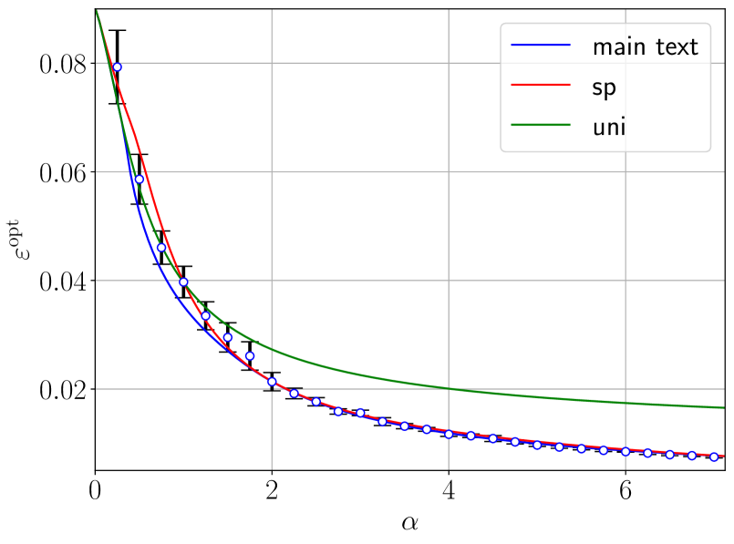
The image is a line chart comparing the relationship between epsilon optimal (εopt) and alpha (α) for three different scenarios: "main text", "sp", and "uni". The chart displays data points with error bars and fitted lines for each scenario. The x-axis represents alpha (α), and the y-axis represents epsilon optimal (εopt).
### Components/Axes
* **X-axis:**
* Label: α
* Scale: 0 to approximately 7
* Markers: 0, 2, 4, 6
* **Y-axis:**
* Label: εopt
* Scale: 0 to approximately 0.09
* Markers: 0, 0.02, 0.04, 0.06, 0.08
* **Legend (Top-Right):**
* "main text" - Blue line
* "sp" - Red line
* "uni" - Green line
### Detailed Analysis
* **"main text" (Blue):**
* Trend: Decreases rapidly from α = 0 to α = 2, then decreases more gradually.
* Data Points:
* α = 0, εopt ≈ 0.08 (with error bars extending from approximately 0.075 to 0.085)
* α = 1, εopt ≈ 0.045 (with error bars extending from approximately 0.04 to 0.05)
* α = 2, εopt ≈ 0.025 (with error bars extending from approximately 0.02 to 0.03)
* α = 3, εopt ≈ 0.015
* α = 4, εopt ≈ 0.01
* α = 5, εopt ≈ 0.008
* α = 6, εopt ≈ 0.006
* **"sp" (Red):**
* Trend: Decreases rapidly from α = 0 to α = 2, then decreases more gradually, closely following the "main text" line.
* Data Points:
* α = 0, εopt ≈ 0.078
* α = 1, εopt ≈ 0.04
* α = 2, εopt ≈ 0.02
* α = 3, εopt ≈ 0.015
* α = 4, εopt ≈ 0.01
* α = 5, εopt ≈ 0.008
* α = 6, εopt ≈ 0.006
* **"uni" (Green):**
* Trend: Decreases from α = 0 to α = 7, but at a slower rate compared to "main text" and "sp".
* Data Points:
* α = 0, εopt ≈ 0.08
* α = 1, εopt ≈ 0.05
* α = 2, εopt ≈ 0.03
* α = 3, εopt ≈ 0.023
* α = 4, εopt ≈ 0.02
* α = 5, εopt ≈ 0.018
* α = 6, εopt ≈ 0.016
### Key Observations
* The "main text" and "sp" lines are very close to each other, indicating similar behavior between these two scenarios.
* The "uni" line decreases at a slower rate compared to the other two, suggesting a different relationship between alpha and epsilon optimal.
* Error bars are present on the "main text" data points, indicating the uncertainty associated with those measurements.
* All three lines converge towards a similar value of epsilon optimal as alpha increases.
### Interpretation
The chart illustrates how epsilon optimal (εopt) changes with respect to alpha (α) under three different conditions ("main text", "sp", and "uni"). The "main text" and "sp" scenarios exhibit a similar inverse relationship, where εopt decreases sharply as α increases initially, then levels off. The "uni" scenario also shows an inverse relationship, but the decrease in εopt is less pronounced. This suggests that the "uni" condition is less sensitive to changes in alpha compared to the other two. The error bars on the "main text" data points provide a measure of the variability or uncertainty in those measurements. The convergence of all three lines at higher alpha values indicates that the differences between the scenarios become less significant as alpha increases.