TECHNICAL ASSET FINGERPRINT
38834aedb0a703735baf3fca
Click to view fullscreen
Press ESC or click to close
FOUND IN PAPERS
EXPERT: gemini-2.0-flash VERSION 1
RUNTIME: nugit/gemini/gemini-2.0-flash
INTEL_VERIFIED
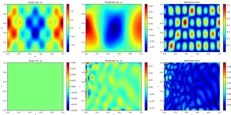
## Heatmap Comparison: Exact vs. Predicted Solutions and Absolute Error
### Overview
The image presents a comparison between exact and predicted solutions for two functions, u(t, x) and r(t, x), along with their absolute errors. The data is visualized using heatmaps, where color intensity represents the function's value at different points. The x and y axes represent spatial or temporal dimensions.
### Components/Axes
**Top Row:**
* **Left:** "Exact u(t, x)" - Heatmap of the exact solution for function u(t, x).
* X-axis: x1, ranging from 0.0 to 1.0
* Y-axis: x2, ranging from 0.0 to 1.0
* Color scale: Ranges from approximately -1.0 (dark blue) to 1.0 (red).
* **Center:** "Predicted u(t, x)" - Heatmap of the predicted solution for function u(t, x).
* X-axis: t, ranging from 0.0 to 1.0
* Y-axis: x, ranging from 0.0 to 1.0
* Color scale: Ranges from approximately -0.75 (dark blue) to 1.0 (red).
* **Right:** "Absolute error" - Heatmap of the absolute error between the exact and predicted solutions for u(t, x).
* X-axis: t, ranging from 0.0 to 1.0
* Y-axis: x, ranging from 0.0 to 1.0
* Color scale: Ranges from approximately 0.0 (dark blue) to 0.7 (red).
**Bottom Row:**
* **Left:** "Exact r(t, x)" - Heatmap of the exact solution for function r(t, x).
* X-axis: t, ranging from 0.0 to 1.0
* Y-axis: x, ranging from 0.0 to 1.0
* Color scale: Ranges from approximately -0.1 (dark blue) to 0.1 (red). The entire plot is predominantly green, indicating values close to 0.
* **Center:** "Predicted r(t, x)" - Heatmap of the predicted solution for function r(t, x).
* X-axis: t, ranging from 0.0 to 1.0
* Y-axis: x, ranging from 0.0 to 1.0
* Color scale: Ranges from approximately -0.15 (dark blue) to 0.15 (red).
* **Right:** "Absolute error" - Heatmap of the absolute error between the exact and predicted solutions for r(t, x).
* X-axis: t, ranging from 0.0 to 1.0
* Y-axis: x, ranging from 0.0 to 1.0
* Color scale: Ranges from approximately 0.0 (dark blue) to 0.16 (red).
### Detailed Analysis
**Exact u(t, x):**
The heatmap shows a complex pattern with alternating regions of high (red) and low (blue) values. There are several distinct "blobs" of high and low values distributed across the space.
**Predicted u(t, x):**
The predicted solution shows a smoother pattern compared to the exact solution. There's a large blue region in the center, flanked by red regions on the sides.
**Absolute error (u(t, x)):**
The absolute error heatmap shows a repeating pattern of high and low error regions. The error appears to be higher in areas where the exact solution has sharp transitions.
**Exact r(t, x):**
The exact solution for r(t, x) is almost uniformly green, indicating a value close to zero across the entire domain.
**Predicted r(t, x):**
The predicted solution for r(t, x) shows more variation than the exact solution, with a mix of blue, green, and yellow regions.
**Absolute error (r(t, x)):**
The absolute error for r(t, x) is generally low, but there are some regions of higher error, particularly near the boundaries.
### Key Observations
* The predicted solution for u(t, x) captures the general shape of the exact solution but misses some of the finer details.
* The absolute error for u(t, x) is significant in some regions, indicating that the prediction is not perfect.
* The exact solution for r(t, x) is close to zero, while the predicted solution shows some deviation.
* The absolute error for r(t, x) is generally low, but there are some areas where the error is higher.
### Interpretation
The heatmaps provide a visual comparison of the exact and predicted solutions for two functions, u(t, x) and r(t, x). The absolute error heatmaps highlight the regions where the predictions deviate most from the exact solutions. The results suggest that the prediction model performs reasonably well for u(t, x), capturing the overall pattern but missing some details. For r(t, x), the exact solution is close to zero, and the prediction introduces some noise, resulting in a small but non-zero error. The higher error near the boundaries in the "Absolute error (r(t, x))" plot might indicate boundary condition issues in the prediction model.
DECODING INTELLIGENCE...
EXPERT: gemma-3-27b-it-free VERSION 1
RUNTIME: google-free/gemma-3-27b-it
INTEL_VERIFIED
\n
## Heatmaps: Comparison of Exact, Predicted, and Error Values
### Overview
The image presents six heatmaps arranged in a 2x3 grid. Each heatmap visualizes a two-dimensional function, likely representing a time-dependent variable 't' against a spatial coordinate 'x'. The heatmaps compare the "Exact" function, a "Predicted" function, and the "Absolute Error" between the two. There are two sets of comparisons, one with a larger scale and one with a smaller scale.
### Components/Axes
Each heatmap shares the following components:
* **X-axis:** Labeled as 'x', ranging from approximately 0.0 to 1.0.
* **Y-axis:** Labeled as 't', ranging from approximately 0.0 to 1.0.
* **Colorbar:** Each heatmap has a colorbar on the right side indicating the value corresponding to each color. The colorbars have different scales for each heatmap.
The heatmaps are organized as follows:
1. Top-Left: "Exact u(t, x)" - Colorbar ranges from approximately -1.0 to 1.0.
2. Top-Center: "Predicted u(t, x)" - Colorbar ranges from approximately -0.75 to 0.75.
3. Top-Right: "Absolute error" - Colorbar ranges from approximately 0.0 to 0.3.
4. Bottom-Left: "Exact r(t, x)" - Colorbar ranges from approximately -0.075 to 0.075.
5. Bottom-Center: "Predicted r(t, x)" - Colorbar ranges from approximately -0.15 to 0.15.
6. Bottom-Right: "Absolute error" - Colorbar ranges from approximately 0.0 to 0.16.
### Detailed Analysis or Content Details
**Top Row:**
* **Exact u(t, x):** Shows a pattern of alternating positive and negative regions, forming roughly circular or elliptical shapes. The maximum positive values are around 1.0, and the maximum negative values are around -1.0. The pattern is periodic in both 't' and 'x'.
* **Predicted u(t, x):** Displays a similar pattern to the "Exact" function, but with reduced amplitude. The maximum positive values are around 0.75, and the maximum negative values are around -0.75. The predicted values appear smoothed compared to the exact values.
* **Absolute Error:** Shows the difference between the "Exact" and "Predicted" functions. The error is concentrated in the regions where the "Exact" function has high amplitude. The maximum error is around 0.3. The error pattern mirrors the periodic structure of the original functions.
**Bottom Row:**
* **Exact r(t, x):** Shows a relatively flat green surface with small variations. The values are centered around 0.0, with a range of approximately -0.075 to 0.075.
* **Predicted r(t, x):** Displays a similar pattern to the "Exact" function, but with more pronounced variations. The values range from approximately -0.15 to 0.15.
* **Absolute Error:** Shows the difference between the "Exact" and "Predicted" functions. The error is more significant than in the top row, with a maximum error of around 0.16. The error pattern is more complex and less periodic than the top row.
### Key Observations
* The "Predicted" functions generally follow the pattern of the "Exact" functions, but with reduced amplitude in the top row and increased variation in the bottom row.
* The "Absolute Error" is highest in the regions where the "Exact" function has the largest variations.
* The error in the bottom row is significantly higher than in the top row, suggesting that the prediction is less accurate for the 'r' function compared to the 'u' function.
* The color scales are different for each heatmap, indicating that the functions have different ranges of values.
### Interpretation
The image demonstrates a comparison between an exact solution and a predicted solution for two functions, 'u(t, x)' and 'r(t, x)'. The heatmaps visualize the accuracy of the prediction by showing the absolute error between the exact and predicted values.
The top row suggests a relatively accurate prediction for 'u(t, x)', with a small error concentrated in regions of high variation. The bottom row indicates a less accurate prediction for 'r(t, x)', with a larger and more complex error pattern.
The differences in error levels between the two functions could be due to several factors, such as the complexity of the functions, the quality of the prediction model, or the limitations of the numerical methods used to solve the equations. The image provides a visual representation of the prediction accuracy and highlights areas where the prediction model could be improved. The functions 'u' and 'r' may represent different physical quantities or different stages in a simulation, and the varying prediction accuracy could have implications for the overall reliability of the results.
DECODING INTELLIGENCE...
EXPERT: healer-alpha-free VERSION 1
RUNTIME: free/openrouter/healer-alpha
INTEL_VERIFIED
## Heatmap Grid: Comparison of Exact vs. Predicted Solutions for u(t, x) and r(t, x)
### Overview
The image displays a 2x3 grid of six heatmap plots. The top row compares the exact and predicted solutions for a function `u(t, x)`, along with the absolute error between them. The bottom row does the same for a function `r(t, x)`. Each plot is a 2D color map over a domain where both axes range from 0.0 to 1.0. The plots are titled and include color bars to indicate the scale of the plotted values.
### Components/Axes
* **Grid Layout**: Two rows, three columns.
* **Row 1 (Top)**:
* **Plot 1 (Top-Left)**: Title: "Exact u(t, x)". X-axis label: "t". Y-axis label: "x". Both axes have tick marks at 0.0, 0.2, 0.4, 0.6, 0.8, 1.0.
* **Plot 2 (Top-Center)**: Title: "Predicted u(t, x)". X-axis label: "t". Y-axis label: "x". Axis ticks identical to Plot 1.
* **Plot 3 (Top-Right)**: Title: "Absolute error". X-axis label: "t". Y-axis label: "x". Axis ticks identical to Plot 1.
* **Row 2 (Bottom)**:
* **Plot 4 (Bottom-Left)**: Title: "Exact r(t, x)". X-axis label: "t". Y-axis label: "x". Axis ticks identical to Plot 1.
* **Plot 5 (Bottom-Center)**: Title: "Predicted r(t, x)". X-axis label: "t". Y-axis label: "x". Axis ticks identical to Plot 1.
* **Plot 6 (Bottom-Right)**: Title: "Absolute error". X-axis label: "t". Y-axis label: "x". Axis ticks identical to Plot 1.
* **Color Bars**: Each plot has a vertical color bar to its right.
* **Plot 1 (Exact u)**: Scale from -1.0 (dark blue) to 1.0 (dark red). Ticks at -1.0, -0.75, -0.5, -0.25, 0.0, 0.25, 0.5, 0.75, 1.0.
* **Plot 2 (Predicted u)**: Scale from -0.75 (dark blue) to 1.00 (dark red). Ticks at -0.75, -0.50, -0.25, 0.00, 0.25, 0.50, 0.75, 1.00.
* **Plot 3 (Error u)**: Scale from 0.0 (dark blue) to 0.7 (dark red). Ticks at 0.0, 0.1, 0.2, 0.3, 0.4, 0.5, 0.6, 0.7.
* **Plot 4 (Exact r)**: Scale from -0.100 (dark blue) to 0.100 (dark red). Ticks at -0.100, -0.075, -0.050, -0.025, 0.000, 0.025, 0.050, 0.075, 0.100.
* **Plot 5 (Predicted r)**: Scale from -0.15 (dark blue) to 0.15 (dark red). Ticks at -0.15, -0.10, -0.05, 0.00, 0.05, 0.10, 0.15.
* **Plot 6 (Error r)**: Scale from 0.00 (dark blue) to 0.16 (dark red). Ticks at 0.00, 0.02, 0.04, 0.06, 0.08, 0.10, 0.12, 0.14, 0.16.
### Detailed Analysis
**Row 1: Analysis of u(t, x)**
* **Exact u(t, x)**: Shows a highly symmetric, periodic pattern. High values (red, ~1.0) are concentrated in the four corners of the domain (t≈0 or 1, x≈0 or 1). Low values (blue, ~-1.0) form a central cross shape, with minima along the lines t=0.5 and x=0.5. Intermediate values (yellow/green) form a grid-like pattern between the extremes.
* **Predicted u(t, x)**: Captures the broad, large-scale structure of the exact solution. It shows high values (red) at the left (t≈0) and right (t≈1) edges and low values (blue) in a central vertical band (t≈0.5). However, it fails to reproduce the fine-grained, high-frequency periodic oscillations seen in the exact solution. The pattern is much smoother.
* **Absolute Error (u)**: The error plot reveals a distinct, high-frequency checkerboard pattern. The largest errors (red, up to ~0.7) occur in a regular grid, corresponding to locations where the exact solution has its peaks and troughs that the smooth prediction misses. The error is lowest (blue, ~0.0) along the central vertical band (t≈0.5) and in broad regions between the error peaks.
**Row 2: Analysis of r(t, x)**
* **Exact r(t, x)**: Appears as a uniform, solid light green color across the entire domain. Based on the color bar, this corresponds to a constant value of approximately 0.0 (midpoint of the -0.1 to 0.1 scale).
* **Predicted r(t, x)**: Shows a noisy, textured pattern with values ranging roughly between -0.15 and 0.15. There is no clear large-scale structure resembling the constant exact solution. The pattern appears somewhat random or high-frequency.
* **Absolute Error (r)**: The error is widespread and textured, mirroring the noise in the prediction. Errors are generally low (dark blue, ~0.00-0.04) but have a speckled appearance. There are localized regions of higher error (light blue/cyan, up to ~0.10-0.12), particularly in the top-left quadrant and along some curved, wave-like features in the bottom-right quadrant.
### Key Observations
1. **Model Performance Disparity**: The predictive model performs significantly better on the `u(t, x)` variable than on the `r(t, x)` variable. For `u`, it captures the macro-structure but misses micro-structure. For `r`, it fails to capture the fundamental constant nature of the exact solution.
2. **Error Patterns**: The error for `u` is systematic and structured (a perfect checkerboard), indicating a specific, recurring failure mode (likely an inability to model high frequencies). The error for `r` is more stochastic and widespread.
3. **Scale Differences**: The magnitude of `u` (range ~[-1, 1]) is an order of magnitude larger than that of `r` (range ~[-0.1, 0.1]). The prediction errors for `u` (max ~0.7) are also larger in absolute terms than for `r` (max ~0.16).
4. **Exact Solution Simplicity**: The exact `r(t, x)` is trivially constant, making the model's failure to predict it particularly notable.
### Interpretation
This image likely comes from a study evaluating a machine learning model (e.g., a neural network) designed to solve or approximate partial differential equations (PDEs). The functions `u(t, x)` and `r(t, x)` are probably components of a PDE system.
* **What the data suggests**: The model has learned the low-frequency, dominant spatial-temporal patterns of the primary variable `u` but is band-limited, acting as a low-pass filter that smooths out high-frequency details. This is a common phenomenon in neural network-based PDE solvers. The complete failure on the seemingly simple `r(t, x)` is critical. It suggests either:
* The training data or loss function did not adequately constrain the model for this component.
* The model architecture is ill-suited to represent a constant field amidst a noisy optimization landscape.
* The variable `r` might represent a source term, constraint, or auxiliary variable that is numerically small and thus difficult for the model to prioritize during training.
* **Relationship between elements**: The top row demonstrates a "partial success" case, while the bottom row demonstrates a "failure" case. Together, they provide a diagnostic view of the model's capabilities and limitations. The error plots are not just metrics but visualizations of the *structure* of the model's failure, which is more informative than a single scalar error value.
* **Notable Anomalies**: The most striking anomaly is the prediction for `r(t, x)`. The exact solution is a flat plane, yet the prediction is a noisy field. This indicates a fundamental issue in the modeling approach for that specific variable, which could undermine the physical validity of the entire solution if `r` is a physically meaningful quantity (e.g., a reaction rate, a density). The structured error in `u` is also an anomaly in the sense that it is perfectly periodic, suggesting the underlying exact solution might be a known analytical function (like a combination of sine/cosine waves) that the model's basis functions cannot fully represent.
DECODING INTELLIGENCE...
EXPERT: nemotron-free VERSION 1
RUNTIME: free/nvidia/nemotron-nano-12b-v2-vl:free
INTEL_VERIFIED
## Heatmap Grid: Model Performance Visualization
### Overview
The image presents a 2x3 grid of heatmaps comparing exact solutions, model predictions, and absolute errors for two variables: `u(t, x)` (top row) and `r(t, x)` (bottom row). Each panel uses a color-coded scale to represent values, with spatial axes `x` (0-1) and `t` (0-1).
---
### Components/Axes
1. **Top Row (`u(t, x)`):**
- **Left Panel (Exact u(t, x)):**
- Color scale: -1.0 (blue) to 1.0 (red)
- Pattern: Alternating red/blue checkerboard with yellow/orange gradients
- **Center Panel (Predicted u(t, x)):**
- Color scale: -0.75 (blue) to 0.75 (red)
- Pattern: Central dark blue region surrounded by red/yellow gradients
- **Right Panel (Absolute Error):**
- Color scale: 0.0 (blue) to 0.7 (red)
- Pattern: Grid-like distribution of red/yellow spots
2. **Bottom Row (`r(t, x)`):**
- **Left Panel (Exact r(t, x)):**
- Uniform green background (value ≈ 0.0)
- **Center Panel (Predicted r(t, x)):**
- Color scale: -0.15 (blue) to 0.15 (red)
- Pattern: Diagonal gradient from blue (bottom-left) to red (top-right)
- **Right Panel (Absolute Error):**
- Color scale: 0.0 (blue) to 0.16 (red)
- Pattern: Scattered red/yellow spots with no clear structure
---
### Detailed Analysis
1. **Top Row (`u(t, x)`):**
- **Exact Solution:**
- Shows a spatially periodic pattern with alternating high/low values.
- Peaks (red) and troughs (blue) form a 3x3 grid structure.
- **Predicted Solution:**
- Central trough (dark blue) matches the exact solution's center.
- Outer regions overestimate (red) compared to exact solution.
- **Absolute Error:**
- High errors (red) align with the exact solution's peaks/troughs.
- Systematic grid-like error distribution suggests model bias at specific `x,t` coordinates.
2. **Bottom Row (`r(t, x)`):**
- **Exact Solution:**
- Uniform value ≈ 0.0 (green background).
- **Predicted Solution:**
- Linear gradient from blue (-0.15) to red (0.15) across `x`.
- No clear correlation with exact solution's uniformity.
- **Absolute Error:**
- Errors concentrated in diagonal bands (bottom-left to top-right).
- Random distribution suggests model struggles with capturing constant values.
---
### Key Observations
1. **Systematic Errors in `u(t, x)`:**
- Model predictions exhibit a 3x3 grid of high errors matching the exact solution's peaks/troughs.
- Suggests model fails to resolve fine spatial oscillations.
2. **Gradient Approximation in `r(t, x)`:**
- Predicted `r(t, x)` shows a linear gradient despite exact solution being uniform.
- Indicates model introduces artificial spatial variation.
3. **Error Distribution:**
- `u(t, x)` errors are spatially structured (grid-like).
- `r(t, x)` errors are spatially random (diagonal bands).
---
### Interpretation
1. **Model Behavior:**
- The model captures the general structure of `u(t, x)` but introduces systematic errors at critical points.
- For `r(t, x)`, the model fails to preserve the exact solution's uniformity, instead imposing a spurious gradient.
2. **Error Analysis:**
- The grid-like error pattern in `u(t, x)` suggests the model's limitations in resolving high-frequency spatial features.
- The diagonal error bands in `r(t, x)` may indicate numerical instability or improper regularization.
3. **Practical Implications:**
- The model requires refinement to reduce localized errors in `u(t, x)`.
- For `r(t, x)`, the model's inability to maintain constant values suggests potential issues with boundary conditions or solver stability.
---
### Spatial Grounding & Color Verification
- **Legend Consistency:**
- Red in `u(t, x)` panels corresponds to values > 0.5 (confirmed via colorbar).
- Blue in `r(t, x)` panels matches values < -0.05 (colorbar scale).
- **Axis Alignment:**
- All panels share identical `x` (horizontal) and `t` (vertical) axes (0-1).
- Error panels align spatially with their respective Exact/Predicted panels.
---
### Conclusion
The visualization reveals critical model limitations: systematic errors in high-gradient regions (`u(t, x)`) and failure to preserve constant values (`r(t, x)`). These findings highlight the need for improved spatial resolution and regularization in the predictive model.
DECODING INTELLIGENCE...