\n
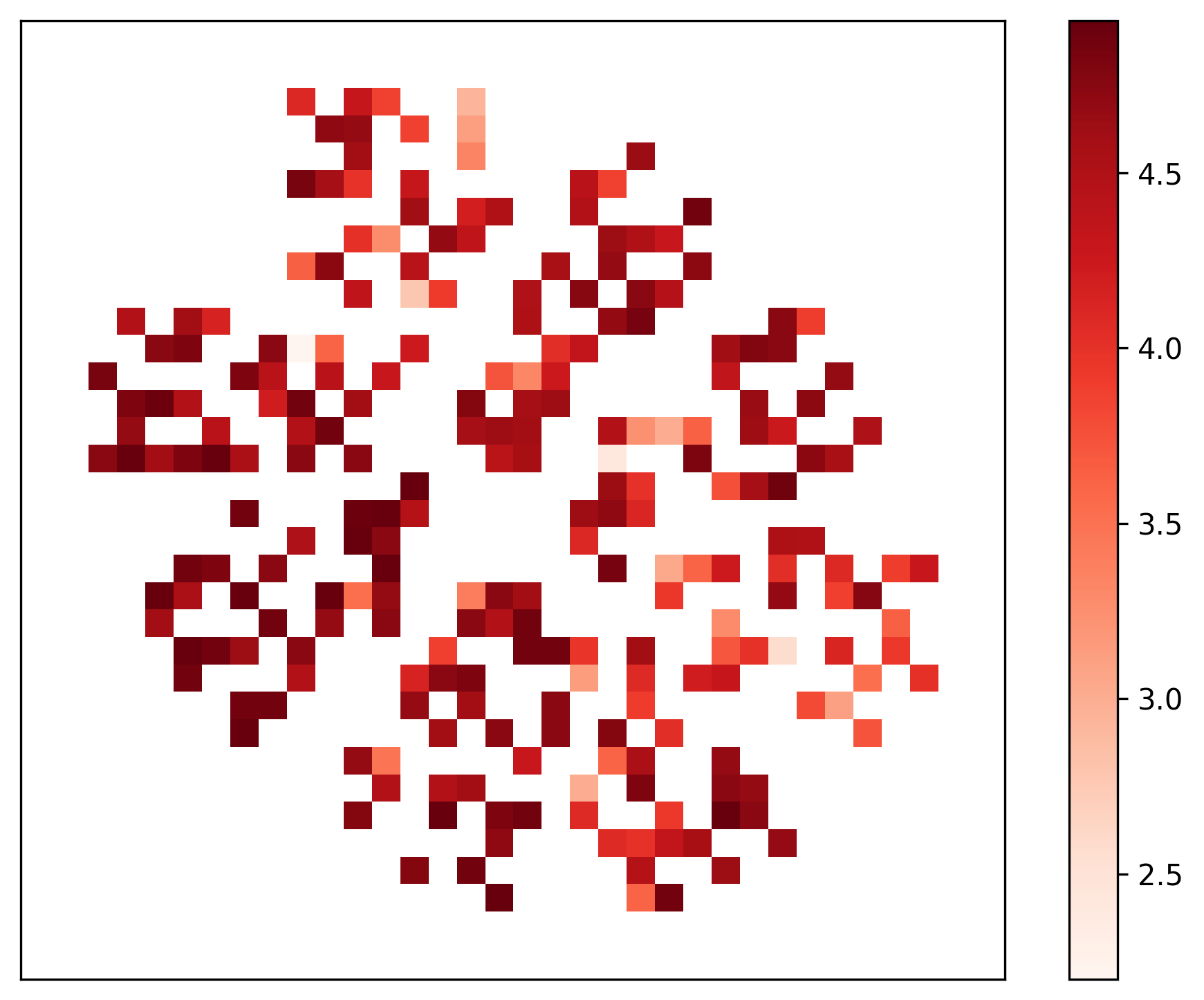
## Heatmap: Unlabeled Data Distribution
### Overview
The image presents a heatmap displaying a two-dimensional distribution of values. The data is represented using a color gradient, ranging from a light beige/white color to a dark red color. The heatmap appears to be arranged in a roughly circular or snowflake-like pattern, with varying concentrations of darker red shades. There are no explicit axis labels or titles.
### Components/Axes
The image consists of a heatmap grid and a vertical colorbar legend positioned on the right side.
* **Colorbar Legend:** The colorbar ranges from approximately 2.5 to 4.5, with the following approximate values:
* 2.5 (Light Beige/White)
* 3.0 (Medium Red)
* 3.5 (Darker Red)
* 4.0 (Very Dark Red)
* 4.5 (Deepest Red)
* **Heatmap Grid:** The grid is composed of square cells, each representing a data point. The color of each cell corresponds to its value according to the colorbar legend. The grid is approximately 30x30 cells.
### Detailed Analysis
The heatmap displays a distribution of values with a clear pattern. The highest values (darkest red) are concentrated in several areas, forming a roughly circular shape. The lowest values (lightest beige) are scattered throughout, but are more prevalent in the outer regions of the circular pattern.
Due to the lack of axis labels, it's impossible to determine the meaning of the x and y coordinates. However, we can analyze the color distribution within the grid:
* **Central Region:** The center of the circular pattern contains a mix of medium and dark red cells, indicating values between approximately 3.0 and 4.0.
* **Outer Regions:** The outer regions of the circular pattern are dominated by lighter red and beige cells, indicating values between approximately 2.5 and 3.5.
* **Concentrated Areas:** Several distinct areas within the circular pattern exhibit high concentrations of dark red cells, suggesting localized peaks in the data. These areas are not uniformly distributed.
* **Sparse Areas:** There are also areas with sparse dark red cells, indicating lower values or a less dense distribution.
It is difficult to provide precise numerical values for each cell without a higher-resolution image or access to the underlying data. However, based on the color gradient, we can estimate the following:
* Approximately 10% of the cells have values above 4.0.
* Approximately 30% of the cells have values between 3.5 and 4.0.
* Approximately 40% of the cells have values between 3.0 and 3.5.
* Approximately 20% of the cells have values below 3.0.
### Key Observations
* The data is not uniformly distributed.
* There is a clear circular or snowflake-like pattern in the data distribution.
* The highest values are concentrated in specific areas within the pattern.
* The lowest values are more prevalent in the outer regions.
* The data exhibits a degree of clustering.
### Interpretation
The heatmap suggests a correlation between the two dimensions represented by the grid. The circular pattern indicates that values tend to cluster around a central point, with a decreasing intensity as you move away from the center. This could represent a variety of phenomena, depending on the context of the data. For example, it could represent:
* **Spatial Distribution:** The distribution of a quantity (e.g., temperature, density) in a two-dimensional space.
* **Correlation Matrix:** The correlation between different variables, where the color intensity represents the strength of the correlation.
* **Similarity Matrix:** The similarity between different objects, where the color intensity represents the degree of similarity.
Without additional information about the data, it is difficult to draw more specific conclusions. The lack of axis labels and a title makes it challenging to interpret the meaning of the heatmap. However, the visual pattern suggests that there is a significant underlying structure in the data. The concentrated areas of high values could represent important features or events, while the sparse areas could represent outliers or noise.