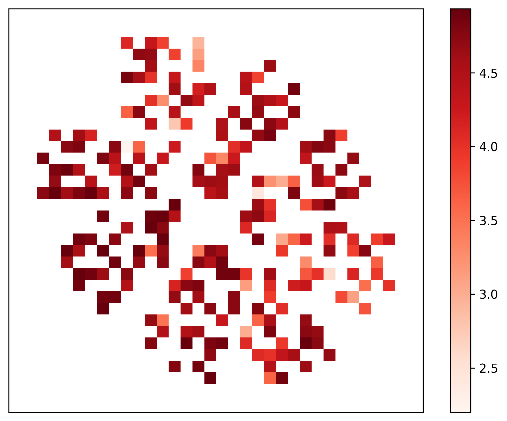
## Heatmap: Unlabeled Spatial Data Distribution
### Overview
The image displays a 2D heatmap visualization. It consists of a grid of colored squares (cells) arranged in an irregular, sparse pattern against a white background. A vertical color scale bar is positioned to the right of the main grid. There are no axis titles, a main chart title, or labels for the grid's rows and columns. The data appears to represent the intensity or magnitude of a measured variable across a two-dimensional space.
### Components/Axes
* **Main Grid:** A square area containing colored cells. The grid dimensions are not explicitly labeled, but visually it appears to be approximately 20x20 cells. Many cells are empty (white).
* **Color Scale (Legend):** A vertical bar located on the right side of the image.
* **Scale Type:** Continuous, sequential color gradient.
* **Color Range:** From a very light, pale peach/white at the bottom to a deep, dark red at the top.
* **Numerical Labels (Markers):** The scale is marked with the following values, from bottom to top: `2.5`, `3.0`, `3.5`, `4.0`, `4.5`.
* **Interpretation:** The color of each cell in the main grid corresponds to a numerical value according to this scale. Darker red indicates a higher value (~4.5), while lighter shades indicate lower values (~2.5).
### Detailed Analysis
* **Data Point Distribution:** The colored cells are not uniformly distributed. They form several distinct clusters and isolated points.
* **Cluster 1 (Top-Left Quadrant):** A dense, irregular cluster of cells. Colors range from medium red to very dark red, indicating values primarily between ~3.5 and 4.5.
* **Cluster 2 (Center):** A significant concentration of cells. This area contains a mix of colors, including some of the darkest red cells (value ~4.5) and several lighter orange/peach cells (value ~3.0-3.5).
* **Cluster 3 (Bottom-Right Quadrant):** Another dense cluster. Shows a similar range of values as the center cluster, with a notable presence of very dark red cells.
* **Sparse Areas:** The top-right and bottom-left quadrants have significantly fewer data points. The cells present in these areas tend to be lighter in color (values ~2.5-3.5), with a few exceptions.
* **Value Range:** The data values represented span the full range of the color bar, from approximately 2.5 to 4.5.
* **Pattern:** The data does not form a simple geometric shape or gradient. It appears as a complex, possibly organic or stochastic, spatial pattern with areas of high density and high value interspersed with empty space.
### Key Observations
1. **Missing Context:** The complete absence of axis labels, a title, or any descriptive text makes it impossible to know what the X and Y dimensions represent (e.g., time, space, categories) or what the measured variable is.
2. **High-Value Hotspots:** The darkest red cells (value ~4.5) are not isolated; they appear in small groups within the major clusters, suggesting localized "hotspots" of high intensity.
3. **Data Sparsity:** A significant portion of the grid is empty (white). This could indicate zero values, missing data, or a threshold below which data is not displayed.
4. **Color Gradient Clarity:** The color scale is well-defined and continuous, allowing for reasonable estimation of values based on color matching.
### Interpretation
This heatmap visualizes the spatial distribution of a quantitative variable. The clustering suggests that the phenomenon being measured is not random but occurs in specific, concentrated regions. The co-location of high-value (dark red) and medium-value (orange) cells within the same clusters indicates variability within these active regions.
**Without axis labels, the specific meaning is ambiguous.** However, common interpretations for such a pattern could include:
* **Geospatial Data:** Density of events (e.g., disease cases, sensor readings, species sightings) across a geographic area.
* **Scientific Measurement:** Intensity of a signal (e.g., gene expression, electromagnetic field strength, material stress) across a sample or simulation grid.
* **Abstract Data:** Correlation strength between pairs of items in a matrix, where the X and Y axes represent the same set of items.
The primary takeaway is the existence of distinct, heterogeneous clusters of activity. The next critical step for understanding this data would be to obtain the missing metadata: what the axes measure and what the color scale quantifies.