## Line Chart: Test Accuracy vs. Time for Different Parameter Configurations
### Overview
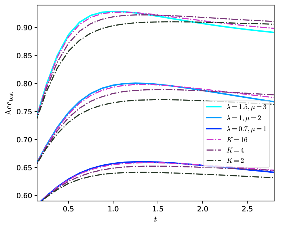
The image is a line chart plotting test accuracy (`Acc_test`) on the vertical axis against a variable `t` (likely time or a training step) on the horizontal axis. It displays six distinct data series, each representing a different model configuration defined by parameters `λ` (lambda), `μ` (mu), and `K`. The chart demonstrates how test accuracy evolves over `t` for these configurations.
### Components/Axes
* **Y-Axis (Vertical):**
* **Label:** `Acc_test`
* **Scale:** Linear, ranging from 0.60 to approximately 0.93.
* **Major Tick Marks:** 0.60, 0.65, 0.70, 0.75, 0.80, 0.85, 0.90.
* **X-Axis (Horizontal):**
* **Label:** `t`
* **Scale:** Linear, ranging from approximately 0.2 to 2.8.
* **Major Tick Marks:** 0.5, 1.0, 1.5, 2.0, 2.5.
* **Legend:** Located in the bottom-right quadrant of the chart area. It contains six entries, each with a specific color and line style:
1. **Cyan, Solid Line:** `λ = 1.5, μ = 3`
2. **Blue, Solid Line:** `λ = 1, μ = 2`
3. **Dark Blue, Solid Line:** `λ = 0.7, μ = 1`
4. **Magenta, Dash-Dot Line:** `K = 16`
5. **Purple, Dash-Dot Line:** `K = 4`
6. **Dark Green, Dash-Dot Line:** `K = 2`
### Detailed Analysis
The six lines form three distinct performance clusters. Within each cluster, the lines follow similar trajectories but reach different peak accuracies.
**High-Performance Cluster (Peak Acc_test ~0.90 - 0.93):**
* **Cyan Solid Line (`λ = 1.5, μ = 3`):** Starts at ~0.74 at t=0.2. Rises steeply, peaks at ~0.93 around t=1.2, then gradually declines to ~0.89 by t=2.8. This is the highest-performing configuration overall.
* **Magenta Dash-Dot Line (`K = 16`):** Follows a very similar path to the cyan line, starting slightly lower (~0.73), peaking slightly lower (~0.925) at a similar t, and ending slightly higher (~0.905).
* **Purple Dash-Dot Line (`K = 4`):** Starts lower (~0.72), rises to a lower peak (~0.915) around t=1.4, and ends at ~0.91. Its ascent is slightly less steep than the top two.
* **Dark Green Dash-Dot Line (`K = 2`):** The lowest in this cluster. Starts at ~0.71, peaks at ~0.905 around t=1.6, and ends at ~0.90. It has the most gradual ascent and the latest peak.
**Mid-Performance Cluster (Peak Acc_test ~0.77 - 0.80):**
* **Blue Solid Line (`λ = 1, μ = 2`):** Starts at ~0.66. Rises to a peak of ~0.80 around t=1.2, then declines to ~0.77 by t=2.8.
* **Dark Blue Solid Line (`λ = 0.7, μ = 1`):** Starts at ~0.65. Peaks at ~0.79 around t=1.4, and ends at ~0.78. It is consistently below the blue line.
**Low-Performance Cluster (Peak Acc_test ~0.64 - 0.66):**
* **Dark Blue Solid Line (`λ = 0.7, μ = 1`):** (Note: This is the same series as in the mid-cluster, but its lower segment is analyzed here for completeness). Its lower bound starts at ~0.59, peaks at ~0.66 around t=1.4, and ends at ~0.64.
* **Purple Dash-Dot Line (`K = 4`):** (Note: This is the same series as in the high-cluster, but its lower segment is analyzed here). Its lower bound starts at ~0.59, peaks at ~0.65 around t=1.5, and ends at ~0.64.
* **Dark Green Dash-Dot Line (`K = 2`):** (Note: This is the same series as in the high-cluster, but its lower segment is analyzed here). Its lower bound starts at ~0.59, peaks at ~0.64 around t=1.6, and ends at ~0.63.
**Trend Verification:** All six lines exhibit the same fundamental trend: a rapid initial increase in accuracy, followed by a peak, and then a very gradual decline or plateau as `t` increases further. The steepness of the initial rise and the height of the peak are determined by the configuration parameters.
### Key Observations
1. **Parameter Hierarchy:** Configurations with higher `λ` and `μ` values (e.g., 1.5, 3) achieve significantly higher peak accuracy than those with lower values (e.g., 0.7, 1).
2. **Effect of K:** For the `K` parameter series (dash-dot lines), higher `K` values (16) lead to higher peak accuracy and a slightly earlier peak compared to lower `K` values (2).
3. **Performance Clustering:** The data series naturally group into three distinct performance tiers, suggesting a strong, non-linear relationship between the parameters and the model's maximum achievable accuracy.
4. **Convergence and Decline:** All models show signs of performance saturation and slight degradation after reaching their peak, which could indicate overfitting or a changing optimization landscape as `t` increases.
5. **Line Style Correlation:** Solid lines are used for the `λ, μ` parameter sets, while dash-dot lines are used for the `K` parameter sets, providing a clear visual distinction between the two types of configurations.
### Interpretation
This chart likely illustrates the performance of a machine learning model (possibly a neural network or an ensemble method) under different regularization or architectural settings over the course of training or across a scaling parameter `t`.
* **What the data suggests:** The parameters `λ` and `μ` appear to be primary drivers of model capacity or regularization strength. Higher values correlate with a higher performance ceiling. The parameter `K` (which could represent ensemble size, number of clusters, or a similar discrete hyperparameter) also positively correlates with performance, but its effect is secondary to the `λ, μ` combination within the ranges tested.
* **How elements relate:** The three performance clusters indicate that the parameter space has distinct "regimes." Moving from the low to mid to high cluster requires a significant shift in parameter values, not just incremental changes. The consistent trend shape across all series suggests the underlying learning dynamics are similar, but the parameters control the efficiency and ultimate limit of that learning.
* **Notable anomalies/insights:** The most striking insight is the clear separation between the high-performance group (all above 0.90 accuracy) and the others. This suggests that finding the right combination of `λ` and `μ` (or a high `K`) is critical for optimal results. The slight decline after the peak is also important, implying that early stopping based on a validation set could be beneficial to capture the model at its peak performance before potential overfitting occurs. The chart provides a visual guide for hyperparameter tuning, showing which combinations are promising and which are not.