## Line Chart: Accuracy vs. Time for Different Parameters
### Overview
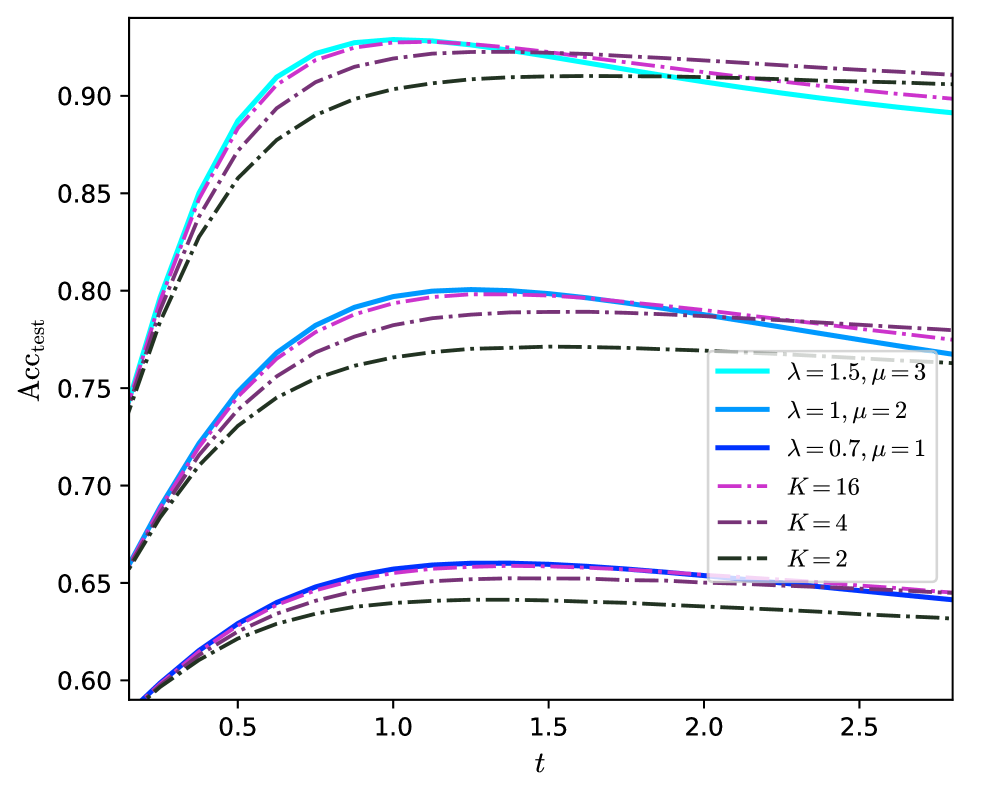
The image is a line chart that plots the test accuracy (Acc_test) against time (t) for different values of parameters lambda (λ), mu (μ), and K. The chart displays six different lines, each representing a unique combination of these parameters. The goal is to visualize how these parameters affect the accuracy of a model over time.
### Components/Axes
* **X-axis:** Time (t), ranging from approximately 0 to 2.5. Axis markers are present at 0.5, 1.0, 1.5, 2.0, and 2.5.
* **Y-axis:** Test Accuracy (Acc_test), ranging from 0.60 to 0.90. Axis markers are present at 0.60, 0.65, 0.70, 0.75, 0.80, 0.85, and 0.90.
* **Legend:** Located on the right side of the chart, the legend identifies each line by its corresponding parameter values:
* Cyan: λ = 1.5, μ = 3
* Blue: λ = 1, μ = 2
* Dark Blue: λ = 0.7, μ = 1
* Purple Dashed: K = 16
* Dark Purple Dashed: K = 4
* Black Dash-Dot: K = 2
### Detailed Analysis
* **Cyan Line (λ = 1.5, μ = 3):** This line starts at approximately 0.75 accuracy at t=0, rises sharply to a peak of approximately 0.92 around t=1, and then gradually decreases to approximately 0.89 at t=2.5.
* **Blue Line (λ = 1, μ = 2):** This line starts at approximately 0.67 accuracy at t=0, rises sharply to a peak of approximately 0.80 around t=1, and then gradually decreases to approximately 0.78 at t=2.5.
* **Dark Blue Line (λ = 0.7, μ = 1):** This line starts at approximately 0.59 accuracy at t=0, rises sharply to a peak of approximately 0.66 around t=1, and then gradually decreases to approximately 0.64 at t=2.5.
* **Purple Dashed Line (K = 16):** This line starts at approximately 0.66 accuracy at t=0, rises sharply to a peak of approximately 0.91 around t=1, and then gradually decreases to approximately 0.90 at t=2.5.
* **Dark Purple Dashed Line (K = 4):** This line starts at approximately 0.65 accuracy at t=0, rises sharply to a peak of approximately 0.89 around t=1, and then gradually decreases to approximately 0.88 at t=2.5.
* **Black Dash-Dot Line (K = 2):** This line starts at approximately 0.64 accuracy at t=0, rises sharply to a peak of approximately 0.87 around t=1, and then gradually decreases to approximately 0.86 at t=2.5.
### Key Observations
* The lines representing different values of λ and μ (cyan, blue, dark blue) show a similar trend: a rapid increase in accuracy followed by a gradual decrease.
* The lines representing different values of K (purple dashed, dark purple dashed, black dash-dot) also show a similar trend to each other.
* Higher values of λ and μ generally lead to higher peak accuracy.
* Higher values of K generally lead to higher peak accuracy.
* All lines converge to a similar accuracy level at t=0.
* All lines peak around t=1.
### Interpretation
The chart illustrates the impact of different parameter settings on the test accuracy of a model over time. The parameters λ and μ, as well as K, appear to influence both the initial rate of accuracy increase and the peak accuracy achieved. The subsequent decrease in accuracy after the peak suggests a potential overfitting phenomenon, where the model performs well on the training data initially but loses generalization ability over time. The optimal parameter settings would likely involve a trade-off between achieving a high peak accuracy and minimizing the subsequent decline. The fact that the K values are dashed, and the lambda/mu values are solid, suggests that they are different types of parameters.