## Line Chart: Test Accuracy vs. Time
### Overview
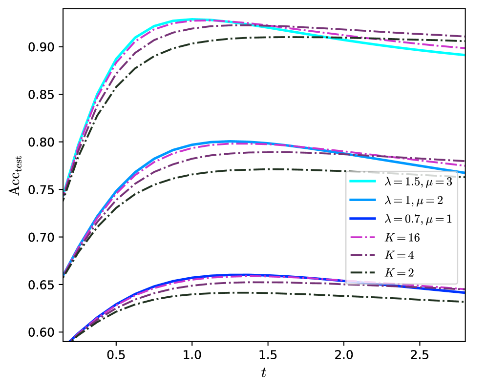
This image presents a line chart illustrating the relationship between test accuracy (Acc<sub>test</sub>) and time (t) for different parameter settings. Several lines are plotted, representing different combinations of lambda (λ) and mu (μ) values, as well as different values of K. The chart appears to demonstrate how test accuracy evolves over time under varying conditions.
### Components/Axes
* **X-axis:** Labeled "t", representing time. The scale ranges from approximately 0.3 to 2.7.
* **Y-axis:** Labeled "Acc<sub>test</sub>", representing test accuracy. The scale ranges from approximately 0.60 to 0.92.
* **Legend:** Located in the top-right corner of the chart. It contains the following entries:
* λ = 1.5, μ = 3 (Light Blue Solid Line)
* λ = 1, μ = 2 (Blue Solid Line)
* λ = 0.7, μ = 1 (Dark Blue Solid Line)
* K = 16 (Purple Dashed Line)
* K = 4 (Purple Dashed-Dotted Line)
* K = 2 (Black Dashed-Dotted Line)
### Detailed Analysis
The chart displays six distinct lines, each representing a different set of parameters.
* **λ = 1.5, μ = 3 (Light Blue):** This line starts at approximately Acc<sub>test</sub> = 0.62 at t = 0.3, rises rapidly, and plateaus around Acc<sub>test</sub> = 0.91 at t = 1.0, remaining relatively stable thereafter.
* **λ = 1, μ = 2 (Blue):** This line begins at approximately Acc<sub>test</sub> = 0.63 at t = 0.3, increases steadily, and reaches a plateau around Acc<sub>test</sub> = 0.88 at t = 1.5, with minimal change after that.
* **λ = 0.7, μ = 1 (Dark Blue):** This line starts at approximately Acc<sub>test</sub> = 0.64 at t = 0.3, exhibits a slower increase compared to the other two, and plateaus around Acc<sub>test</sub> = 0.77 at t = 2.0.
* **K = 16 (Purple Dashed):** This line starts at approximately Acc<sub>test</sub> = 0.61 at t = 0.3, increases rapidly, and reaches a plateau around Acc<sub>test</sub> = 0.89 at t = 1.0, remaining relatively stable.
* **K = 4 (Purple Dashed-Dotted):** This line begins at approximately Acc<sub>test</sub> = 0.62 at t = 0.3, increases steadily, and plateaus around Acc<sub>test</sub> = 0.78 at t = 1.5.
* **K = 2 (Black Dashed-Dotted):** This line starts at approximately Acc<sub>test</sub> = 0.60 at t = 0.3, increases slowly, and plateaus around Acc<sub>test</sub> = 0.67 at t = 2.0.
All lines exhibit an initial increase in Acc<sub>test</sub> as t increases, but the rate of increase and the final plateau value vary significantly.
### Key Observations
* The lines representing different values of λ and μ (light blue, blue, and dark blue) generally achieve higher test accuracy than those representing different values of K (purple and black).
* Higher values of λ and μ appear to lead to faster convergence to a higher test accuracy.
* Increasing K from 2 to 4 to 16 results in a noticeable increase in test accuracy, but the accuracy remains lower than that achieved with higher λ and μ values.
* The line for K=2 shows the lowest overall test accuracy.
### Interpretation
The chart suggests that the parameters λ and μ have a more significant impact on test accuracy than the parameter K. The values of λ and μ likely control the learning rate or the strength of the model's ability to capture patterns in the data, while K might represent the complexity or capacity of the model. The rapid initial increase in accuracy followed by a plateau indicates that the model quickly learns the initial patterns but then reaches a point of diminishing returns. The differences in the plateau values suggest that different parameter settings lead to different levels of model performance. The relatively low accuracy achieved with K=2 suggests that a model with insufficient capacity may not be able to fully capture the underlying patterns in the data, even with optimal values of λ and μ. The chart demonstrates a trade-off between model complexity (K) and learning parameters (λ, μ) in achieving optimal test accuracy.