\n
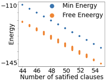
## Scatter Plot: Energy vs. Satisfied Clauses
### Overview
This image presents a scatter plot illustrating the relationship between the number of satisfied clauses and energy levels, represented by two distinct data series: "Min Energy" and "Free Energy". The plot appears to visualize the optimization process of a system, potentially related to constraint satisfaction or energy minimization.
### Components/Axes
* **X-axis:** "Number of satisfied clauses" ranging from approximately 44 to 54. The axis has tick marks at integer values.
* **Y-axis:** "Energy" ranging from approximately -110 to -145. The axis has tick marks at integer values.
* **Legend:** Located in the top-right corner.
* "Min Energy" – Represented by blue circles.
* "Free Energy" – Represented by orange circles.
### Detailed Analysis
**Min Energy (Blue Circles):**
The "Min Energy" data series exhibits a generally downward trend.
* At approximately 44 satisfied clauses, the energy is around -110.
* At approximately 46 satisfied clauses, the energy is around -108.
* At approximately 48 satisfied clauses, the energy is around -105.
* At approximately 50 satisfied clauses, the energy is around -103.
* At approximately 52 satisfied clauses, the energy is around -100.
* At approximately 54 satisfied clauses, the energy is around -97.
**Free Energy (Orange Circles):**
The "Free Energy" data series also shows a downward trend, but it is more pronounced and less linear than the "Min Energy" series.
* At approximately 44 satisfied clauses, the energy is around -125.
* At approximately 46 satisfied clauses, the energy is around -130.
* At approximately 48 satisfied clauses, the energy is around -135.
* At approximately 50 satisfied clauses, the energy is around -138.
* At approximately 52 satisfied clauses, the energy is around -140.
* At approximately 54 satisfied clauses, the energy is around -142.
### Key Observations
* Both energy levels decrease as the number of satisfied clauses increases, indicating a positive correlation.
* The "Free Energy" consistently has lower (more negative) energy values than the "Min Energy" across the observed range of satisfied clauses.
* The rate of energy decrease appears to be more rapid for "Free Energy" than for "Min Energy".
* The data points are not perfectly aligned on a straight line, suggesting some variability or noise in the data.
### Interpretation
The plot likely represents the progress of an optimization algorithm attempting to satisfy constraints (represented by clauses) while minimizing energy. The "Min Energy" could represent the lowest energy state found so far, while "Free Energy" might represent a thermodynamic potential or a measure of the system's stability. The downward trends indicate that the algorithm is successfully finding solutions with more satisfied clauses and lower energy. The difference between the two energy levels suggests that the system is not yet in its global minimum energy state, and there is still potential for improvement. The variability in the data points could be due to the stochastic nature of the optimization algorithm or inherent noise in the problem being solved. The plot demonstrates a clear trade-off between the number of satisfied constraints and the overall energy of the system.