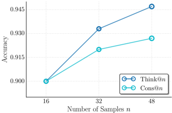
## Line Chart: Accuracy vs. Number of Samples
### Overview
The image is a line chart comparing the accuracy of two methods, "Think@n" and "Cons@n", as the number of samples (n) increases. The x-axis represents the number of samples, and the y-axis represents accuracy.
### Components/Axes
* **X-axis:** Number of Samples (n), with markers at 16, 32, and 48.
* **Y-axis:** Accuracy, with markers at 0.900, 0.915, 0.930, and 0.945.
* **Legend:** Located in the bottom-right corner.
* "Think@n" is represented by a dark blue line with circular markers.
* "Cons@n" is represented by a light blue line with circular markers.
### Detailed Analysis
* **Think@n (Dark Blue):**
* At 16 samples, the accuracy is approximately 0.900.
* At 32 samples, the accuracy is approximately 0.932.
* At 48 samples, the accuracy is approximately 0.946.
* Trend: The accuracy increases as the number of samples increases.
* **Cons@n (Light Blue):**
* At 16 samples, the accuracy is approximately 0.900.
* At 32 samples, the accuracy is approximately 0.917.
* At 48 samples, the accuracy is approximately 0.928.
* Trend: The accuracy increases as the number of samples increases, but at a slower rate than "Think@n".
### Key Observations
* Both methods show an increase in accuracy with an increasing number of samples.
* "Think@n" consistently outperforms "Cons@n" in terms of accuracy across all sample sizes.
* The rate of increase in accuracy for "Think@n" appears to be higher than that of "Cons@n".
### Interpretation
The chart suggests that both "Think@n" and "Cons@n" benefit from a larger number of samples, as indicated by the upward-sloping lines. However, "Think@n" is the superior method, achieving higher accuracy levels than "Cons@n" for all tested sample sizes. The steeper slope of the "Think@n" line indicates that it may be more efficient in utilizing additional samples to improve accuracy. The data implies that "Think@n" is a more robust and effective method for the given task.