## Line Chart: Accuracy vs. Number of Samples
### Overview
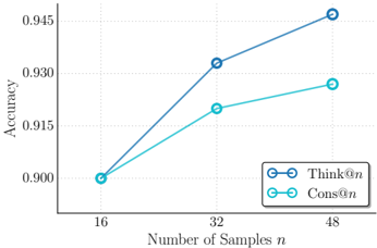
The image is a line chart comparing the performance of two methods, labeled "Think@n" and "Cons@n," as a function of the number of samples (`n`). The chart plots "Accuracy" on the vertical axis against the "Number of Samples n" on the horizontal axis. Both methods show improving accuracy with more samples, but their rates of improvement differ.
### Components/Axes
* **Chart Type:** Line chart with markers.
* **X-Axis (Horizontal):**
* **Label:** "Number of Samples n"
* **Scale:** Linear scale with discrete tick marks.
* **Tick Values:** 16, 32, 48.
* **Y-Axis (Vertical):**
* **Label:** "Accuracy"
* **Scale:** Linear scale.
* **Range:** Approximately 0.900 to 0.945.
* **Tick Values:** 0.900, 0.915, 0.930, 0.945.
* **Legend:**
* **Position:** Bottom-right corner of the chart area.
* **Entries:**
1. **Think@n:** Represented by a dark blue line with open circle markers.
2. **Cons@n:** Represented by a light blue (cyan) line with open circle markers.
### Detailed Analysis
The chart displays two data series, each with three data points corresponding to n=16, 32, and 48.
**1. Data Series: Think@n (Dark Blue Line)**
* **Trend Verification:** The line slopes upward consistently from left to right, indicating a positive correlation between the number of samples and accuracy. The slope is steeper between n=16 and n=32 than between n=32 and n=48.
* **Data Points (Approximate):**
* At n=16: Accuracy ≈ 0.900
* At n=32: Accuracy ≈ 0.932
* At n=48: Accuracy ≈ 0.945
**2. Data Series: Cons@n (Light Blue/Cyan Line)**
* **Trend Verification:** The line also slopes upward from left to right, showing improved accuracy with more samples. The slope is more gradual compared to the "Think@n" line, especially between n=32 and n=48.
* **Data Points (Approximate):**
* At n=16: Accuracy ≈ 0.900 (appears to start at the same point as Think@n)
* At n=32: Accuracy ≈ 0.920
* At n=48: Accuracy ≈ 0.927
### Key Observations
1. **Common Starting Point:** Both methods begin at approximately the same accuracy level (0.900) when the number of samples is 16.
2. **Diverging Performance:** As the number of samples increases, the performance of the two methods diverges. The "Think@n" method shows a greater improvement in accuracy.
3. **Performance Gap:** The gap in accuracy between "Think@n" and "Cons@n" widens with more samples. At n=48, "Think@n" is approximately 0.018 points (or 1.8 percentage points) more accurate than "Cons@n".
4. **Diminishing Returns:** Both curves show signs of diminishing returns; the increase in accuracy from n=32 to n=48 is smaller than the increase from n=16 to n=32 for both methods.
### Interpretation
The data suggests that while both evaluated methods ("Think@n" and "Cons@n") benefit from an increased number of training or evaluation samples (`n`), the "Think@n" method scales more effectively. It leverages additional data to achieve a higher final accuracy.
This could imply several things in a technical context:
* **Methodological Superiority:** The "Think@n" approach may have a more robust underlying algorithm or architecture that better utilizes larger datasets.
* **Data Efficiency:** "Cons@n" might be more data-efficient at very low sample sizes (though they are equal at n=16 here), but it plateaus sooner. "Think@n" continues to extract meaningful signal from more data.
* **Practical Implication:** For applications where collecting or processing more samples is feasible, "Think@n" would be the preferable method based on this trend. The choice between them at lower sample sizes (n=16) may depend on other factors like computational cost, as their accuracy is nearly identical.
The chart effectively communicates that the advantage of the "Think@n" method becomes pronounced as the scale of the problem (number of samples) increases.